SUBSTRATE CASE STUDY
CASE STUDY
Phase II: Level-Up Your Chemistry
Better Learning Through Chemistry
Mol, the Organic Chemistry prototype I redesigned and helped develop over the course of several months with a team from Iowa State, went on to receive a Phase II grant award from the NIH. The project spun from a small prototype into a full-blown company with plans for commercialization. I joined the newly formed Substrate as Head of Design in August of 2019.
With Substrate, our product goals remained similar to those we had with Mol, but this time, we wanted to go bigger - Starting with Organic Chemistry and scaling to additional courses as more funds became available to us. The Substrate vision: We wanted to be the leader in interactive simulation of natural phenomena that enables diverse experiences across gaming, learning, and other contexts.
You can find more background on how Substrate came to be and how we identified a need for our product in the Mol Chemistry case study.
Below: Early molecular visualization style exploration for Substrate (done in Figma)

Design Goals
We had the opportunity to recruit Texas A&M University (TAMU) to partner with us in the development of the Substrate app. Initial user interviews were done over the course of a week in College Station, Texas, with organic chemistry students and instructors from TAMU providing key insights to help us better understand how to design and deliver the best educational experience.
We interviewed 7 students enrolled in Organic Chemistry I courses at TAMU. We also spent a day getting to know and interviewing instructors in the Department of Chemistry. With the aim to commercialize, I developed higher level design goals based on user needs from Mol and our TAMU user interview feedback that would be critical for our success in developing a product relevant to our primary audience. Our primary audience consisted of any student enrolled in a college-level Organic Chemistry I course. We identified a secondary audience in college-level Organic Chemistry educators.
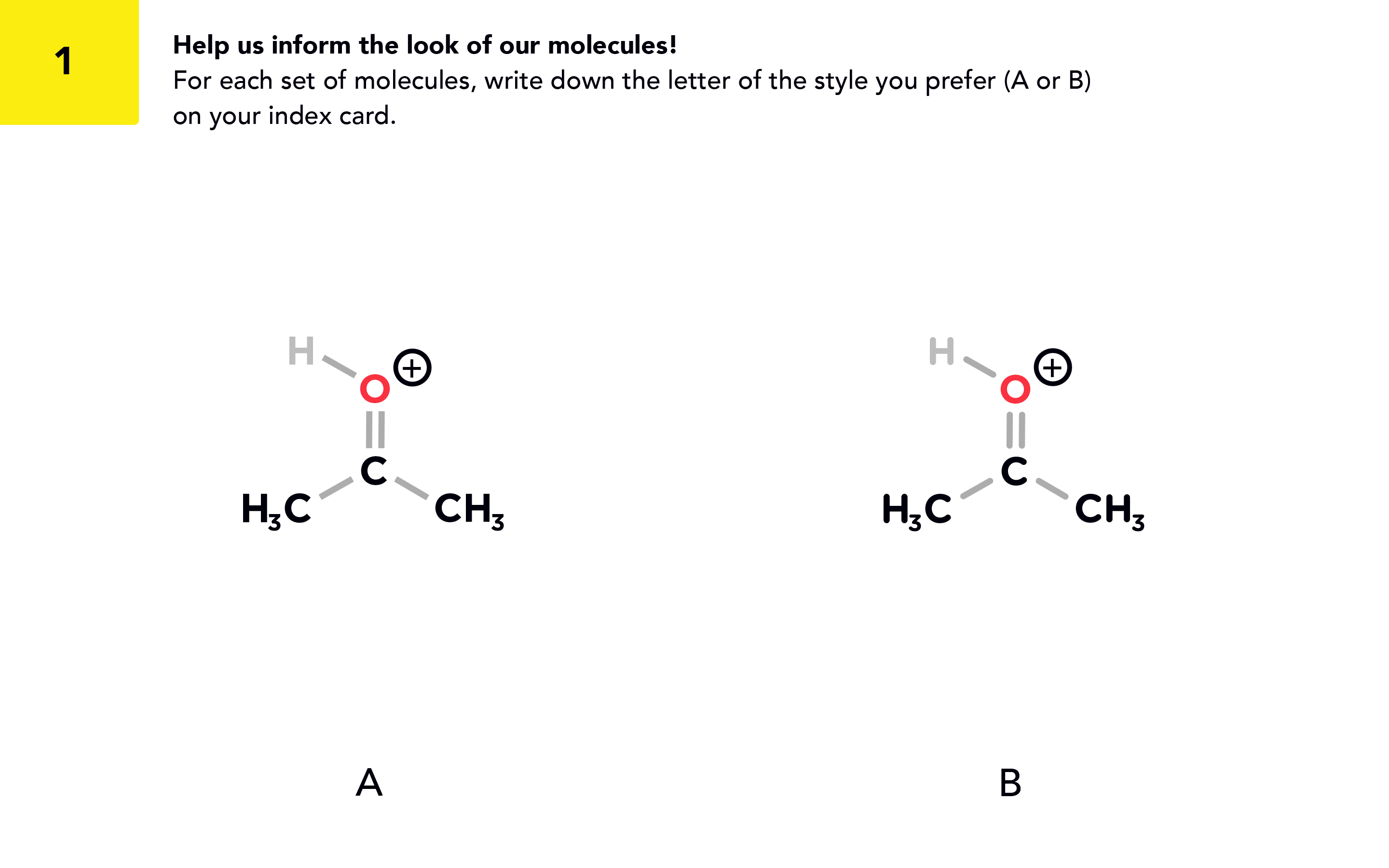
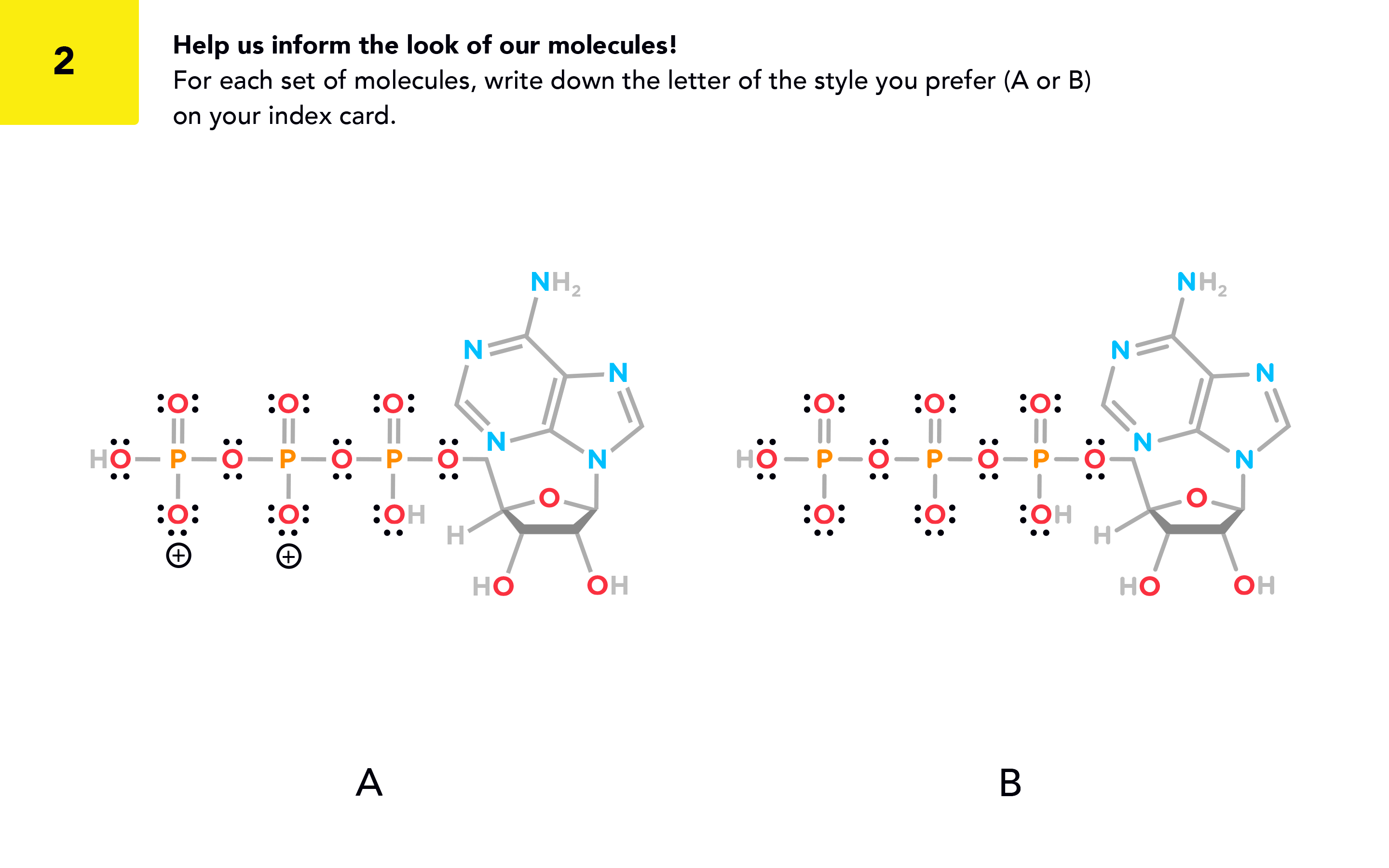
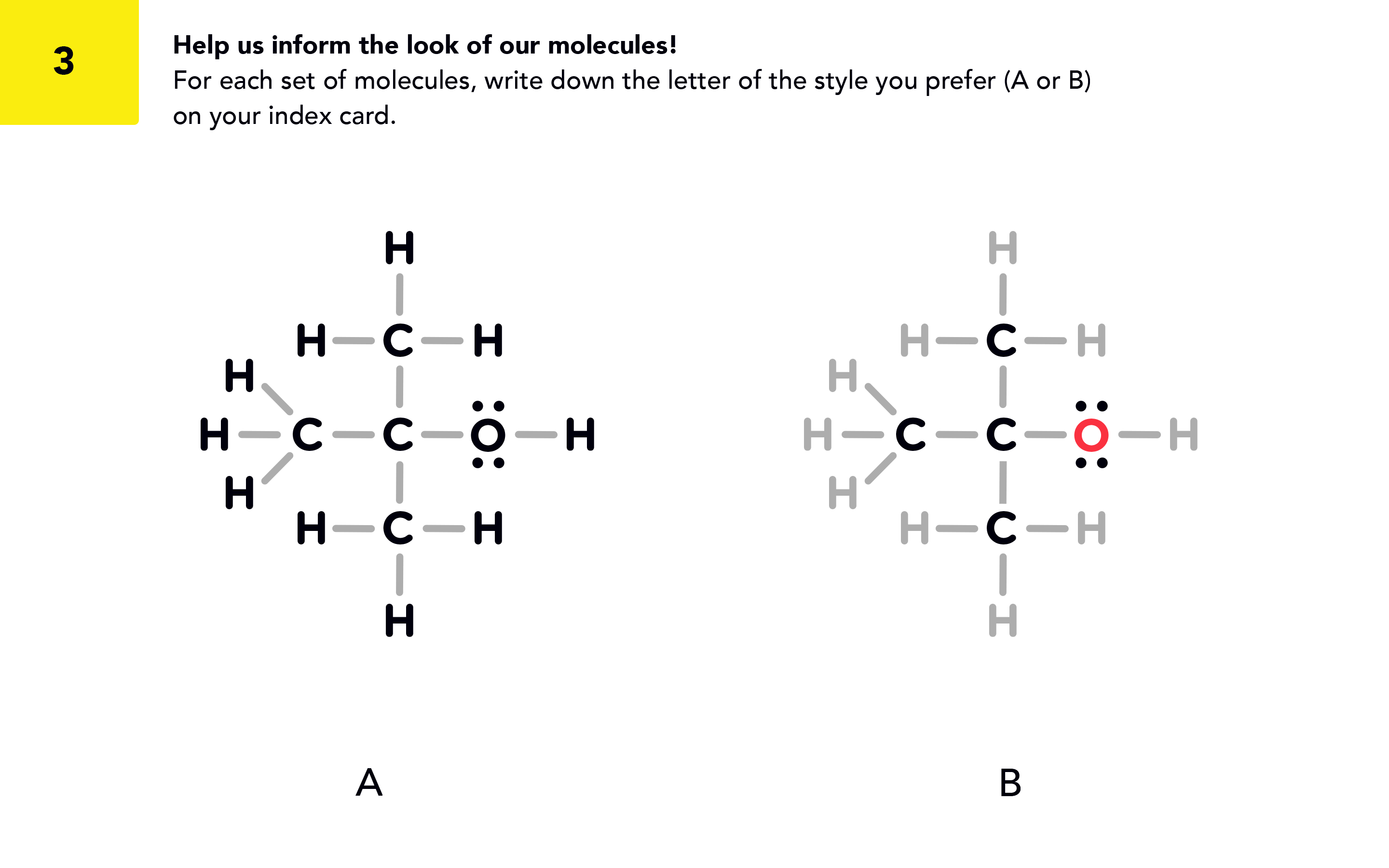
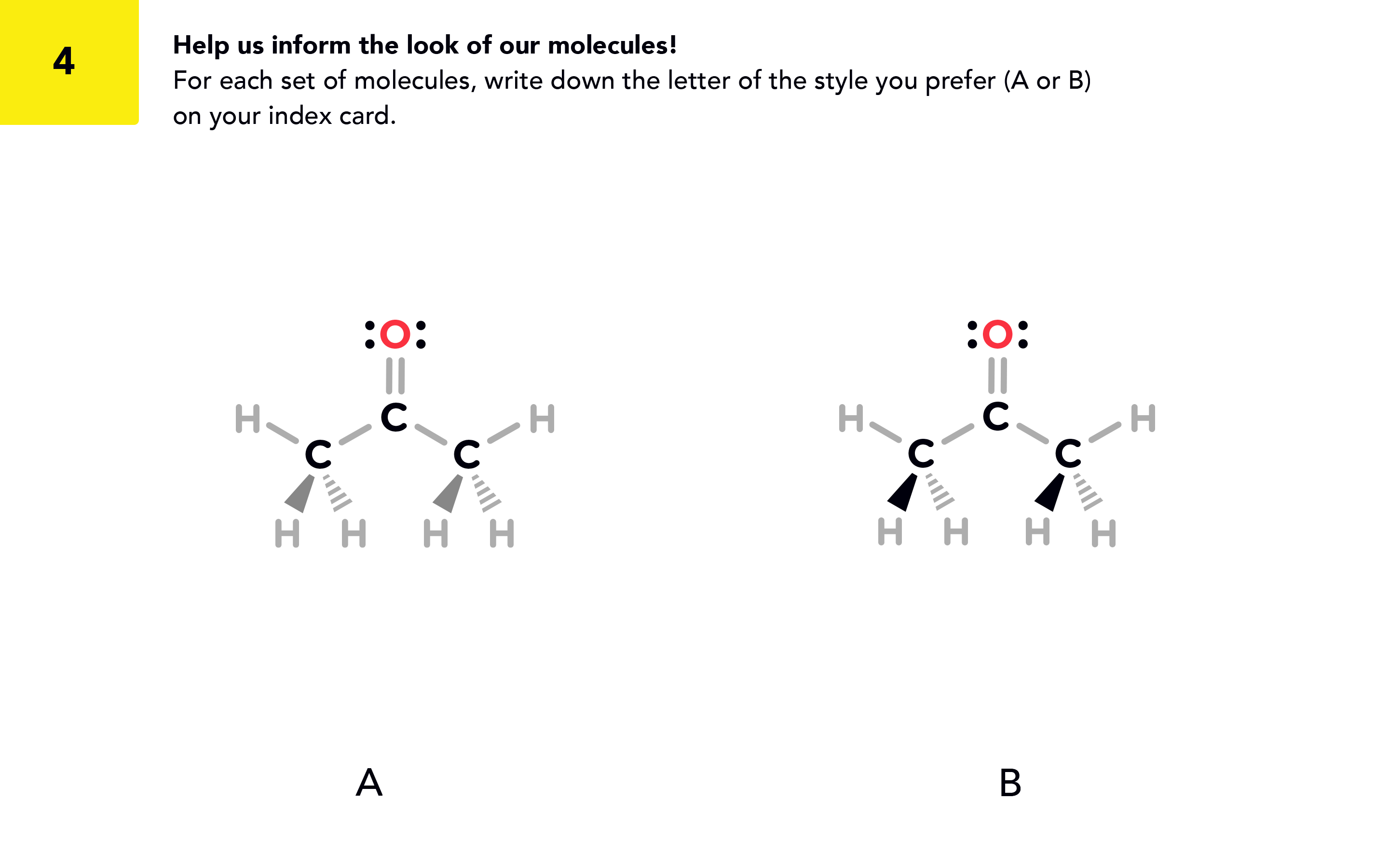
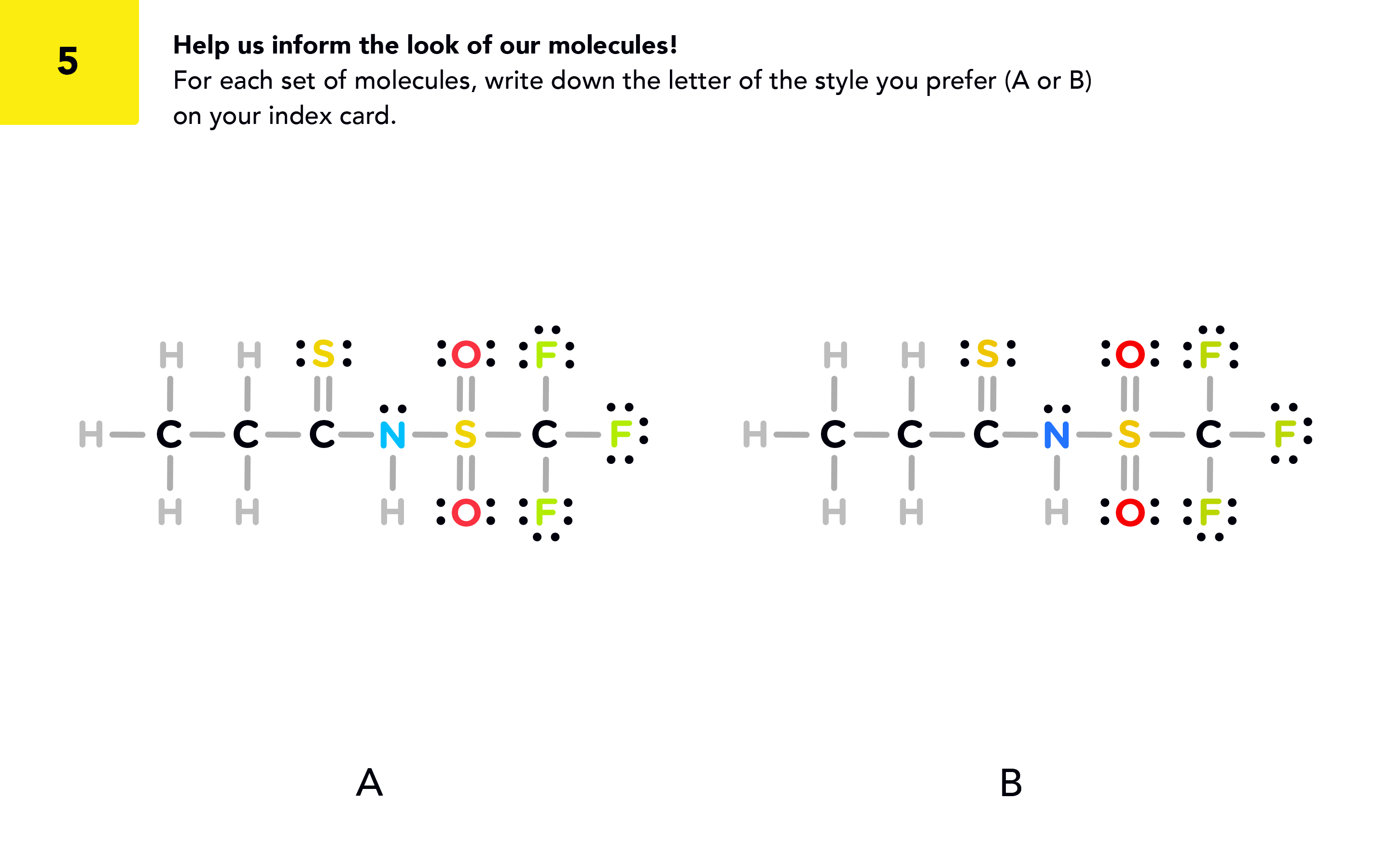
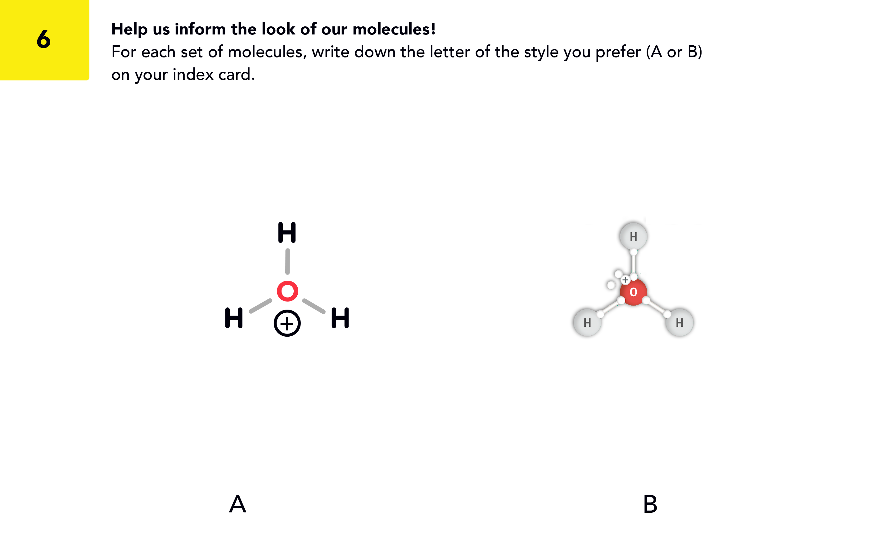
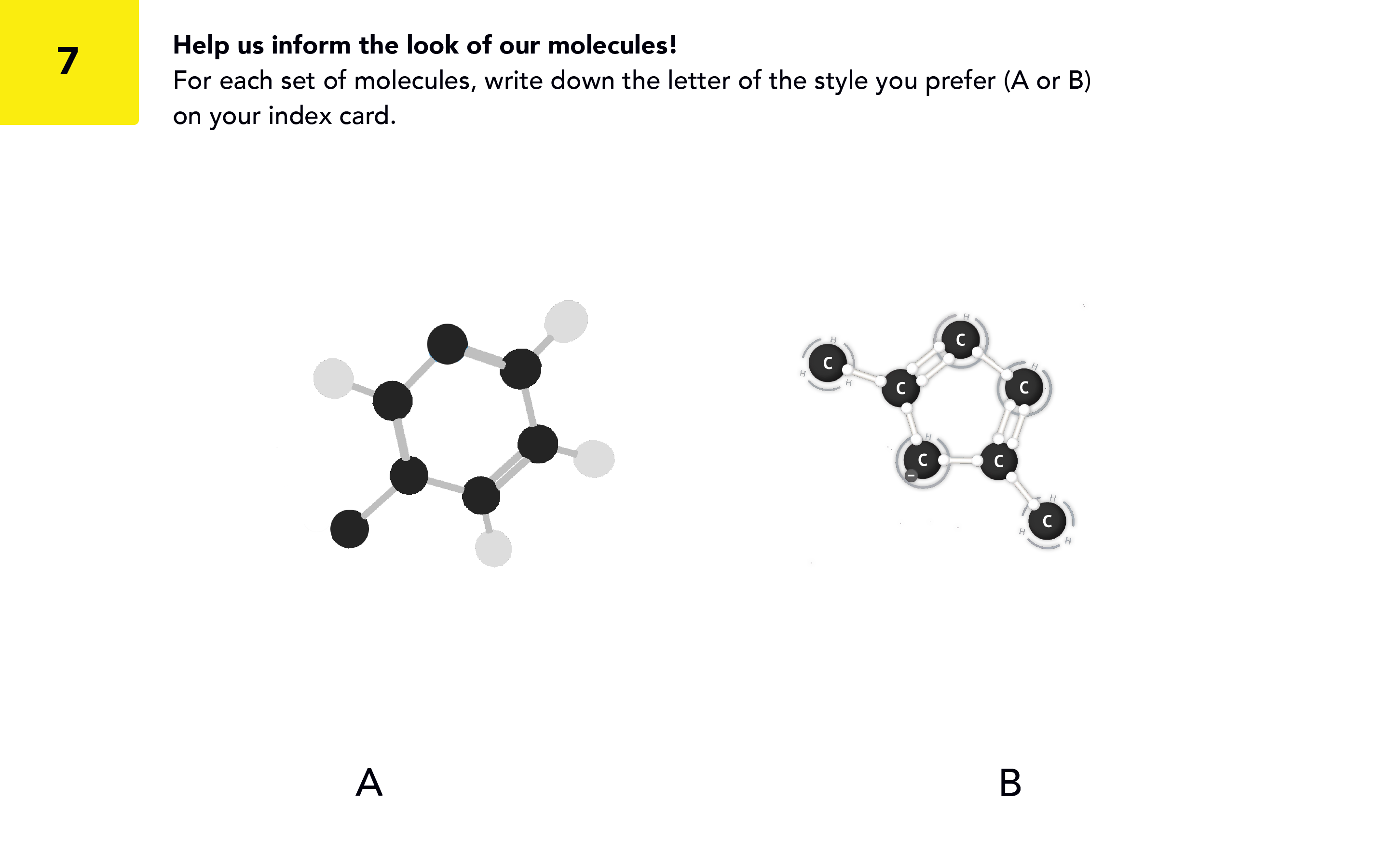
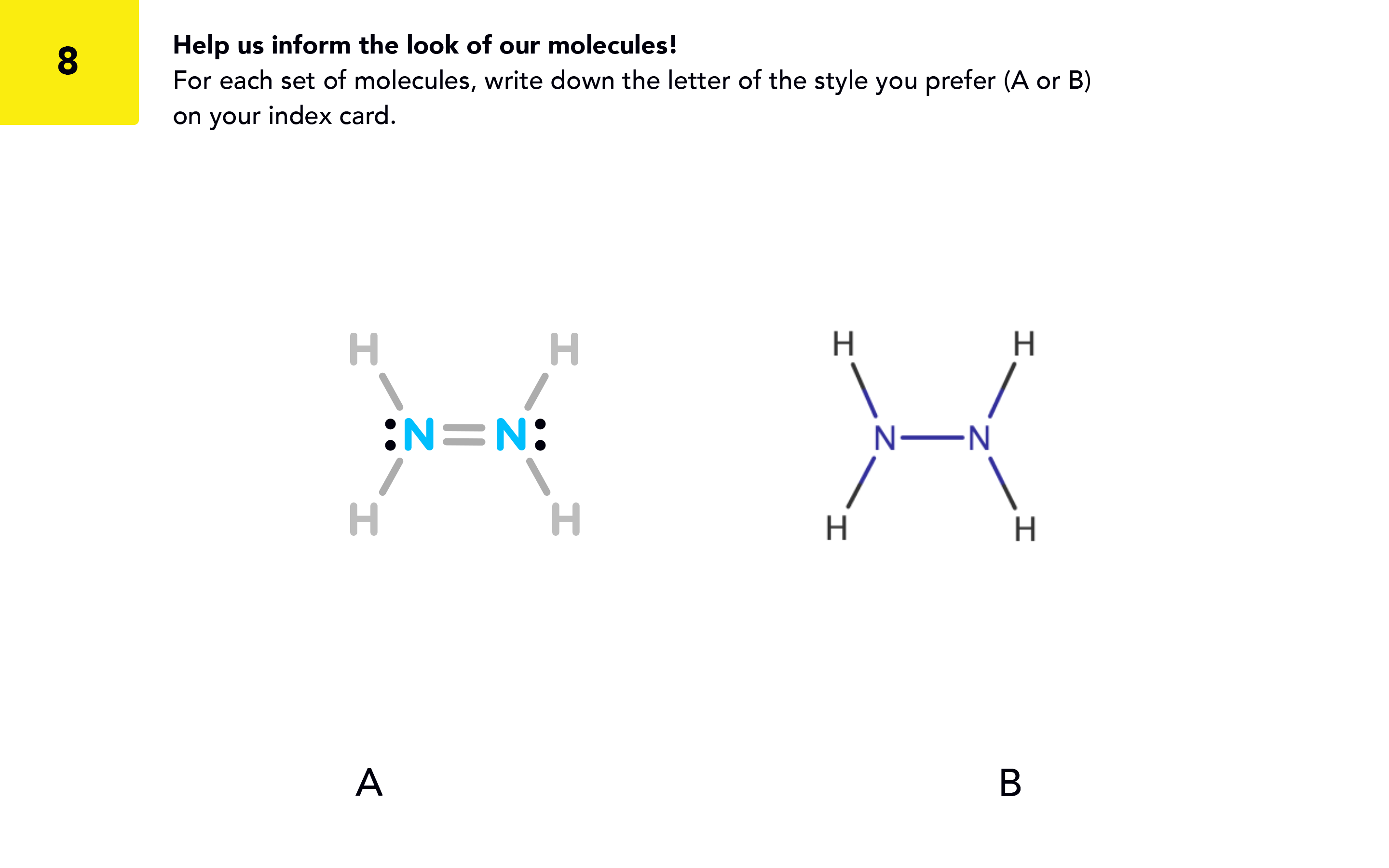
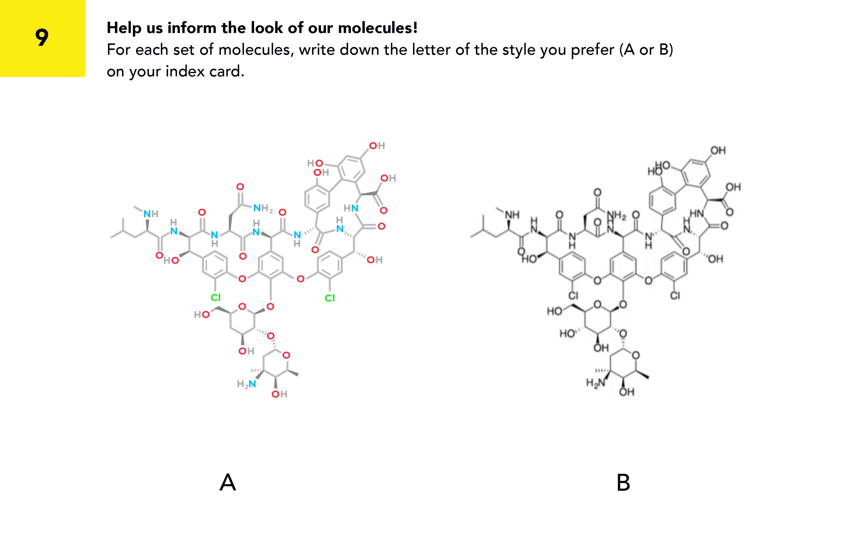
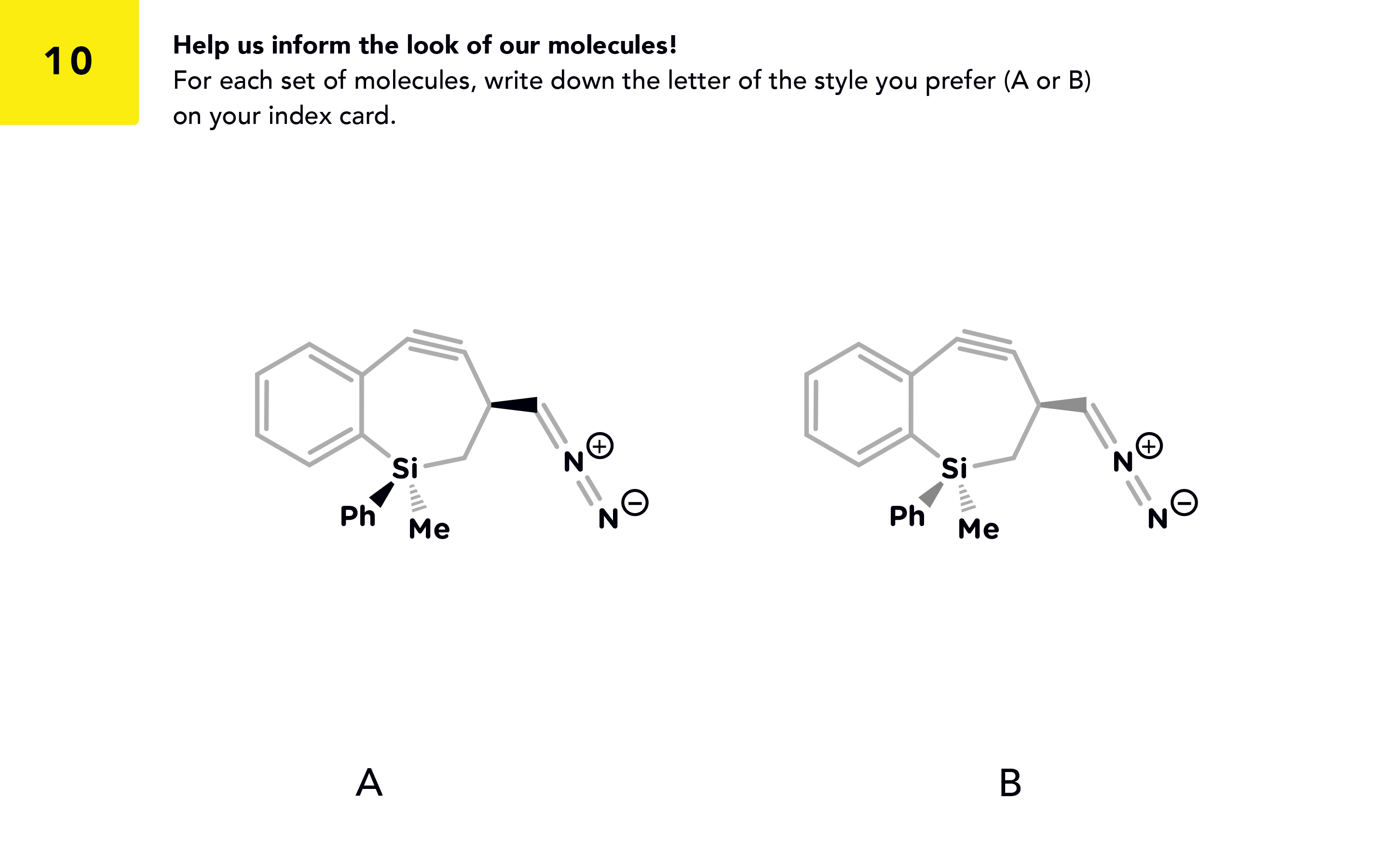
Below: Images from the Molecular visualization A/B test survey given to TAMU students and professors. Click the left or right arrows or hover over the image and click the left or right arrow keys on your keyboard to see the images.
Understanding
users
Our target users are college students enrolled in Organic Chemistry I courses, putting them primarily between the ages of 17-21. Most are on track to develop careers in science, medicine, or education. Reviewing information from user interviews, we developed a list of user needs and their corresponding goals.
User need
– intuitive exercises that maximize learning potential and correspond to course material
– ability to use anywhere
Goal: design a mobile app for iOS and Android with a total of 5 exercises, focusing on molecular interaction (source: PubChem database), covering fundamental organic chemistry concepts that reinforce understanding and are tailored to different learning styles
User need
– interaction with molecules three-dimensionally and ability to switch between 3D/2D visualization
– requisite information to help solve problems (atom ID key, definitions, etc)
Goal: create simple, intuitive, and engaging UI that makes use of interaction design to convey meaning; should enable switching between different visualization modes and include all relevant information to solve problems within each exercise
User need
– ability to sync content with course dashboard
Goal: develop a dashboard that displays user progress for each exercise, with functionality to connect to social media or course software
User need
– content that retains user interest and encourages exploration; integrated tutorials
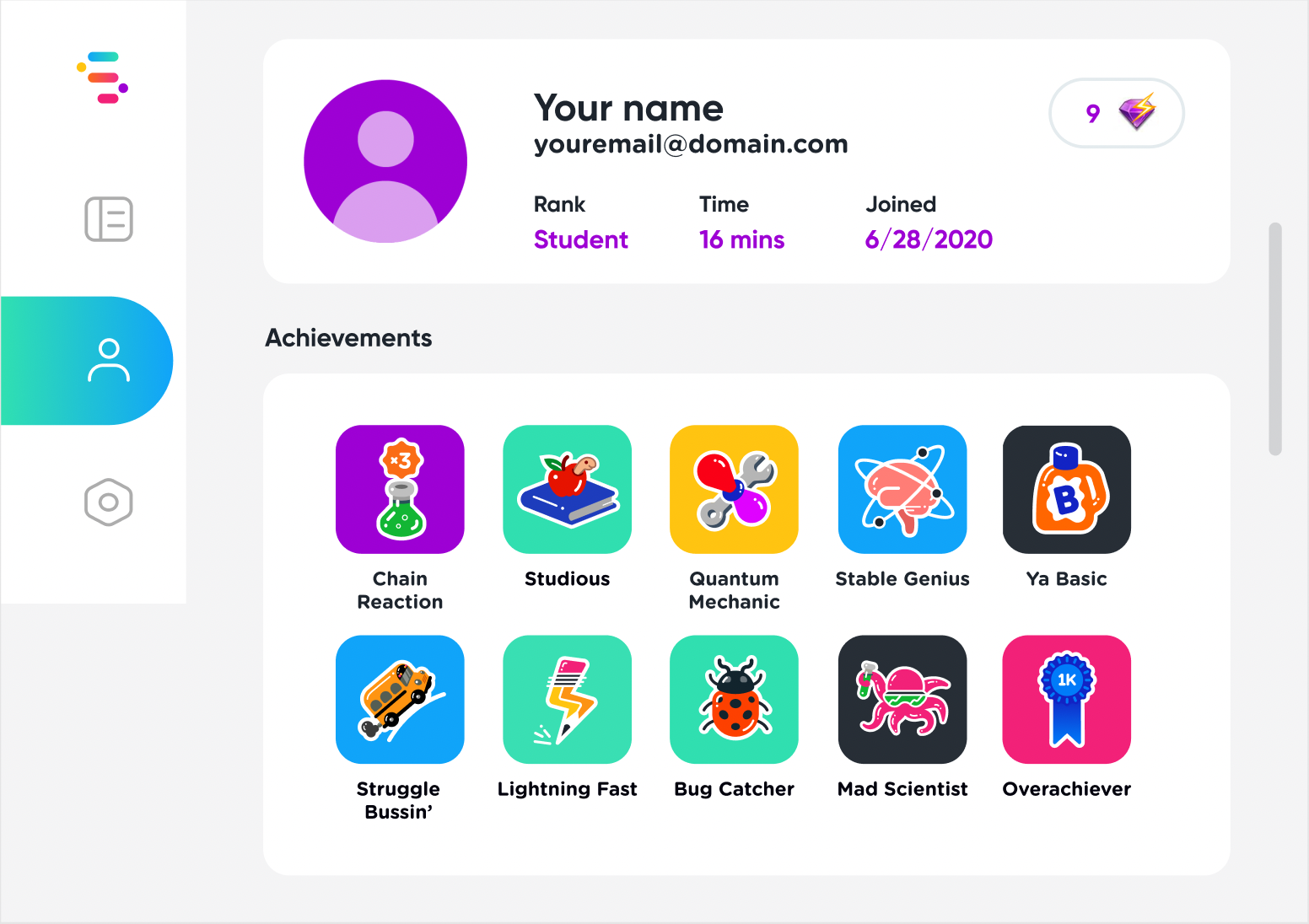
Goal: create intuitive tutorials that help you learn as you play; include sandbox component where users can search for molecules and explore their structures/ properties; create a list of achievements users can unlock as they advance
"We wanted to be the leader in interactive simulation of natural phenomena that enables diverse experiences across gaming, learning, and other contexts."


Designing a
Chemistry Visualization System
Some of the most rewarding feedback we received with Mol was that the molecular visualization was beautiful and easy to interact with. I wanted to maintain that momentum, but take it a step further, with Substrate.
With Mol, we were able to utilize the PubChem database to import chemistry data and apply a style to it. Because of potential technical issues in scaling our user base, our engineering team advised us to use a different approach with Substrate. We decided on an approach that would use mol files, the file format that ChemDraw uses to display its chemical structures, and a script in Unity to apply our own style to the structure data being imported.
Using the generative user research data from our trip to Texas A&M as well as design intuition, I created a set of structures and coalesced it into the signature molecular style of Substrate.
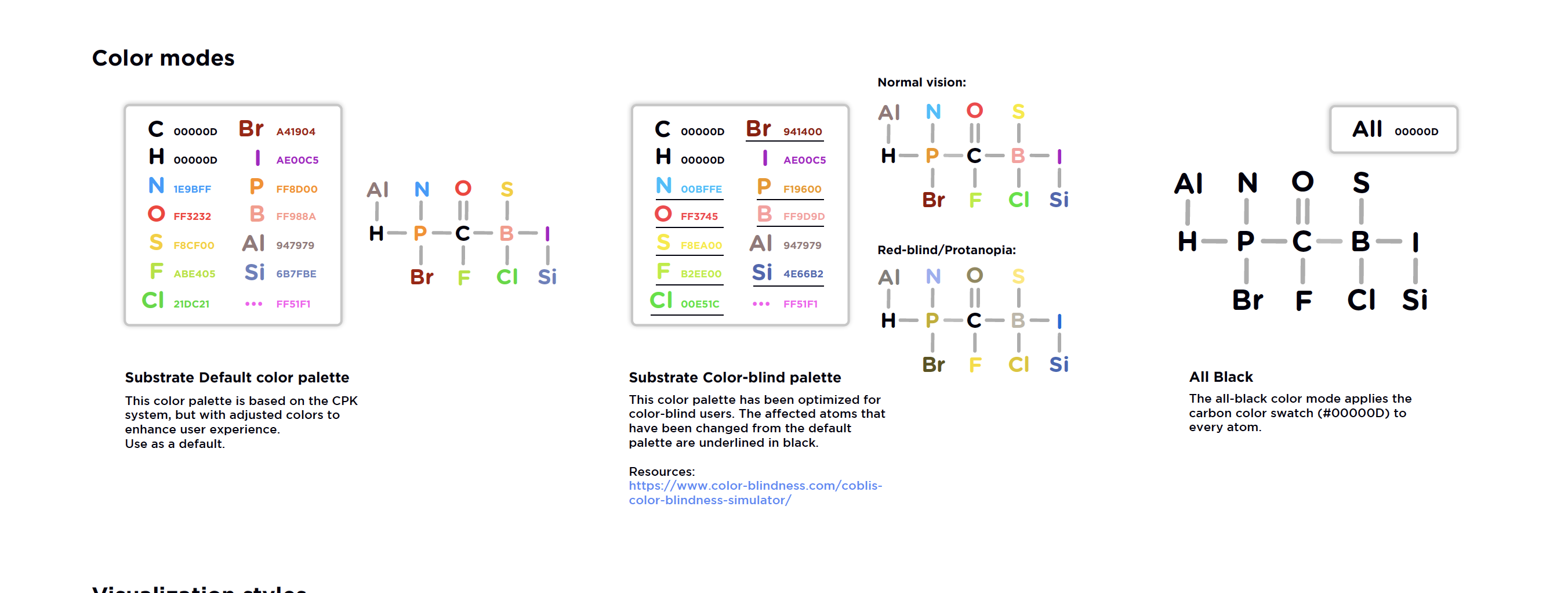
Instead of using the CPK color system, I decided to create one from scratch. Another priority was to design for accessibility, allowing color blind or visually impaired users to feel comfortable using Substrate, as well. These color palettes were tested using Coblis, an online colorblind simulator.
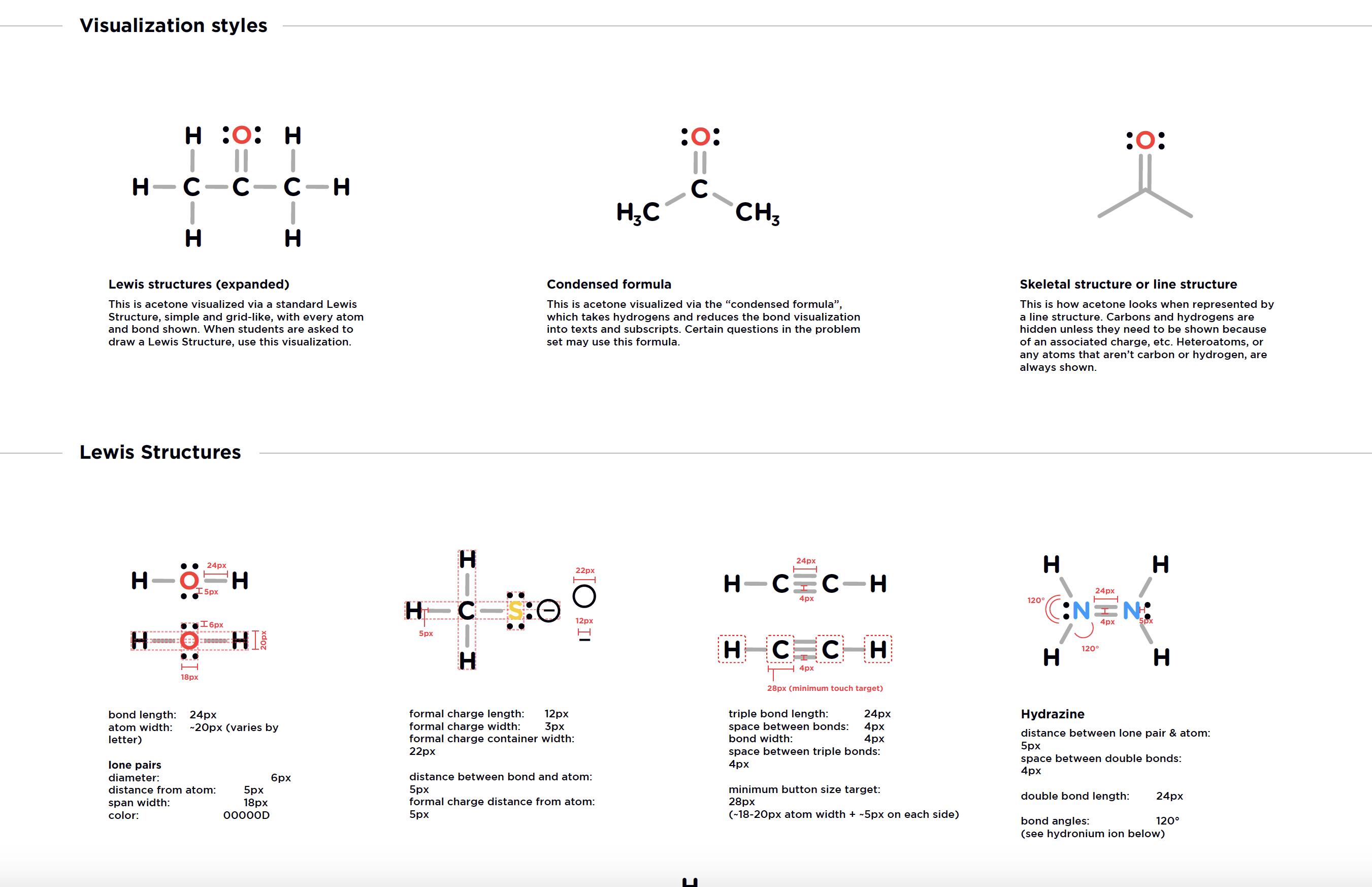
Using ChemDraw and Marvin Sketch basic structure representations as a template, I created a 2D Style Guide and UI Kit using prefabs in Unity.
Below: A section from the 2D Molecular Visualization Style Guide.
Design & Development
NanoString has on-site laboratories where I was able to observe users of the nCounter systems.
I spoke with lab researchers and engineers to better understand their workflows and how they interacted with the instruments.
Key takeaways:
most users were between the ages of 26-44;
wanted to spend less time on the machinechanging reagents & opening the cartridge drawer
were most common taskslab researchers always wore gloves when interacting with the instrument
- need clear and easy way to download their data files

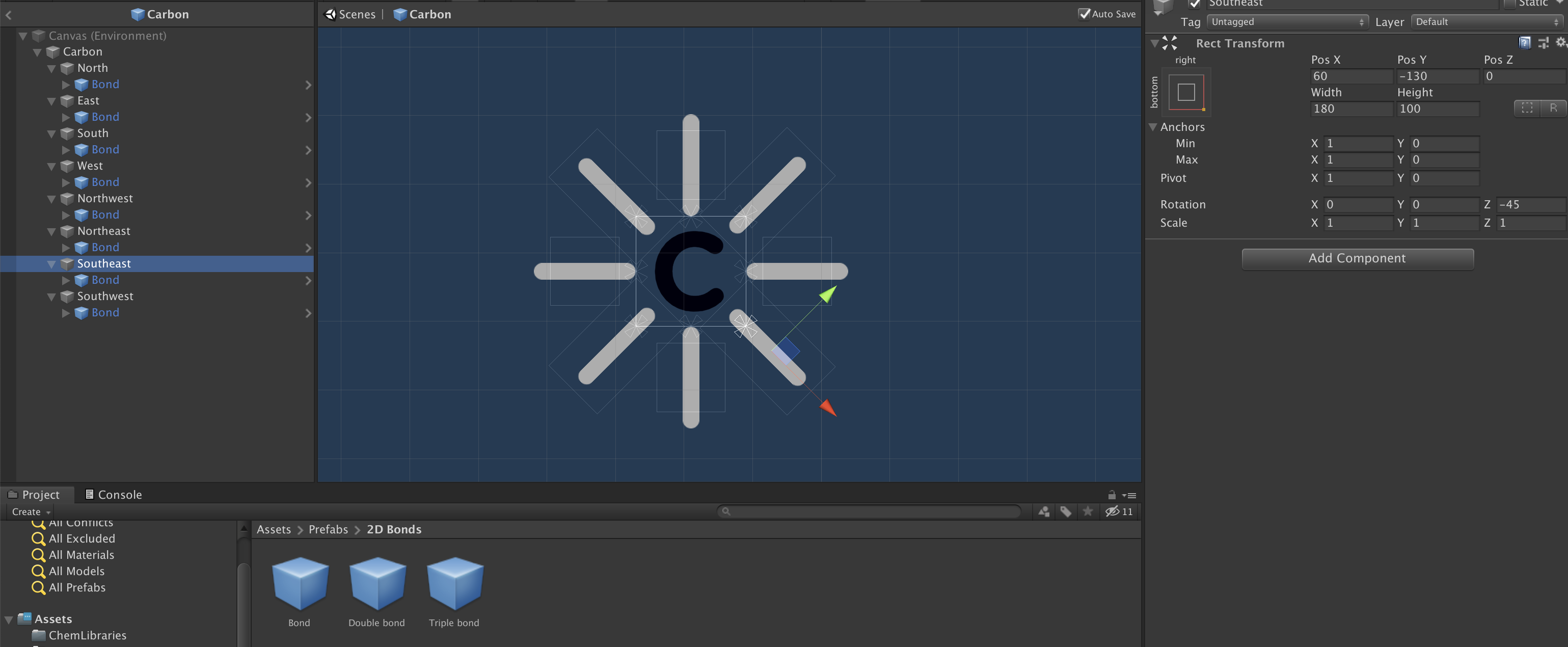
The prefab system was created using a North-South-East-West labelling schema, and was designed to be a placeholder to aid in manually creating and displaying structures until our importer was fully developed. After we developed our baseline 2D chemistry visualization system, it was easy to apply the styles to the importer's automated system.
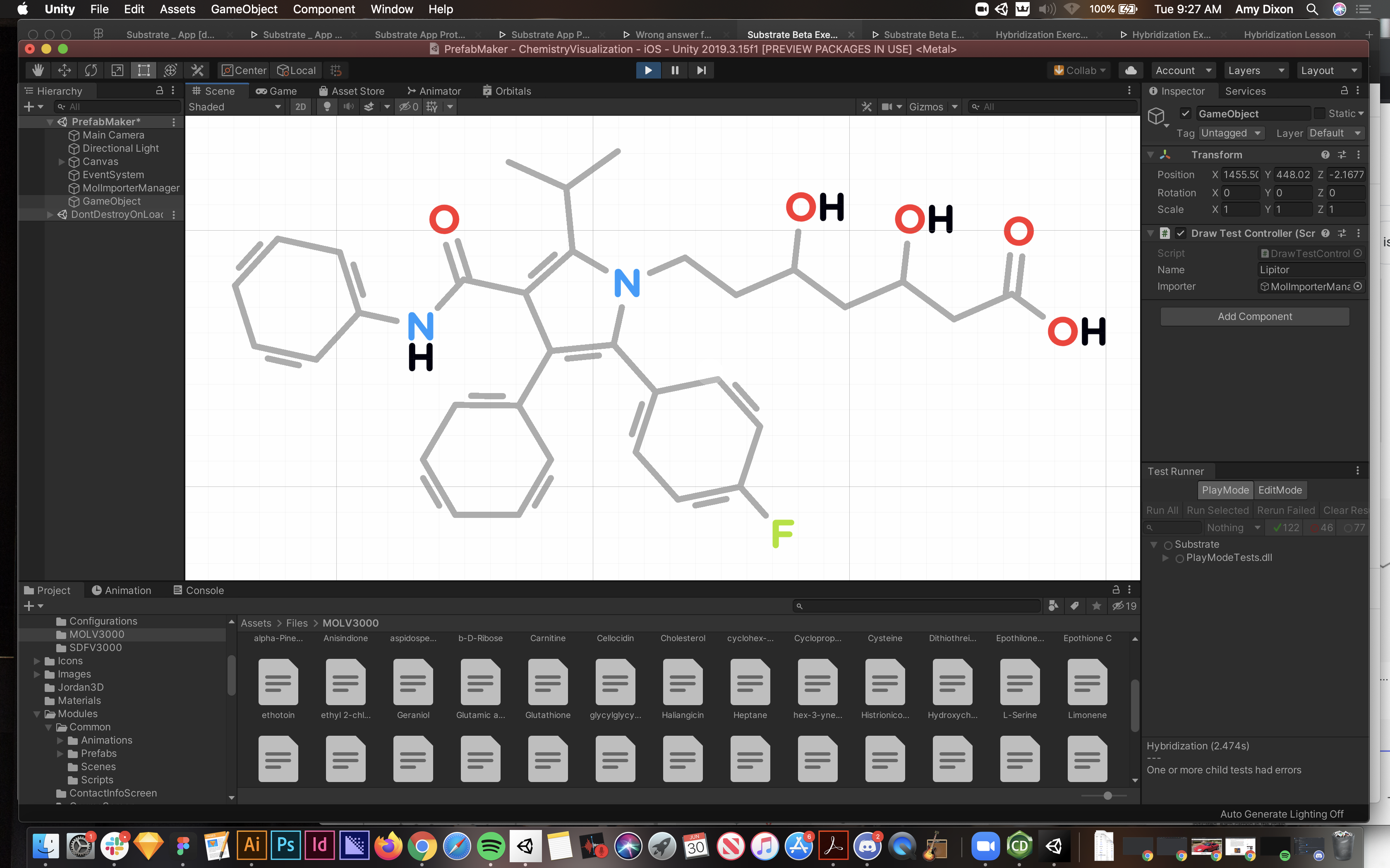
Below: 1) A screenshot of development in Unity; Early atom and bond prefab hierarchy/structure. The atom and bond prefabs were the smallest units, and compounding them created larger chemical structures (imagine a lot of clicking). We stayed with this process briefly until the importer was created. I narrowly averted Carpal Tunnel Syndrome. 2) A screenshot of the importer that automated the process and applied the style from the style guide to the mol files (we were very proud and relieved when our engineering team successfully implemented it).
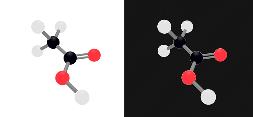
Our 3D visualization needed to complement and remain cohesive enough visually with our 2D system that it was easy to make a connection between the 2D and 3D representation of a given structure. I created a 3D structure in Cinema4D as a style guide for one of our artists, who also worked with us on Mol, to use to create a shader system in Unity.
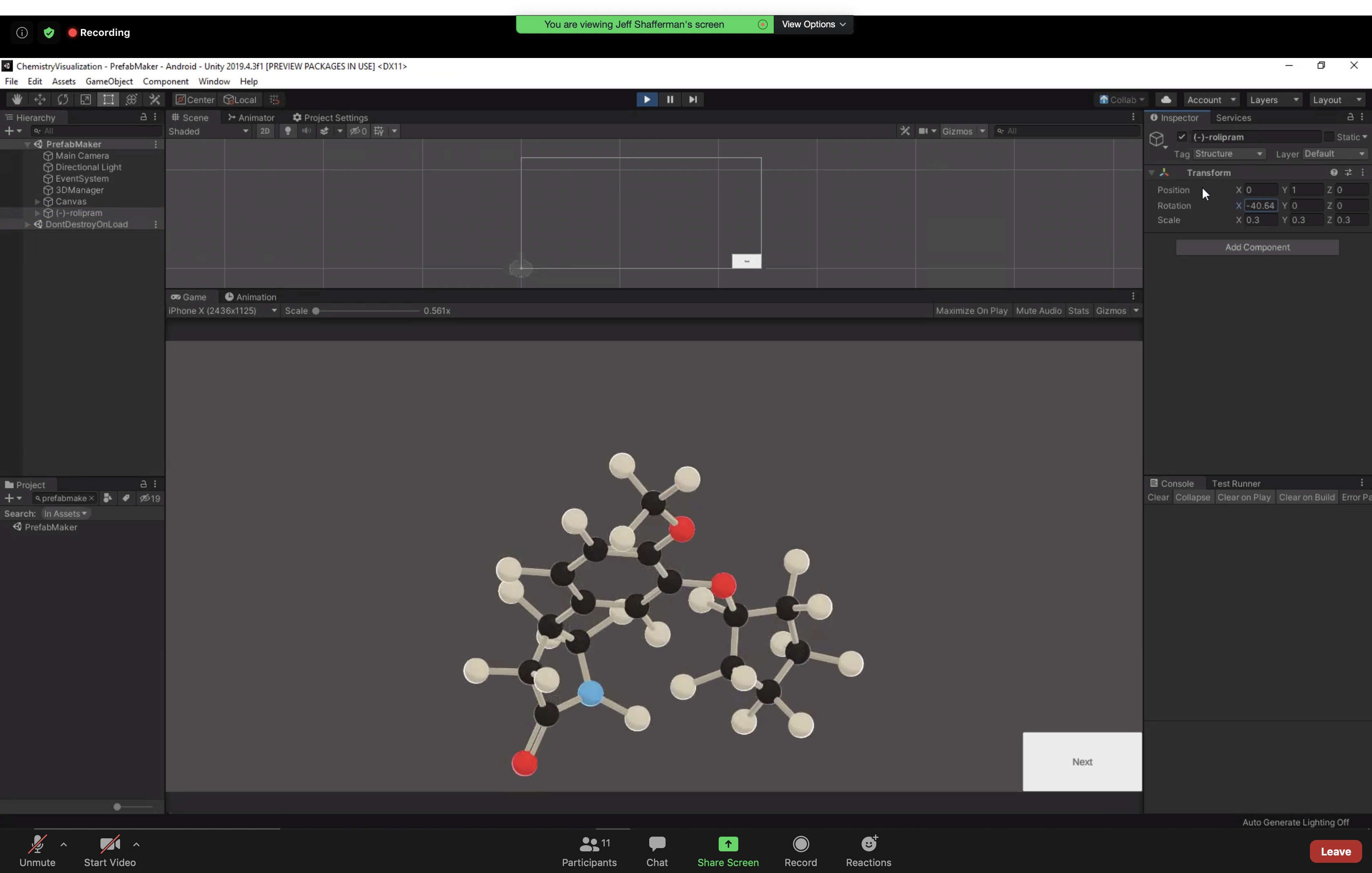
Once the shader system was in place, our engineering team was able to create a 3D importer script that could be toggled on or off so users could switch between 2D and 3D views - directly in the exercise.
We also created a series of 3D molecular orbitals as part of a lesson module on Hybridization, a somewhat difficult topic to visualize in Organic Chemistry. These were similarly first created in Cinema4D and then brought into Unity.
Below: 1) 3D visualization guide for Unity shader creation 2) Screenshot of an early prototype of working 3D visualization in Unity. (thank you, engineering)
The combination of Figma + Unity was a great pipeline for designing and implementing a solid chemistry visualization style to set a strong foundation for our next big feat - Educational content development and exercise design.

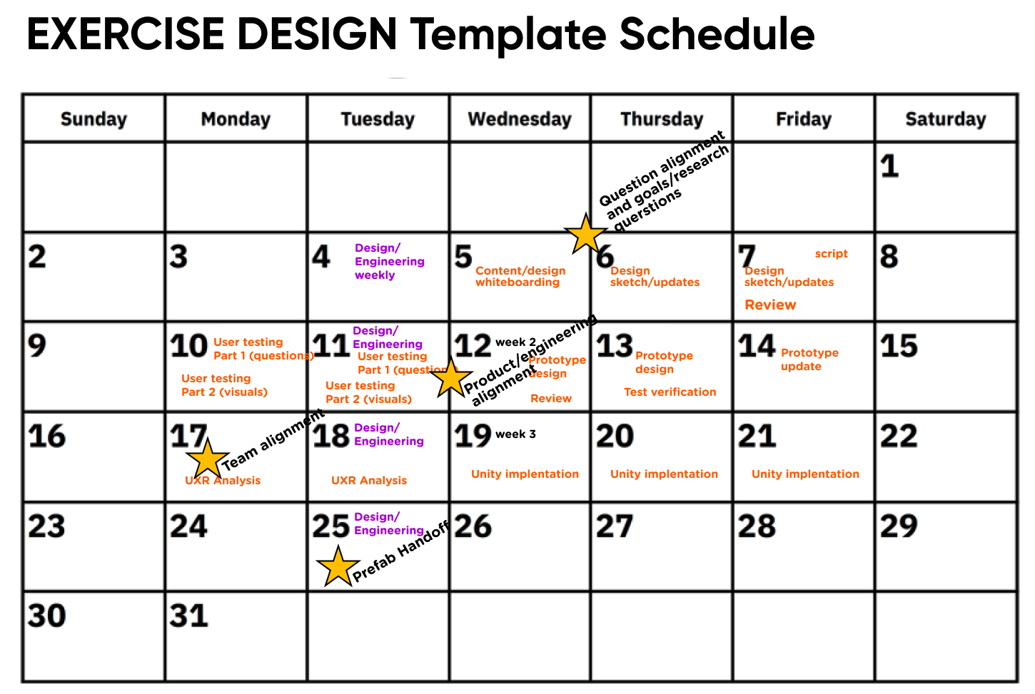
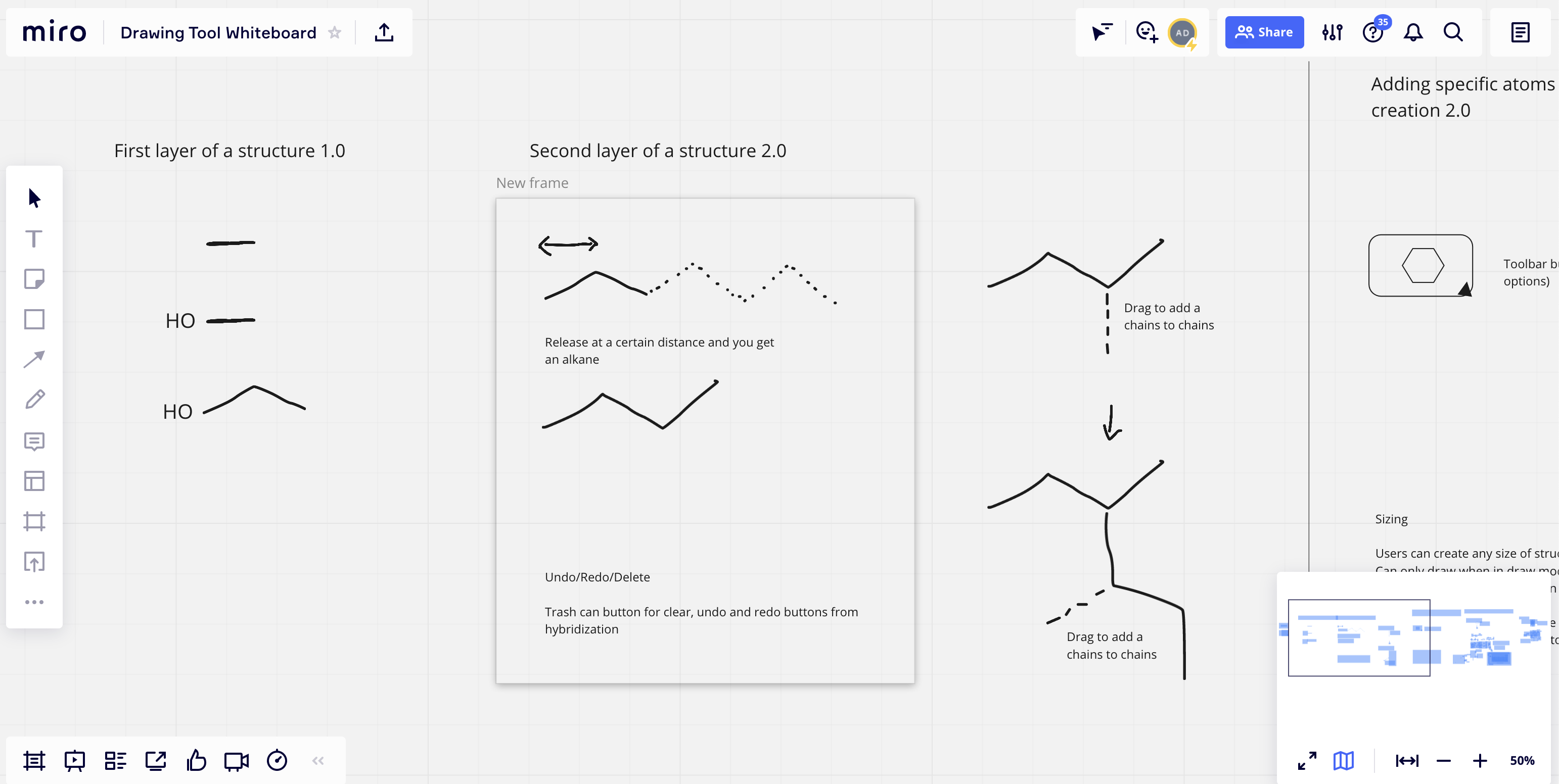
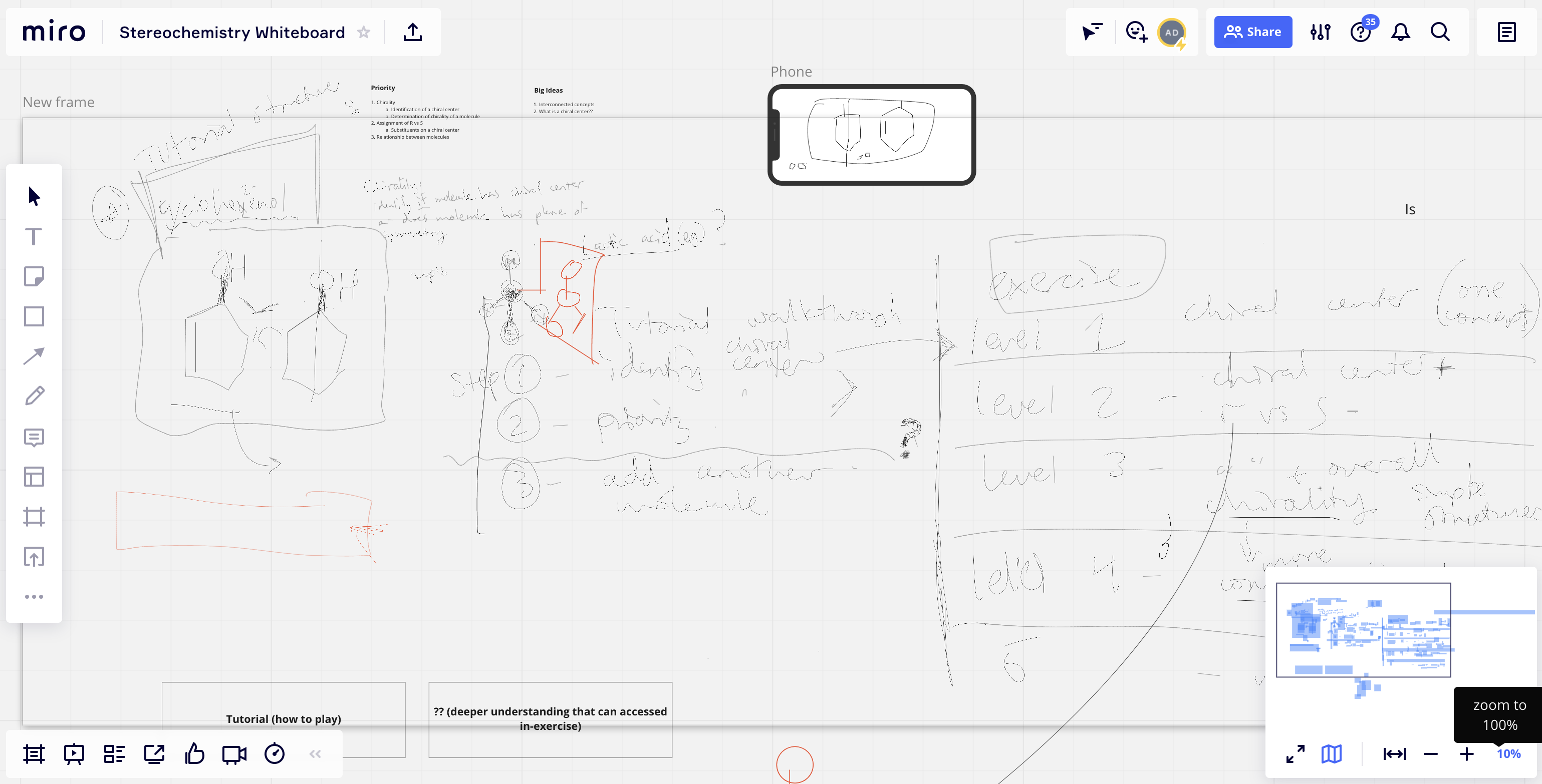
Myself, our chemist, and occasionally our CEO used Miro to conduct whiteboarding sessions together and elevate our problem-solving skills.
Below: Whiteboarding sessions for Drawing and Stereochemistry (the 2nd one was grokable.. to us)
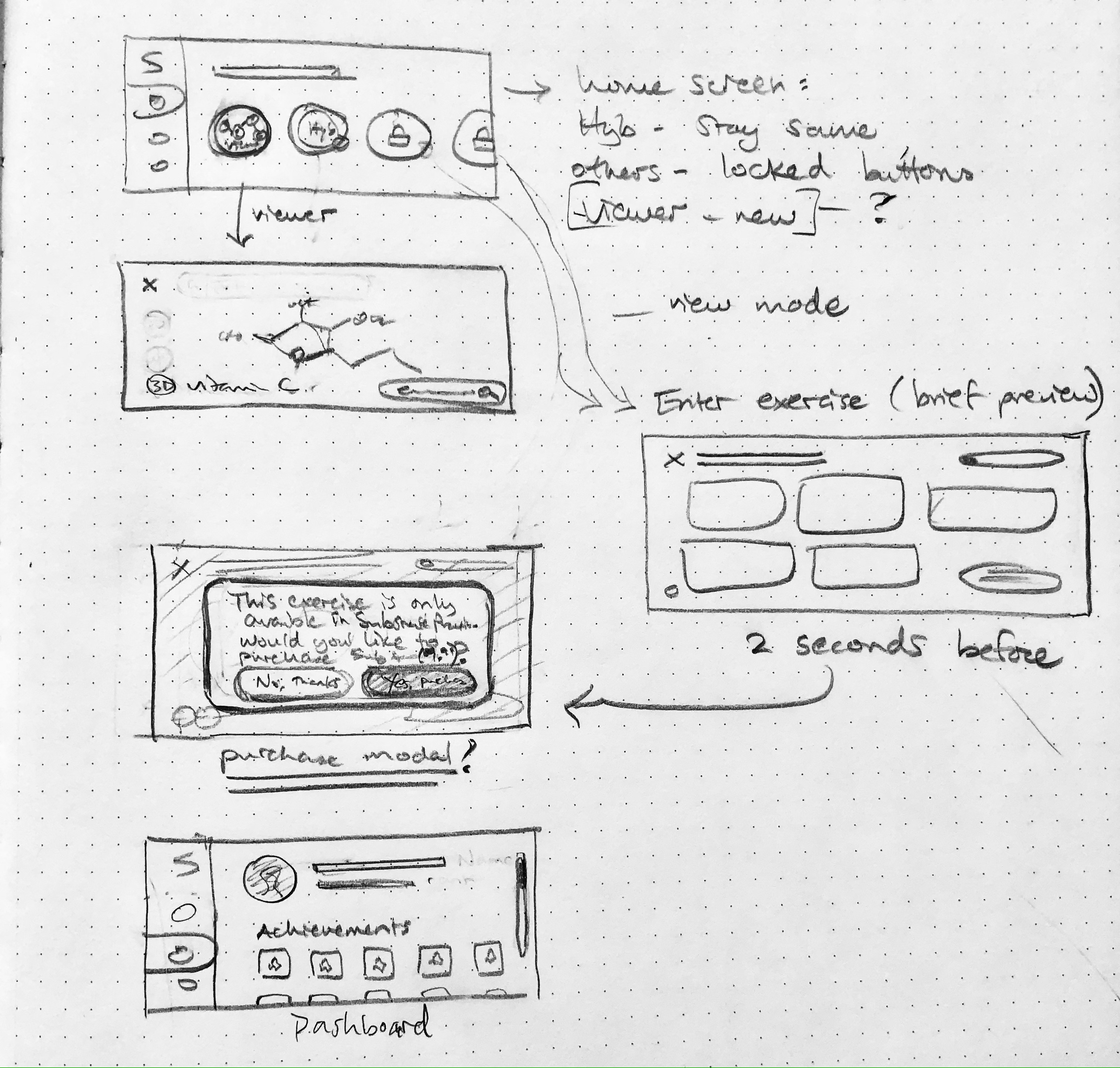
From there, I did pencil sketches of key frames in flows. Depending on the exercise and the potential to develop it in different ways, I might have created 2-3 concepts that were functionally unique.
Below: Sketch for one potential In-App Purchase flow. We ended up doing something slightly different.
After a team review where we aired out our ideas and settled on a direction, I developed first-pass prototypes using Figma.
Below: A screen recording of the Figma prototype used in our Drawing tool UXR sessions
"The assessment showed that the Substrate hybridization exercises helped students gain a better understanding of hybridization. Students in the Substrate group not only performed better than the control group on the hybridization post-quiz, but they felt more confident about hybridization after using the app. Also, these students enjoyed the Substrate app enough to likely recommend it to a friend."
"The assessment showed that the Substrate hybridization exercises helped students gain a better understanding of hybridization. Students in the Substrate group not only performed better than the control group on the hybridization post-quiz, but they felt more confident about hybridization after using the app. Also, these students enjoyed the Substrate app enough to likely recommend it to a friend."
Find me on