CASE STUDY
CASE STUDY
Better Learning Through Chemistry
Better Learning Through Chemistry
If you’ve ever taken an Organic Chemistry class, you know how difficult it can be to develop a complete understanding of the subject.
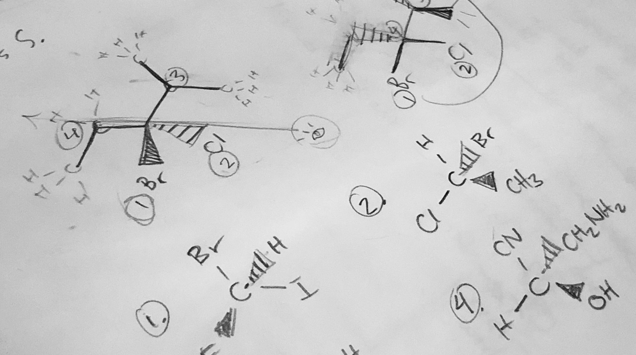
When I took the class several years back, I drew stick figures of molecules to help me learn core concepts and chemical structures, with dashes and wedges for days. This can be helpful in learning surface-level relationships of the atoms and molecules, but it provides very abstract, flat representations of much more three-dimensional (3D) structures.
Defining the problem
The approach to teaching chemistry has changed little in the last 50 years. During a standard Organic Chemistry I course, students often require supplemental instruction or office hours help. It's not uncommon to invest many hours per week outside of class and still get a C in the course.
Some chemistry instructors encourage the use of molecular model kits to help students better understand the 3D nature of molecules, but they're time-consuming and don't provide real-time feedback.
After interviewing more than 100 STEM students and 18 college chemistry instructors across the US, the team at Substrate Games identified a universal need for a different teaching approach: one that supported the concept of incorporating 3D visualization and interactivity.
Defining the problem
Organic molecules are highly complex, 3D forms whose conformations affect their properties. Some chemistry instructors encourage the use of molecular model kits to help students better understand the 3D nature of molecular structures. These provide a tactile way to deepen understanding; however, kits can be expensive, are time-consuming, and don't provide real-time feedback.
During a standard Organic Chemistry I course, even after course lectures and lab sessions, students often require supplemental instruction or office hours help. It's not uncommon to invest many hours per week outside of class and still get a C in the course.
The approach to teaching chemistry has changed very little in the last 50 years. After interviewing more than 100 STEM students and 18 college chemistry instructors across the US, we identified a universal need for a different teaching approach: one that supported the concept of incorporating 3D visualization and interactivity.
We set out to create a scalable & adaptive game-based mobile learning platform, prioritizing engagement and accessibility, to improve students' understanding of fundamental concepts in science.
Mol is a mobile learning app for college-level students studying organic chemistry. Focusing on core concepts in organic chemistry I, Mol enables 3D visualization and interaction with molecules sourced from the PubChem database and is designed to be used whenever a better understanding of chemistry is desired.
The Before
I was brought on as Art Director for Substrate Games to help the team redesign Mol. When I started, Mol had already been in development for 4 months. At the time I began working, Mol consisted of a welcome screen, a dashboard, and an unfinished exercise, Chiral Centers. The team was currently conducting user research, allowing a small group of students and invite-only users to preview Mol on iOS and Android. The early version of the app showed potential yet ample room for improvement.
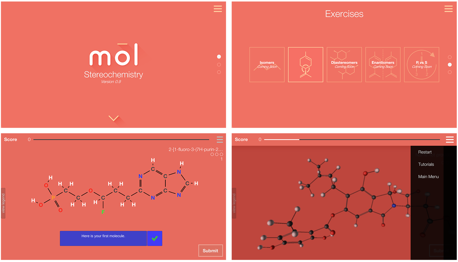
Below are some screenshots from Mol, version 1.0.
The Before
I started researching examples of other instrument UIs, as well as studying existing nCounter user interfaces.
The images below are screenshots of the nCounter Analysis System UI. My first thought was that the visual design left something to be desired. The information architecture needed a lift, as well.
Below are some screenshots from Mol, v 1.0
Understanding users
My team conducted several types of user testing before and during development of Mol Chemistry. Initial user interviews were done in Iowa, with organic chemistry students and instructors from Drake University, Iowa State University, and Des Moines Area Community College (DMACC) to understand user needs and pain-points.
Those interviewed were students enrolled in Organic Chemistry I courses. Most were on track to develop careers in medicine, pharmacy, or a similar field. Reviewing information from 14 user interviews (involving both students and instructors), a list of user needs was identified.
User need
– intuitive exercises, focusing on two difficult concepts (stereoisomers and reaction mechanisms), that maximize learning potential and correspond to course material
– ability to use anywhere
Goal: design a mobile app for iOS and Android with a total of 5 exercises, focusing on molecular interaction, covering fundamental organic chemistry concepts, especially stereoisomers, that reinforce understanding and are tailored to different learning styles
User need
– the ability to display procedurally generated, accurate molecular data to assist in a lab setting (showing chemical properties/safety information) and general study
Goal: create a molecule viewer with a sandbox component that allows students to search for molecules using data from the PubChem database
User need
– interaction with molecules and the ability to switch between 3D/2D visualization, with 2D visualization acting as a stepping stone from the class material to 3D models
– requisite information to help solve problems (atom ID key, definitions, etc)
Goal: create simple, intuitive, and engaging UI that makes use of interaction design to convey meaning; should enable switching between different visualization modes and include all relevant information to solve problems within each exercise
User need
– ability to sync content with course dashboard
Goal: develop a dashboard that displays user progress for each exercise, with functionality to connect to social media or course software
Understanding
users
Our target users are college students enrolled in Organic Chemistry I courses, putting them primarily between the ages of 17-21. Most are on track to develop careers in science, medicine, or education. Reviewing information from user interviews, we developed a list of user needs and their corresponding goals.
User need
– intuitive exercises that maximize learning potential and correspond to course material
– ability to use anywhere
Goal: design a mobile app for iOS and Android with a total of 5 exercises, focusing on molecular interaction (source: PubChem database), covering fundamental organic chemistry concepts that reinforce understanding and are tailored to different learning styles
User need
– interaction with molecules three-dimensionally and ability to switch between 3D/2D visualization
– requisite information to help solve problems (atom ID key, definitions, etc)
Goal: create simple, intuitive, and engaging UI that makes use of interaction design to convey meaning; should enable switching between different visualization modes and include all relevant information to solve problems within each exercise
User need
– ability to sync content with course dashboard
Goal: develop a dashboard that displays user progress for each exercise, with functionality to connect to social media or course software
User need
– content that retains user interest and encourages exploration; integrated tutorials
Goal: create intuitive tutorials that help you learn as you play; include sandbox component where users can search for molecules and explore their structures/ properties; create a list of achievements users can unlock as they advance

Design & Development
We encountered several design challenges while develoing Mol. One of the first was deciding on primary and secondary colors that really complemented the content while not clashing with it. We make use of the CPK color system to identify atoms, and that uses a lot of fundamental colors. I wanted to use something that wasn't already being used within the atomic identification system that felt scientific, yet was also edgy and fun.
Using Google's material design language, I created several brand styles using different color swatches. The team and I agreed that the version consisting of a primary gray, accented by a secondary bright turqoise, mixed with a rich red for the logo and punctuated UI elements was the best choice.
Design & Development
NanoString has on-site laboratories where I was able to observe users of the nCounter systems.
I spoke with lab researchers and engineers to better understand their workflows and how they interacted with the instruments.
Key takeaways:
most users were between the ages of 26-44;
wanted to spend less time on the machinechanging reagents & opening the cartridge drawer
were most common taskslab researchers always wore gloves when interacting with the instrument
- need clear and easy way to download their data files
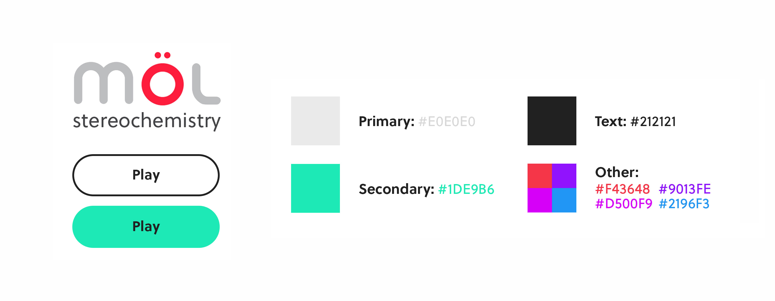
The other colors in the mix are used to designate different exercises in the dashboard and areas where instructional color is useful.
Alongside branding, art direction, and UI design, much of my work with Mol involved designing learning exercises. Collaborating with our lead developer, I co-designed the instructional design of the Functional Groups, Isomers, and R vs S exercises. The challenge was figuring out how to design something fun and interactive, enabling users to retain the maximum amount of information while not overwhelming them.
All animations and screens shown from here onward are those I designed and created as detailed mockups using Sketch/After Effects. (Below: Functional Groups exercise prototype)
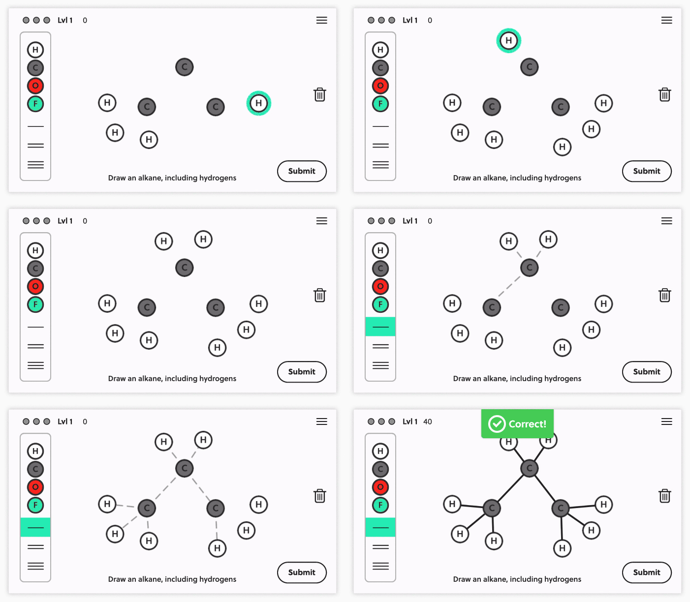
Chiral Centers asks users to identify all chiral centers in a given molecule. The exercise gets progressively harder as you go along. Functional Groups & Isomers ask users to draw molecules using atoms and bonds. It provides freestyle interaction and the opportunity to be intentional about what you're constructing, while still having the advantage of knowing which pieces to use.
R vs S exercise prototype
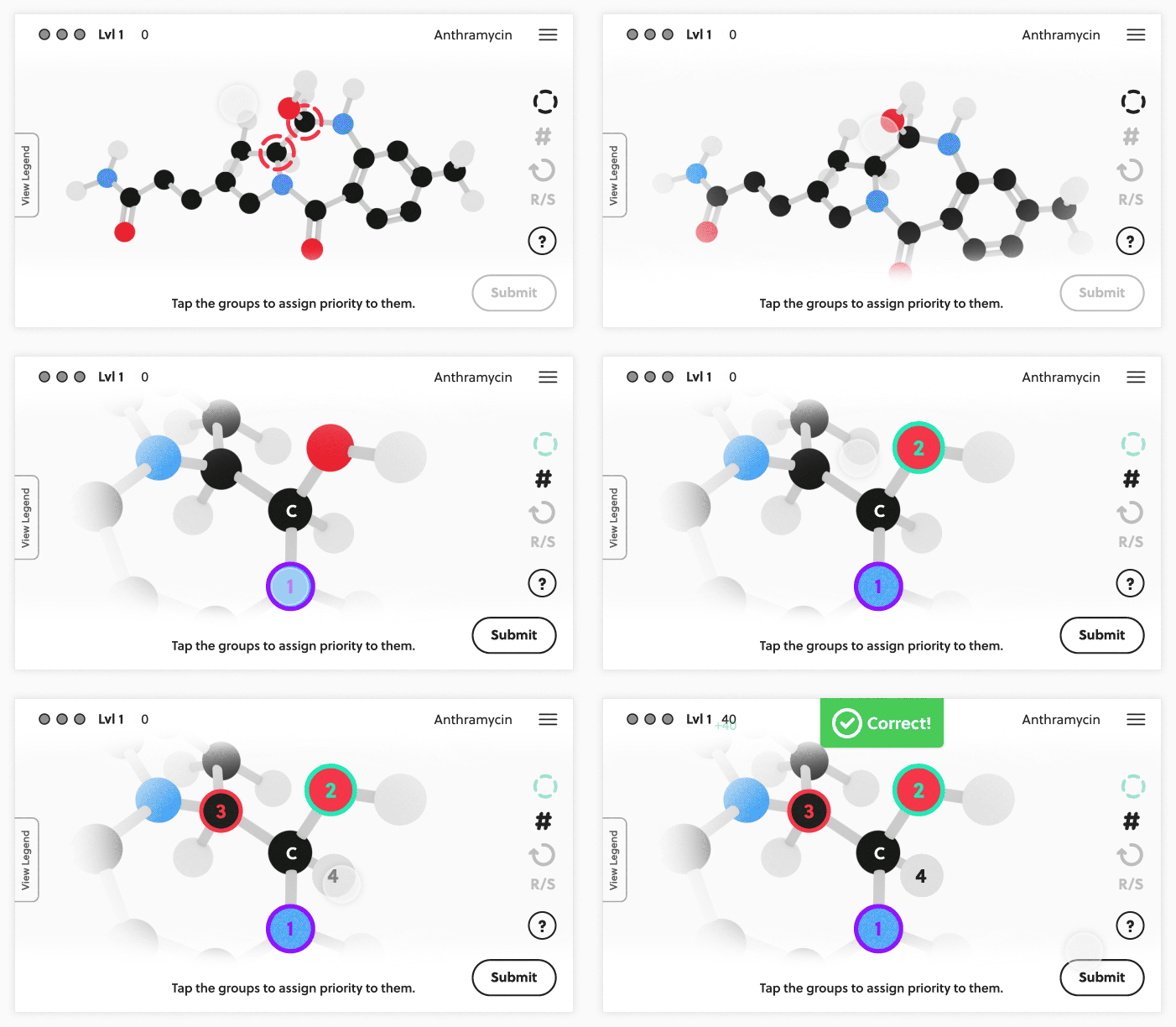
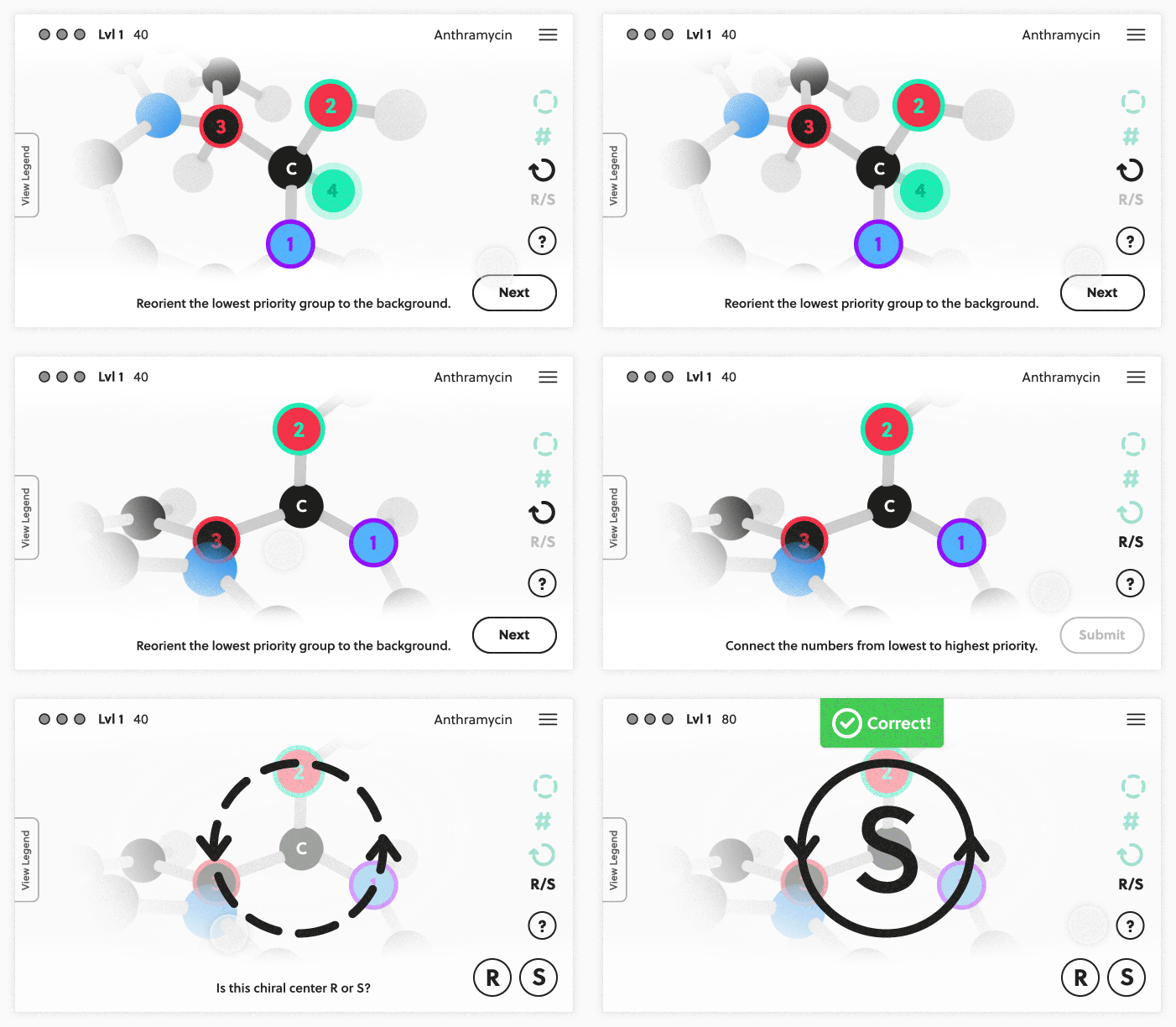
Since the nature of solving some organic chemistry problems requires multiple steps, the R vs S exercise (shown above) uses a step-wise, prompted approach.
A collection of screens created using Sketch & InVision.

With the help of our chemistry consultant, an educator at Drake University, we were able to include some of the toughest organic chemistry problems in our exercises.
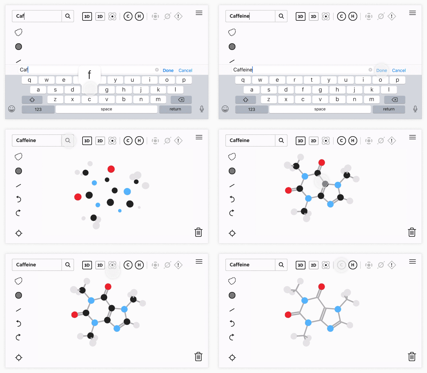
Another critical component to Mol is the Mol Viewer, an exercise that allows users to pull any molecule from the PubChem database, by searching for its common or IUPAC name, and interacting with it in 2D or 3D while exploring its properties.
Interaction design prototype for the Mol Viewer
Method/Results
We developed version 2.0 of Mol with a team of 5 people in an AGILE environment. Everyone attended daily stand-up meetings to discuss bugs, progress, problems, and give a general report of what we were working on. I held design meetings once to twice a week to collect feedback and bounce ideas off the team.
For exercise design, I met with our lead developer in-person over the course of several months to hash out a plan of action and discuss/brainstorm UX solutions. I collaborated with the founder of the company to create a flat molecular visualization aesthetic that fit the overall look and feel we were aiming to achieve. We also worked on the interaction design of the molecules. I created animations using After Effects to spec the interaction design of the UI.
Top: Main screen to exercises user flow;
Bottom: Molecular visualization interaction in Chiral Centers
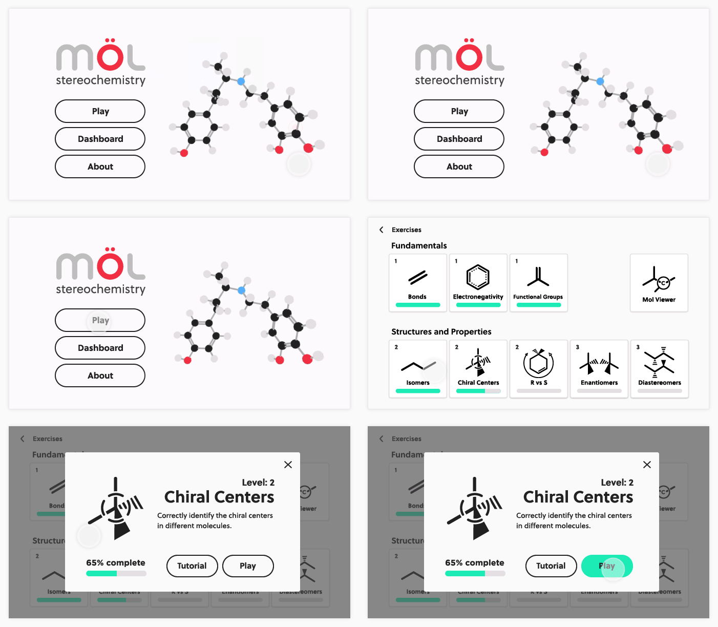
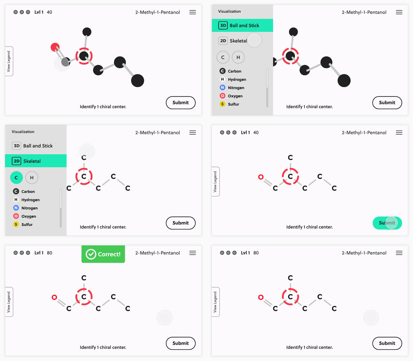
Version 1.2 of Mol Chemistry was released in June 2018 with an improved version of Chiral Centers and two new exercsises: R vs S, and Stereoisomers.
To measure learning outcomes and usability, an assessment was done with two Des Moines Area Community College organic chemistry classes with a total population size of twenty-four. In both assessment sessions, a sequence of pre-test, app demo, post-test, and a follow up survey were used.
The first group of students, on average, scored 7.3 points out of a possible 10 when testing their baseline knowledge. After the students had a chance to interact with the Mol Chemistry app, they scored an average of 8.1 points out of 10, a full letter-grade improvement. A similar outcome of 10% improvement, on average, presented in the second group.
In Retrospect
One of my biggest passions is using my expertise and creativity to build products that bring others joy and enable them to improve a skill or learn something new. It was extremely rewarding to be part of a small team working on such a unique problem with the potential to really impact students' ability to better conceptualize and learn organic chemistry.
Mol was made possible through funding from the NIH. Going forward, I'd like to see more chemistry educators/consultants involved, as well as more ongoing user testing. The students and educators were integral to the successful work we did, and it would be powerful to leverage their knowledge in a greater capacity.
Find me on