CASE STUDY
CASE STUDY
Quicker Workflows
Quicker Workflows
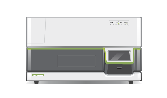
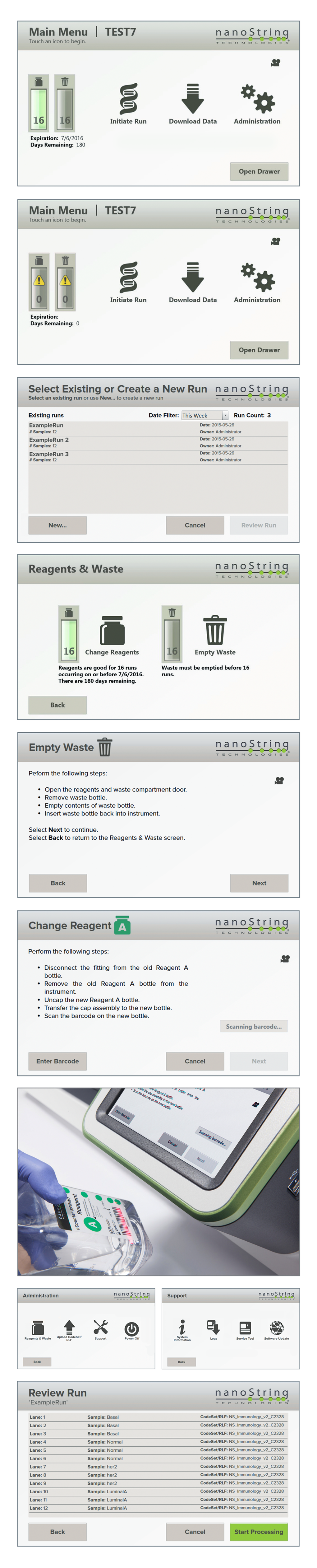
While at NanoString Technologies, I lead design on the user interface for the nCounter SPRINT Profiler, the 3rd generation of nCounter systems. The systems are platforms that help lab researchers measure multiple substances (such as DNA, RNA, and protein) in their tissue samples.
The previous generation, the nCounter Analysis System, includes a touchscreen interface that allows users to perform several tasks such as measuring biological samples, downloading data, and uploading files. The nCounter SPRINT is similar, with a slightly modified purpose and workflow.
Previous versions
I started researching examples of other instrument UIs, as well as studying existing nCounter user interfaces.
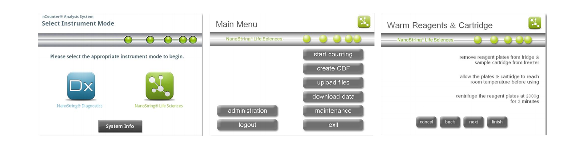
The images below are screenshots of the 2nd generation nCounter Analysis System UI. My first thought was that the visual design left something to be desired. The information architecture needed a lift, as well.
Previous versions
I started researching examples of other instrument UIs, as well as studying existing nCounter user interfaces.
The images below are screenshots of the nCounter Analysis System UI. My first thought was that the visual design left something to be desired. The information architecture needed a lift, as well.
Opportunities for improvement:
· Reworked information architecture
· Restructured layout
· Limited use of gradients and layer effects
· Button redesign: Bringing in icons to help recognize
at-a-glance actions
Defining goals
Many other instruments on the market require intensive hands-on time and sample preparation. The value of the nCounter SPRINT is that researchers can:
- analyze a higher number of samples simultaneously
- work faster and more simply
- conduct individual experiments
After meeting with the product manager and several other stakeholders, our idea of improving the next generation’s interface/user experience boiled down to this question:
“How can we develop a more intuitive, graphical user interface that reduces visual noise, provides an at-a-glance overview of top-priority information, and grants access to the actions most important to the user and their workflow?”
“How can we develop a more intuitive, simple, graphical user interface provides an at-a-glance overview of top-priority information, and grants access to the actions most important to the user and their workflow?”

Understanding the users
NanoString has on-site laboratories where I was able to observe users of the nCounter systems.
I spoke with lab researchers and engineers to better understand their workflows and how they interacted with the instruments.
Key takeaways:
Most users were between the ages of 26-44;
wanted to spend less time on the machineChanging reagents & opening the cartridge drawer
were their most common tasksLab researchers always wore gloves when interacting with the instrument
- Needed a clear and easy way to download their data files
Understanding the users
NanoString has on-site laboratories where I was able to observe users of the nCounter systems.
I spoke with lab researchers and engineers to better understand their workflows and how they interacted with the instruments.
Key takeaways:
most users were between the ages of 26-44;
wanted to spend less time on the machinechanging reagents & opening the cartridge drawer
were most common taskslab researchers always wore gloves when interacting with the instrument
- need clear and easy way to download their data files
Design
I put together some rough concepts using post-its. This made it easy to adjust the positioning of elements to see at a high-level what worked and what didn’t.
Design
I put together some rough concepts using post-its. This made it easy to adjust the positioning of elements to see at a high-level what worked and what didn’t.
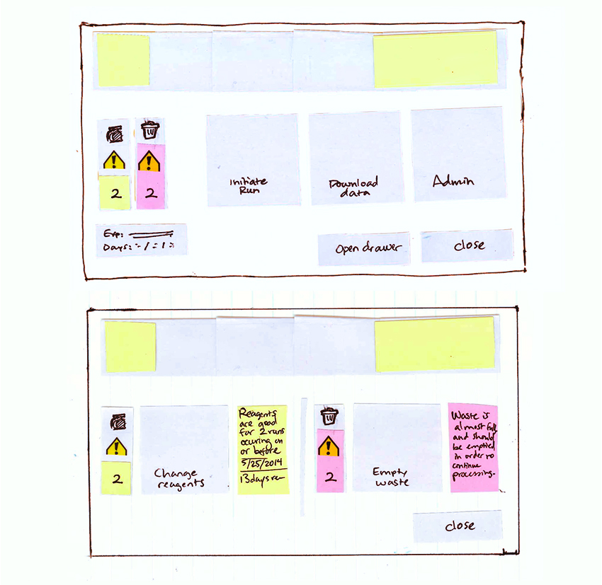
post-its make it possible
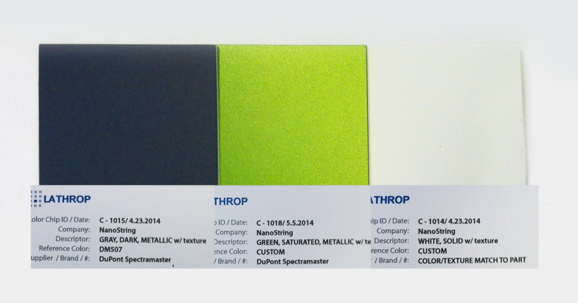
I also obtained official color swatches to be sure I could have a quick visual reference for the body of the instrument. Previous instrument color was not harmonious with the user interface, and I wanted to avoid making that mistake.
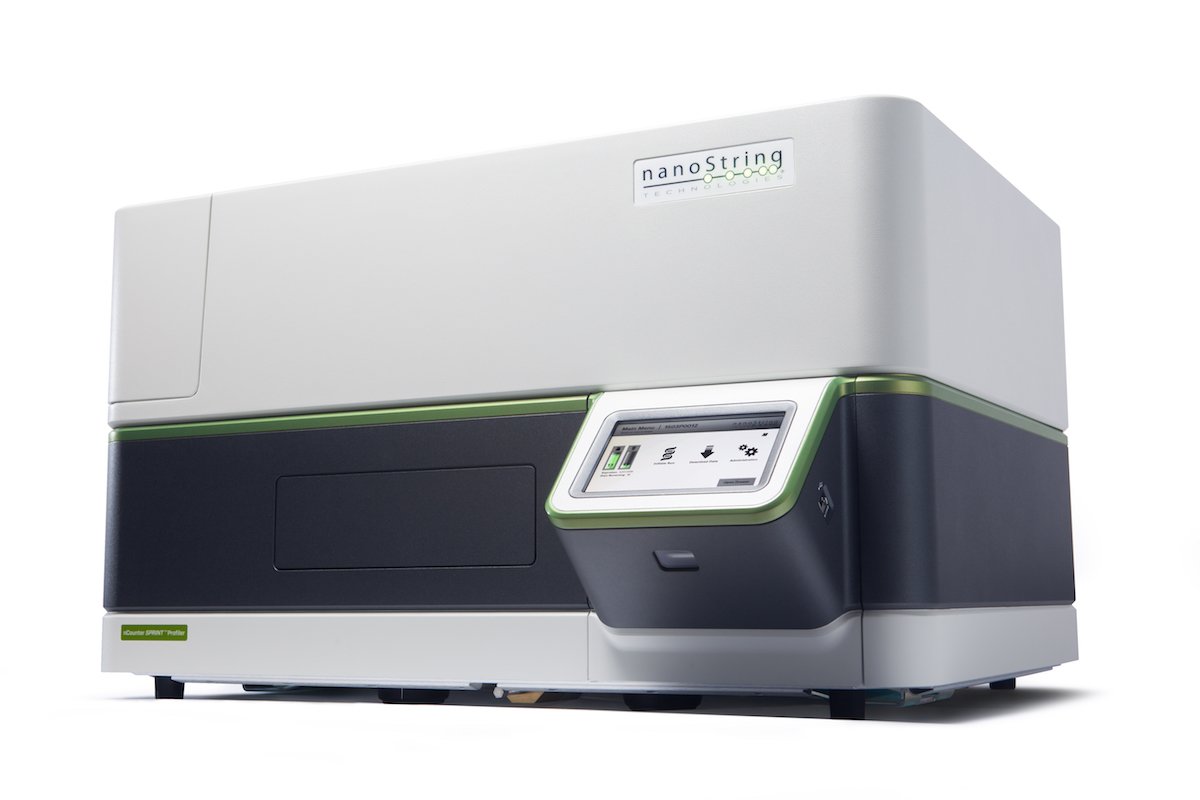
In addition to the UX Design of the instrument and web app, I art directed a photoshoot for the launch of the new instruments using pencil sketches as references for all of the shots we needed. Below are the final images and designs, which came about as a result of a lot of designer-developer communication and testing in-house.
Instrument GUI
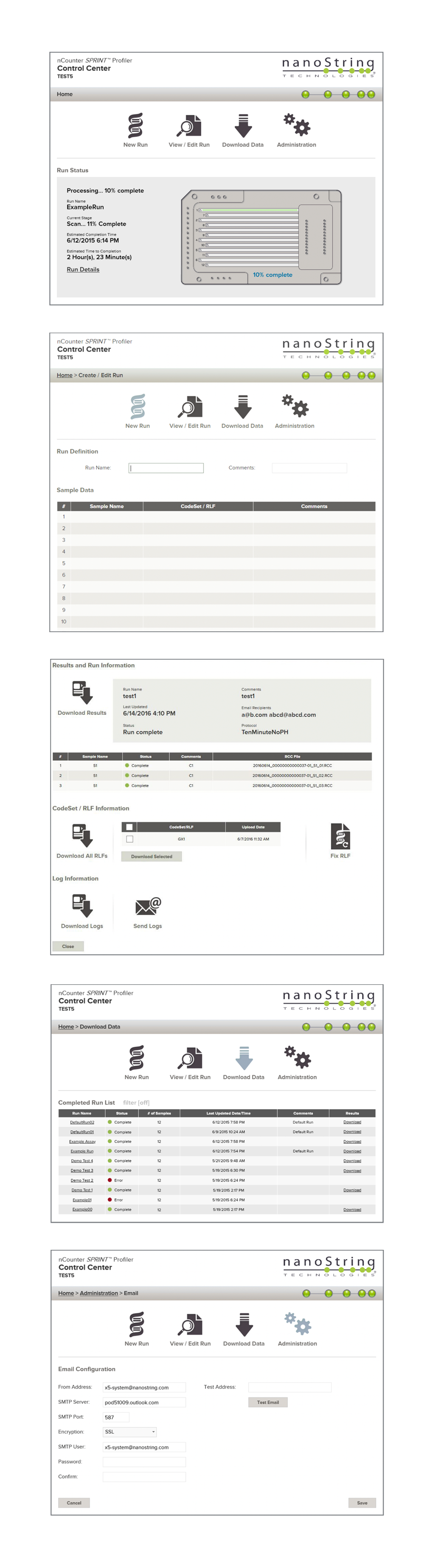
Web Application
Web App
Watch the video to get a sense of how the final product looks, feels, and functions in action.
This was a fantastic project that I'm grateful to have had the opportunity to work on, working with an amazing team at NanoString. I'm proud that we were able to deliver a product that enabled researchers to work faster and more efficiently than previous generations of the nCounter product, all while looking sharp and functioning smoothly.