CASE STUDY (WIP)
CASE STUDY
Krikey
Krikey is a metaverse gaming app where you can create avatars, play games, and compete with friends. It's pretty cool. It's also one of the most popular AR apps in India and continuing to grow its user base.
Krikey
Krikey is a metaverse gaming app where you can create avatars, play games, and compete with friends. It's pretty cool. It's also one of the most popular AR apps in India and continuing to grow its user base.
Design System
The main issue I noticed with the Krikey app was an inconsistency in UI elements and a clunky user experience in many areas. The design team was also creating very static screens and not any interactive prototypes, on top of that having to export assets from Sketch to InVision for the engineering teams. We quickly made the switch over to Figma soon after I joined the team, and I was able to mentor much of the team about how to prototype in Figma.
Figma made it easy to have design jams, quick collaborations, and create a design system that could be mirrored using prefab variants in Unity. It also made our developer handoff run much more smoothly since the engineers could download the assets themselves and view prototypes via shared links.
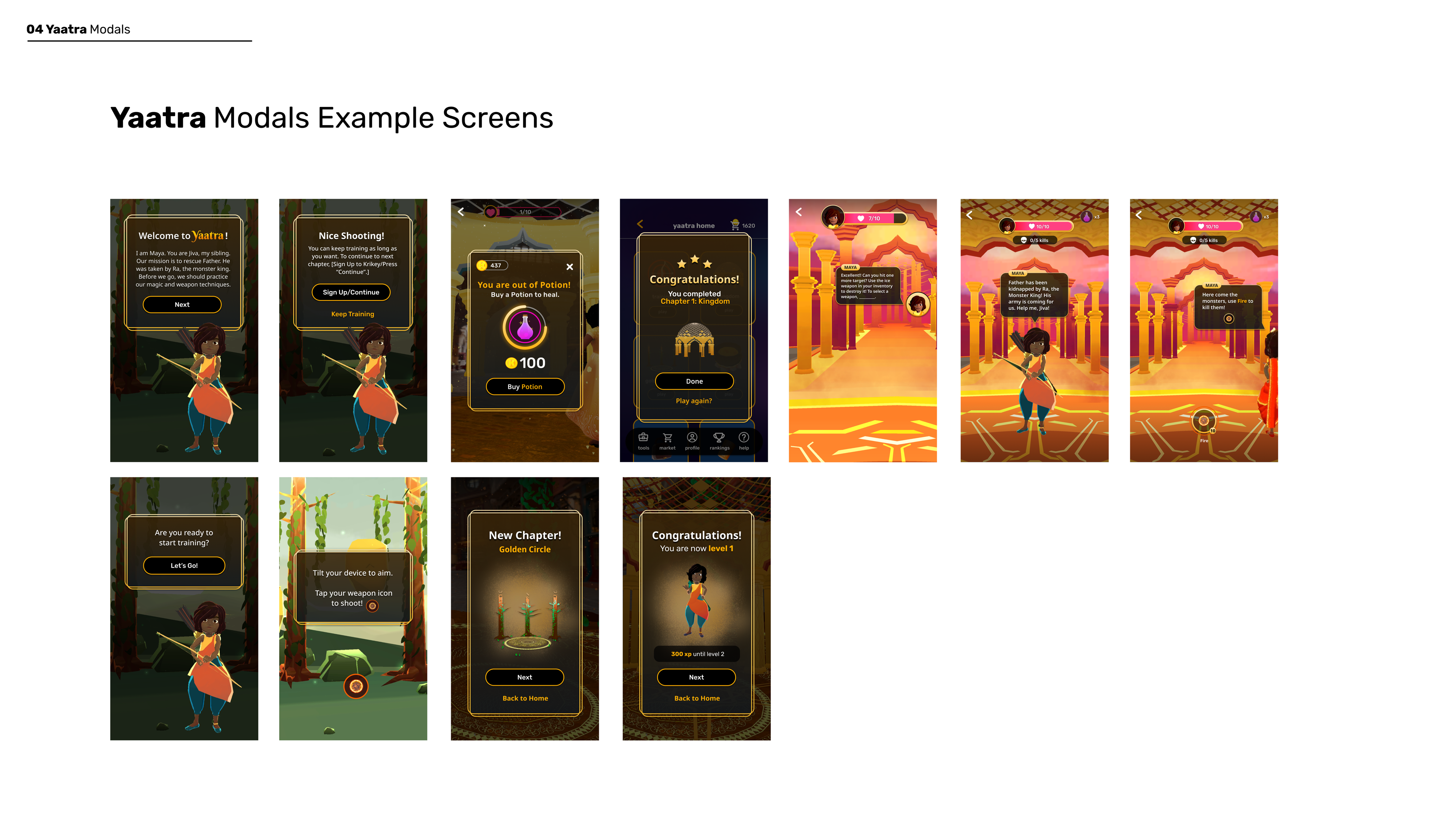
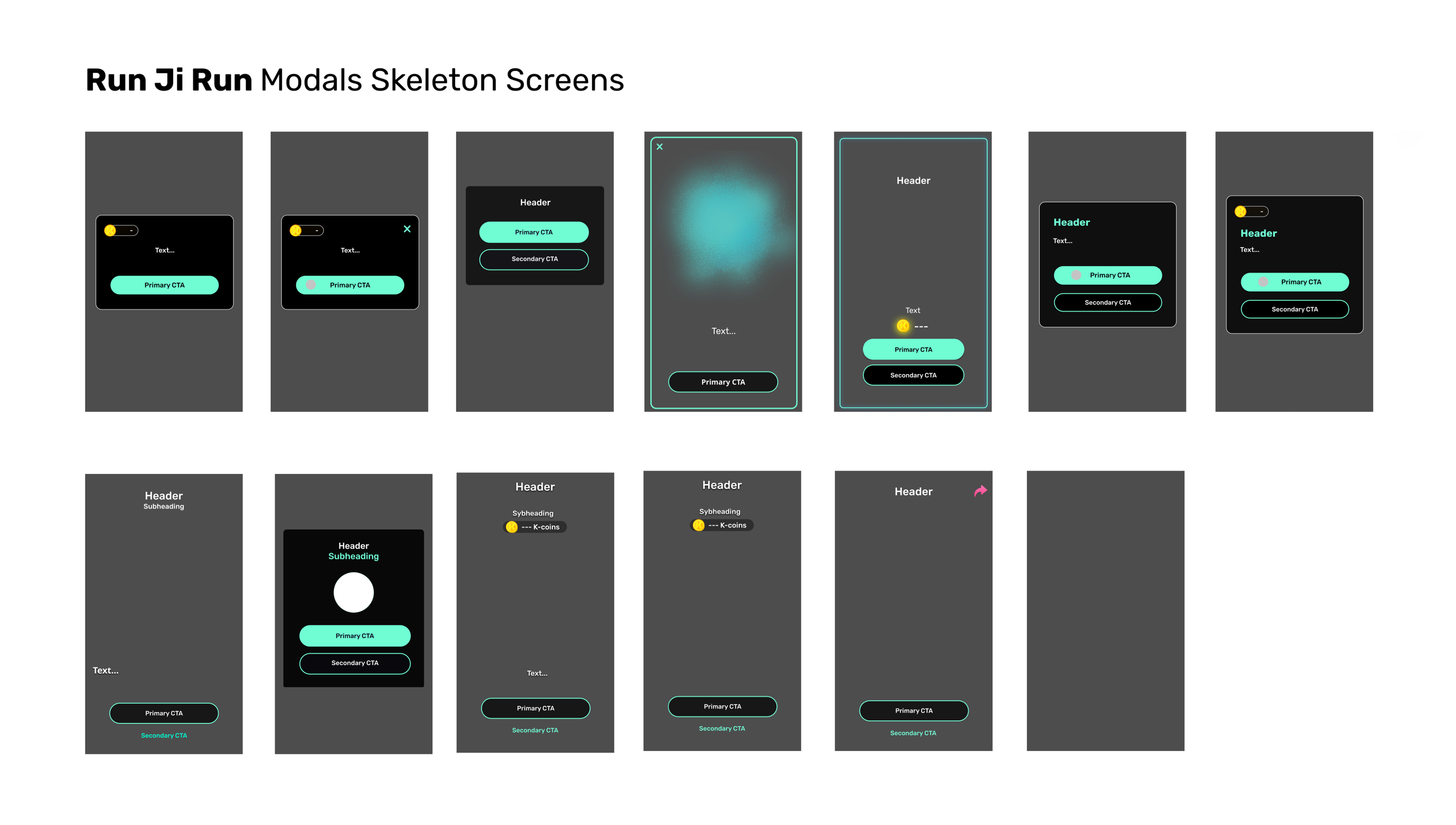
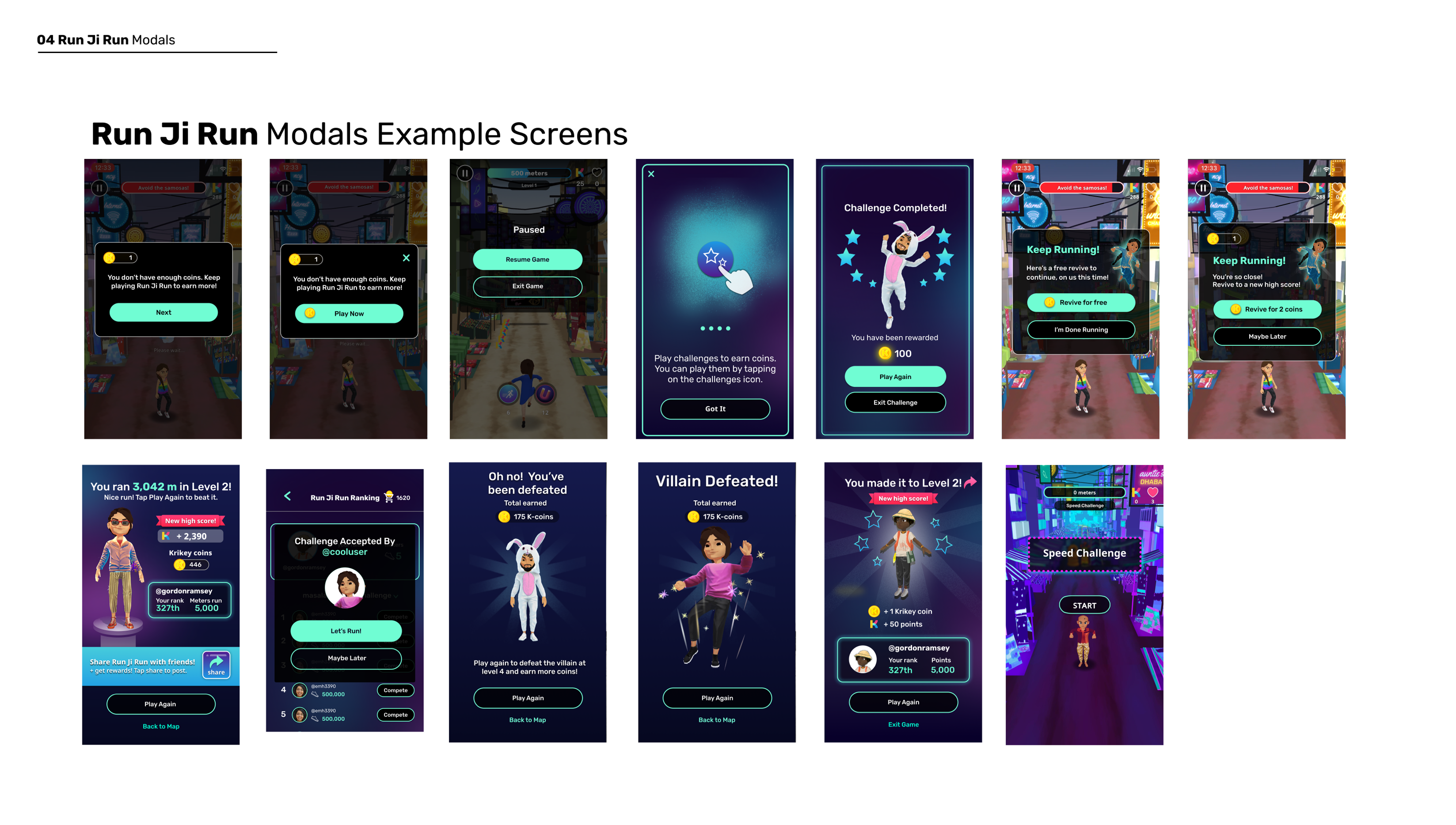
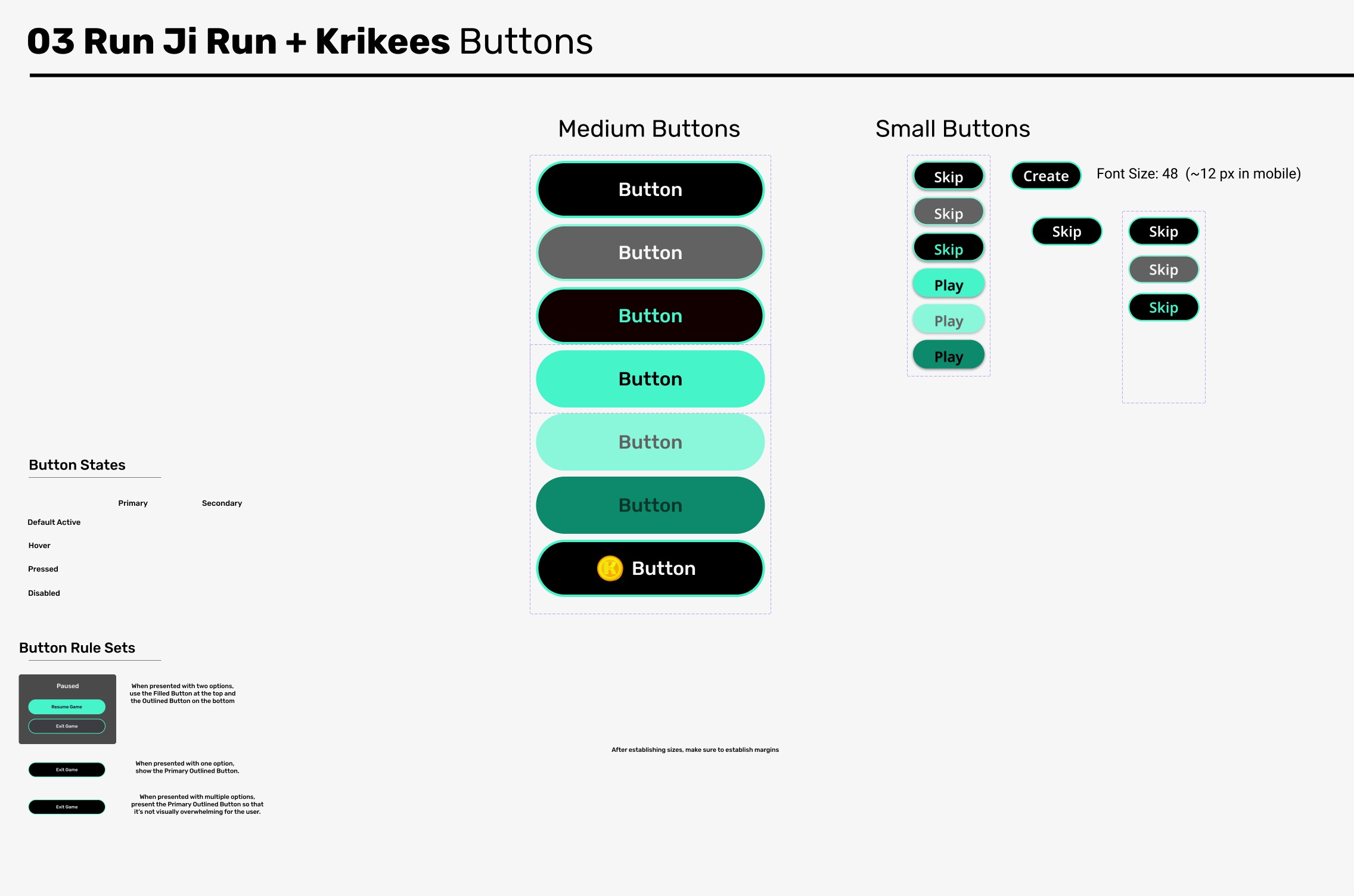
Below are some screenshots of the design system we created to elevate the user experience of Krikey players.
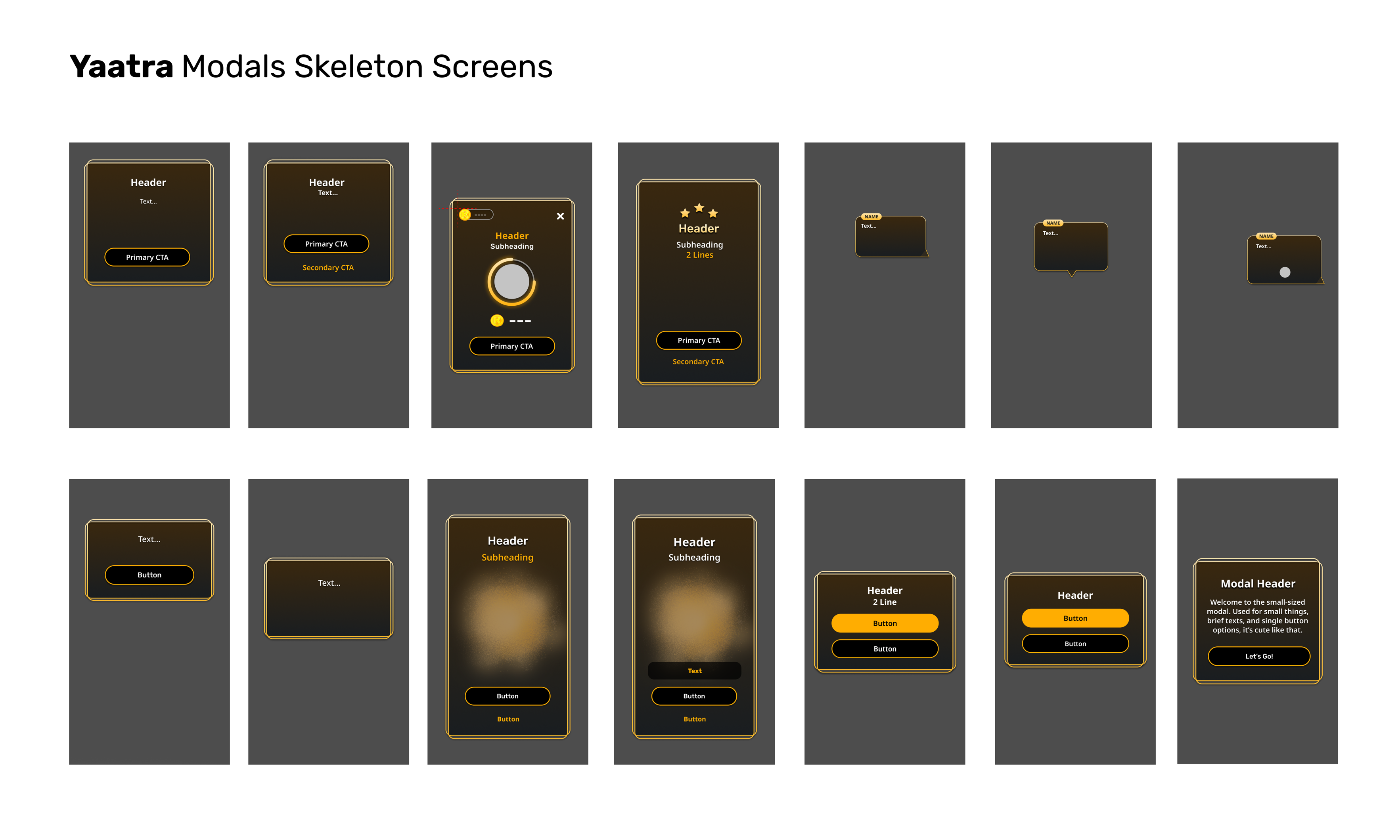
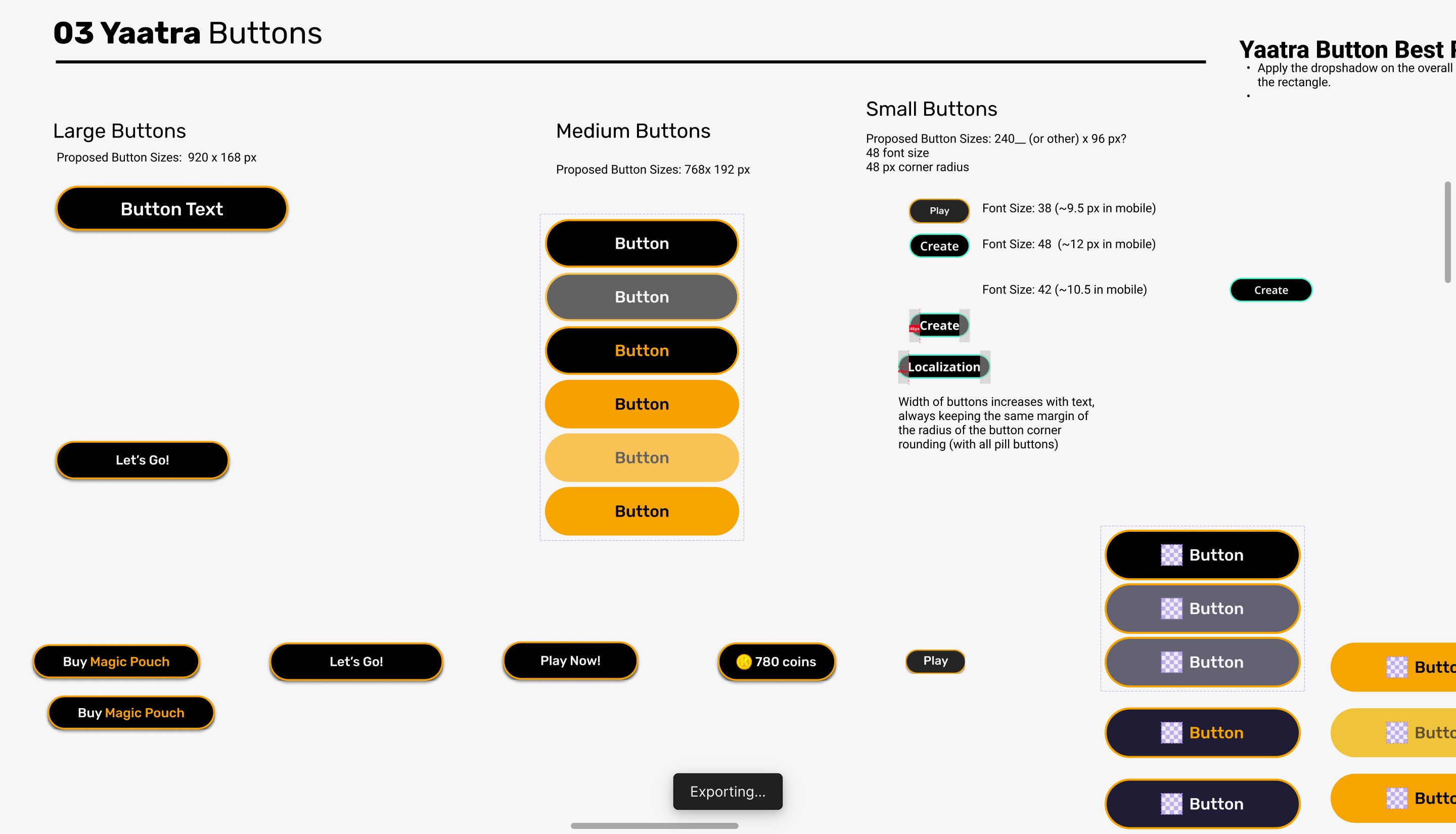
With 5 of us in our design team, we created a design system of stripped down, reusable components that were cohesive, scalable, and consisting of various sizes of different elements (S, M, L, sometimes XL). We split the work into sections tasked across the team, between the main app and game systems. For both the game buttons and game modals in the design system, I focused on:
- Standardizing the various sizes and layouts between both games
- Creating button scaling rules for localization (regional languages)
- Designing the button component variants and optimizing layer hierarchies
- Creating the visual design of the modals (Yaatra)
- Button states (normal, pressed, disabled, and coin shop versions)
- Font sizes in different scenarios (priority to multiples of 8, 4, and 2)
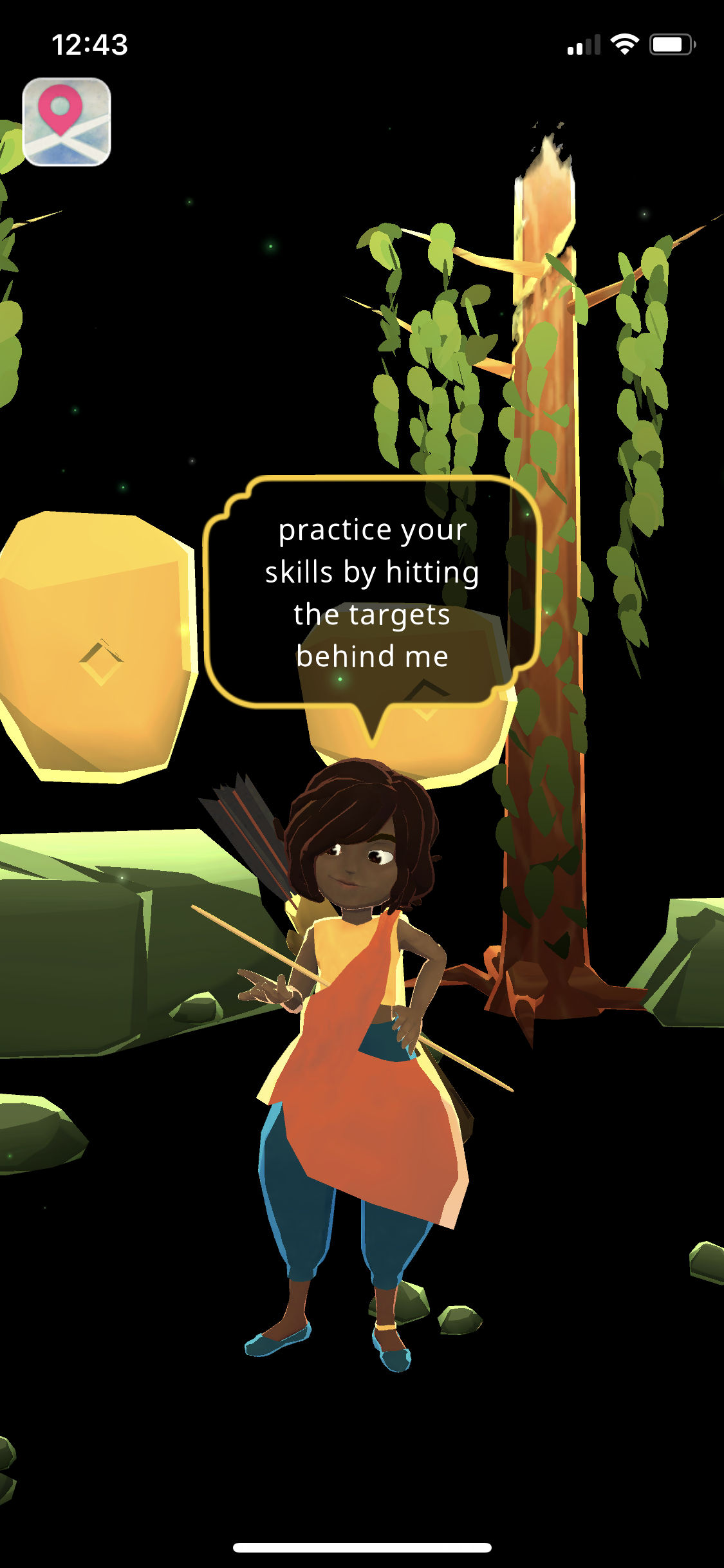
- Speech bubble design (Yaatra) – with an off-screen indicator and the associated interaction design to show where the character was if they were off-camera (especially helpful in an Augmented Reality environment).
All of these elements were proportionally consistent between the iOS and Android mobile teams and Unity dev teams, using the same-sized elements between both Yaatra and Run Ji Run and reskinned to fit each game's theme.
Before & After
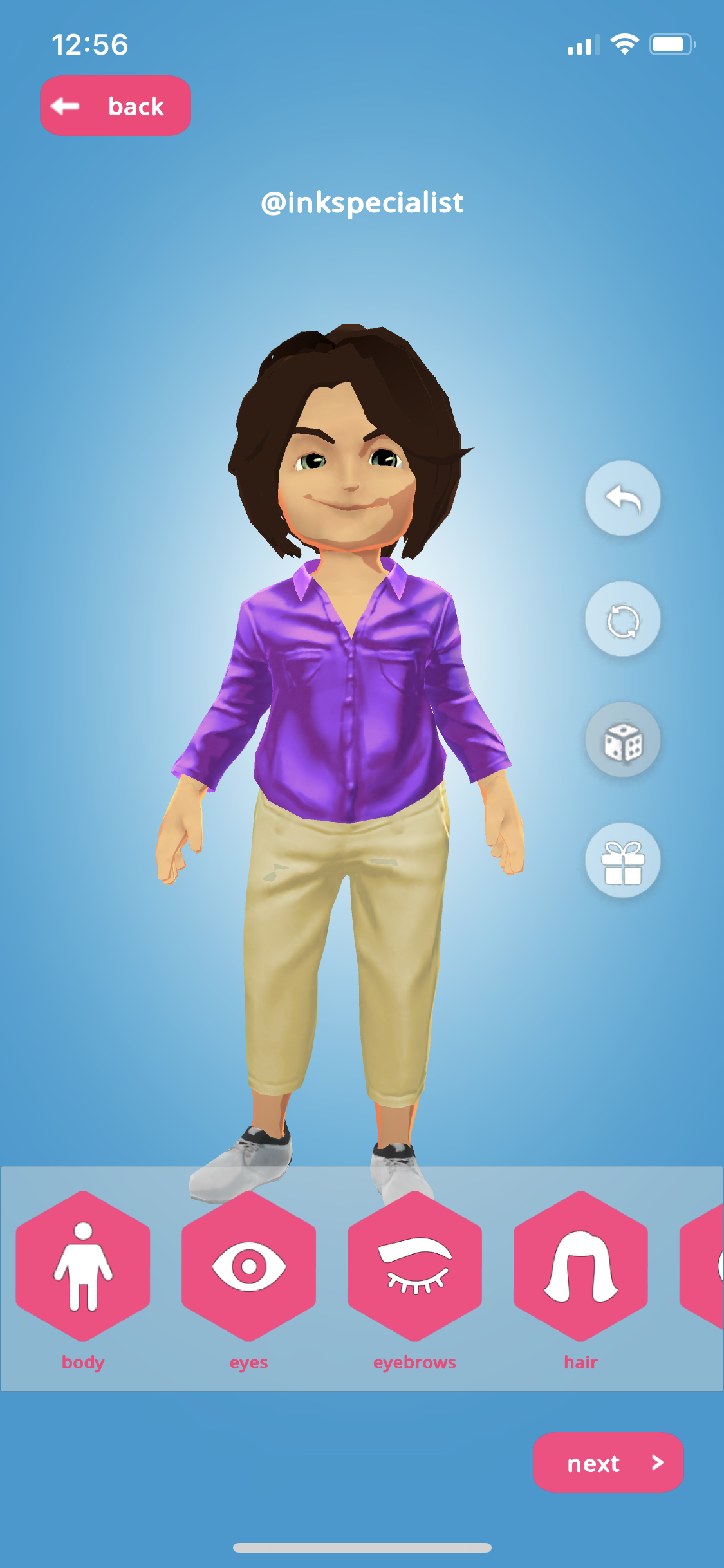
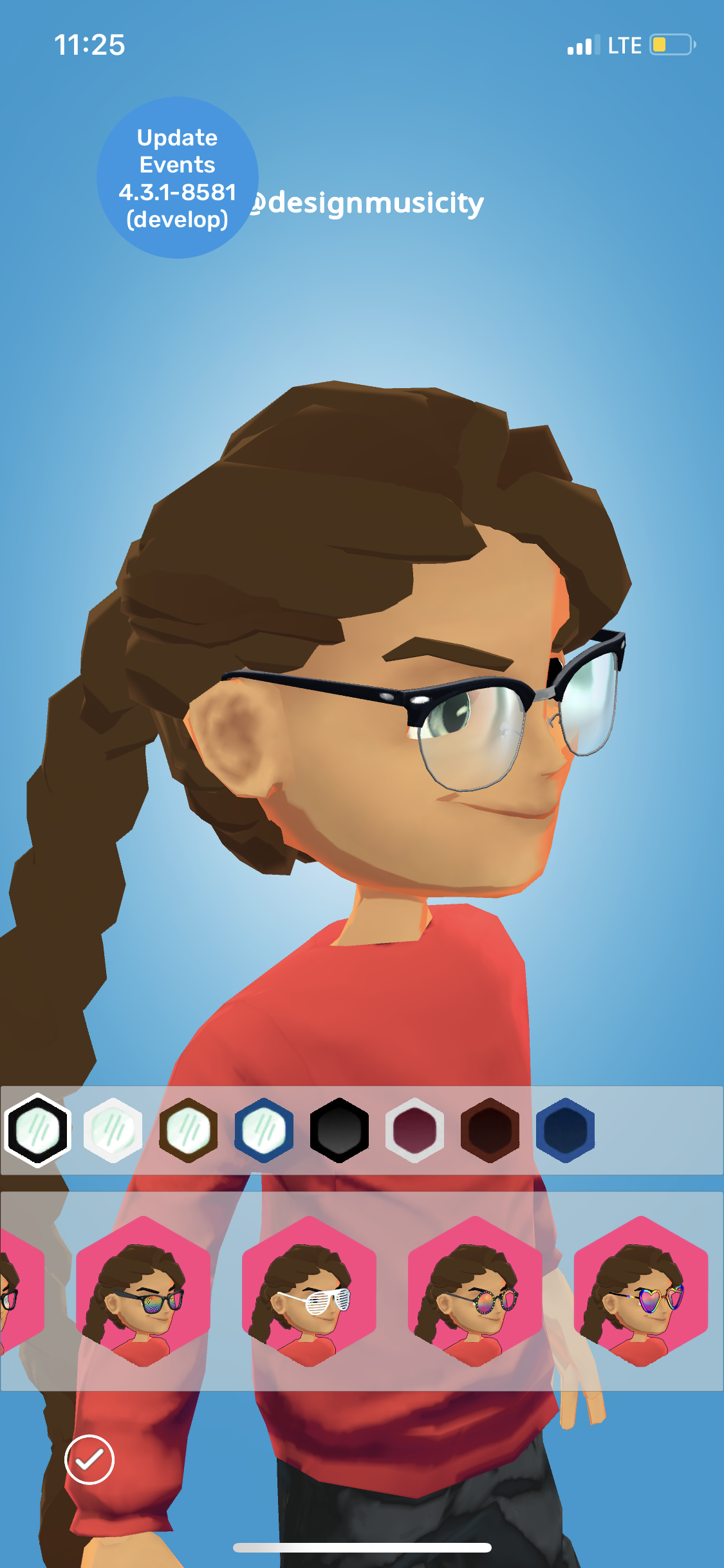
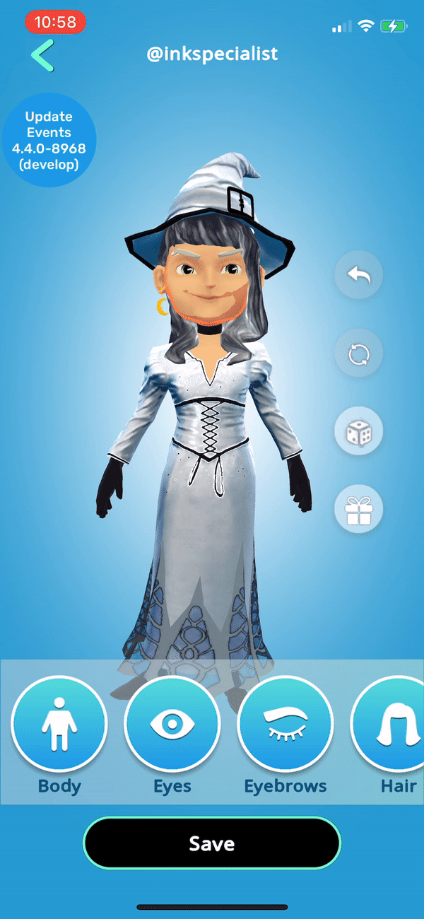
Before: Avatar Creator
The following is a collection of feature work I've done at Krikey, showing what the feature looked like before and after a redesign. Some features were new and don't have a before version. Right after signing up with Krikey, a player is taken to the avatar creator to make their first avatar. The layout was alright, but the category buttons were garish and hard to read, as well the CTA buttons were inconsistently sized and small.
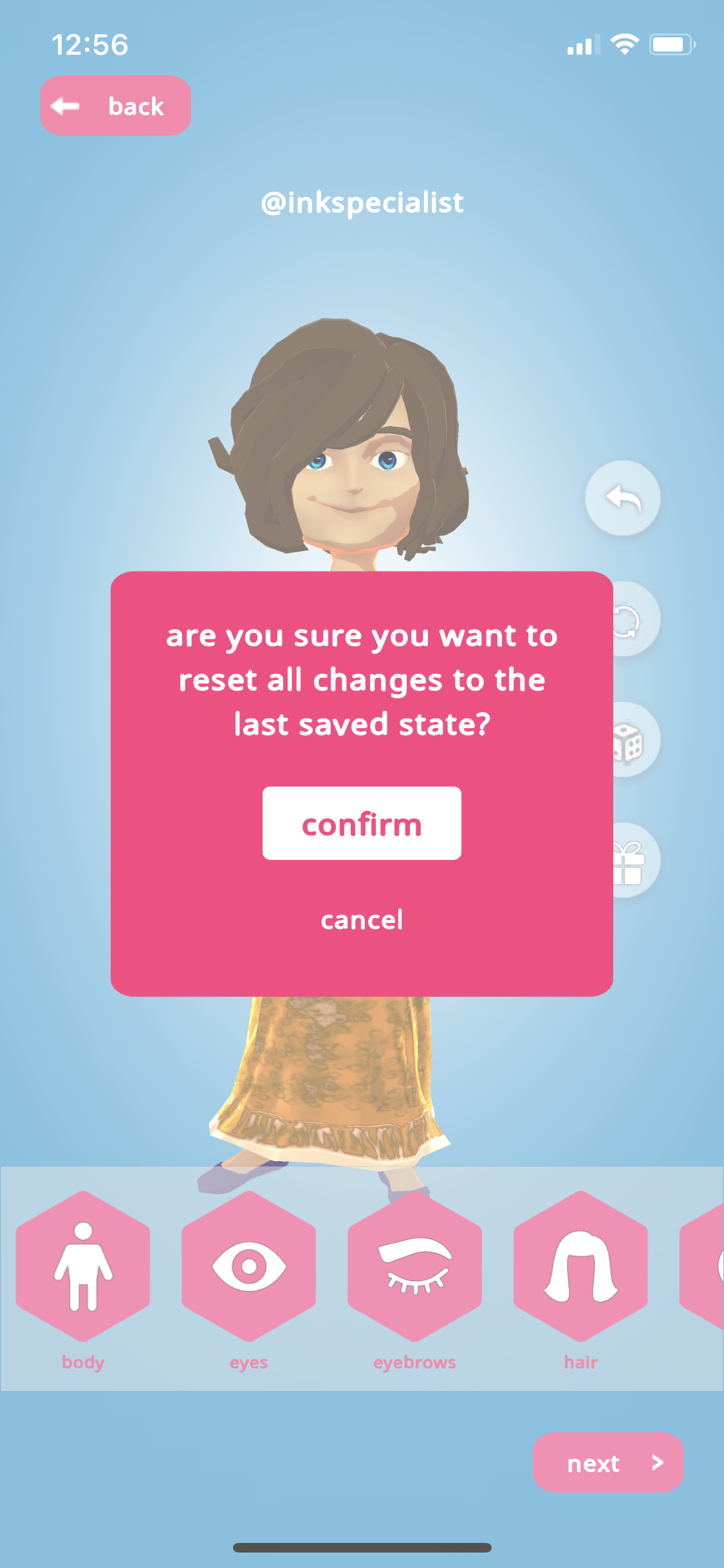
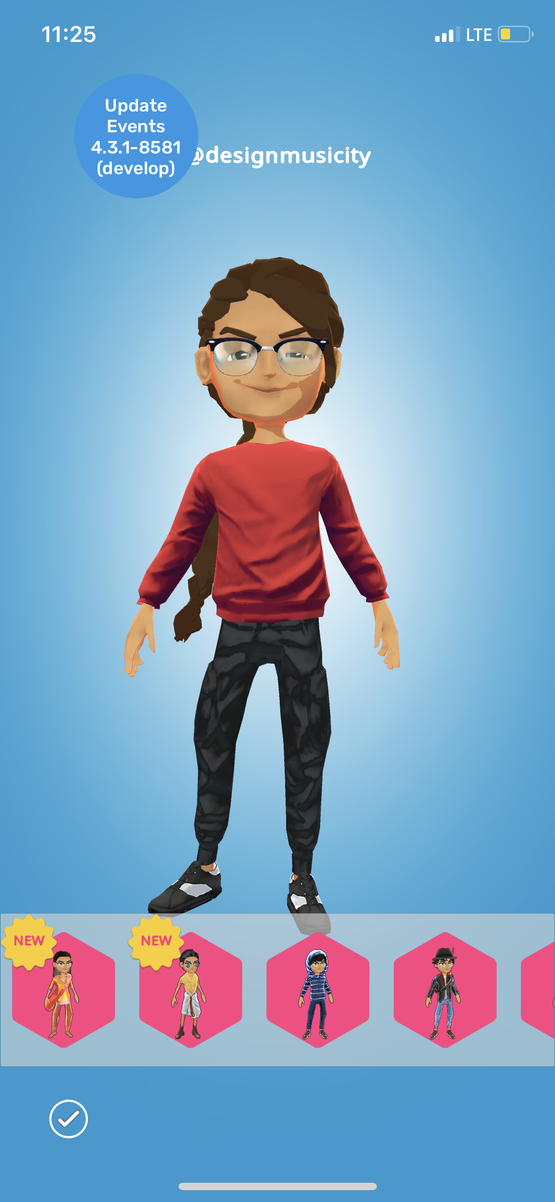
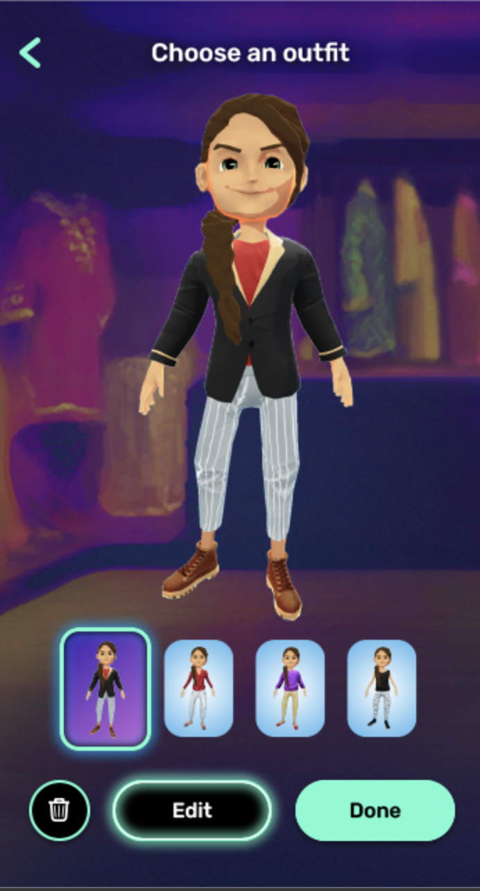
After: Avatar Creator
In updating the categories menus, the goal was to keep the buttons vibrant yet subtle enough to keep the avatar on center stage and allow its features to pop. To make the selected state of the subcategories more apparent, we took away the background circle for all unselected items. We also made sure to increase the text size and contrast against the background for greater accessibility.
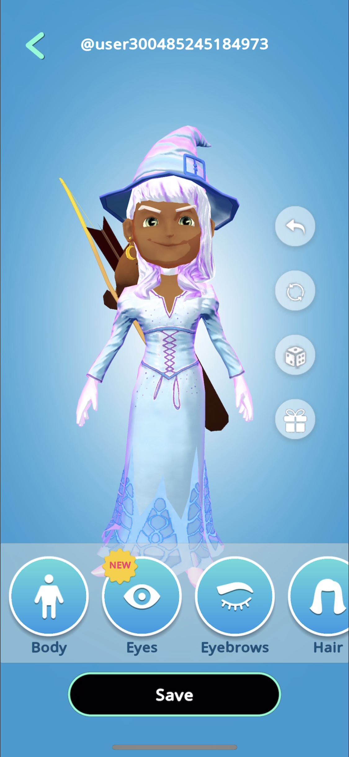
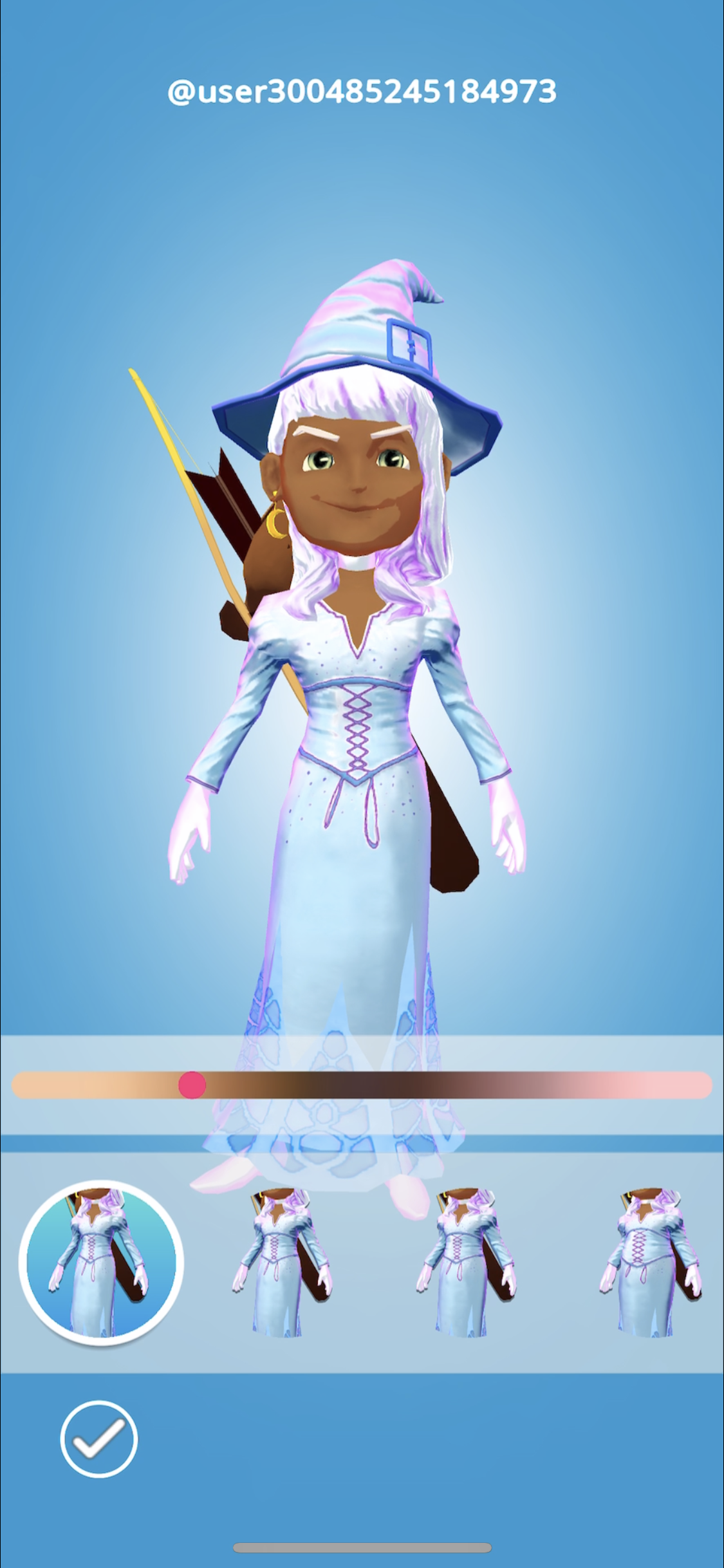
Above: Implementation in Unity (left) of Designs I created (right) for a feature that allowed users to save multiple avatars
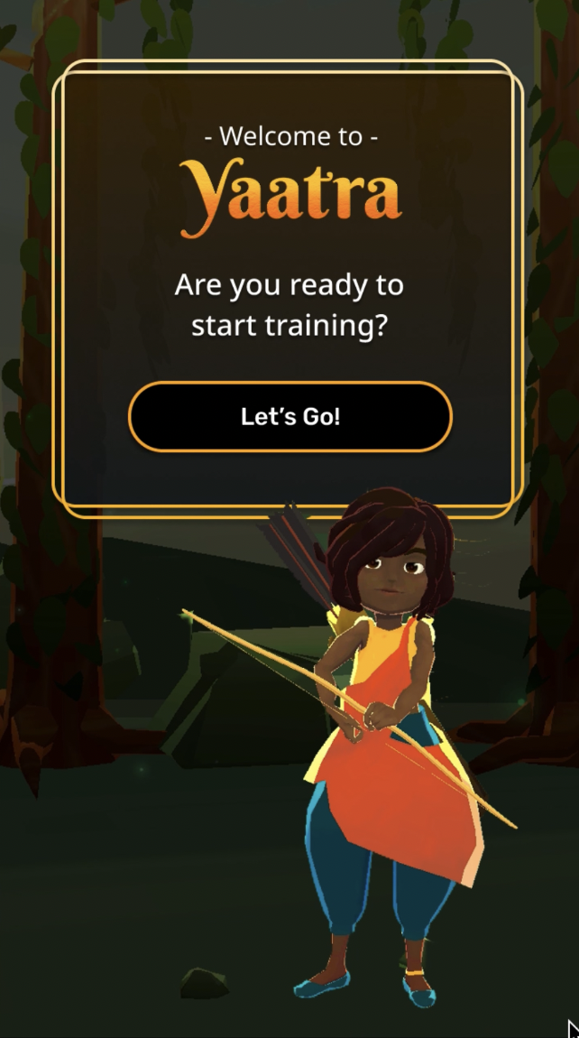
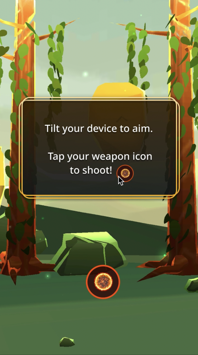
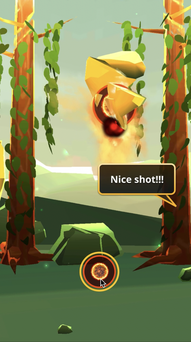
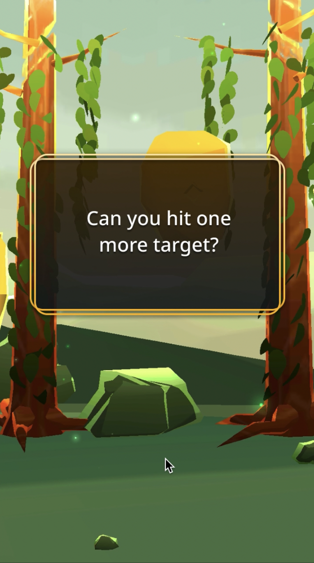
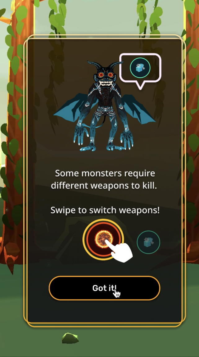
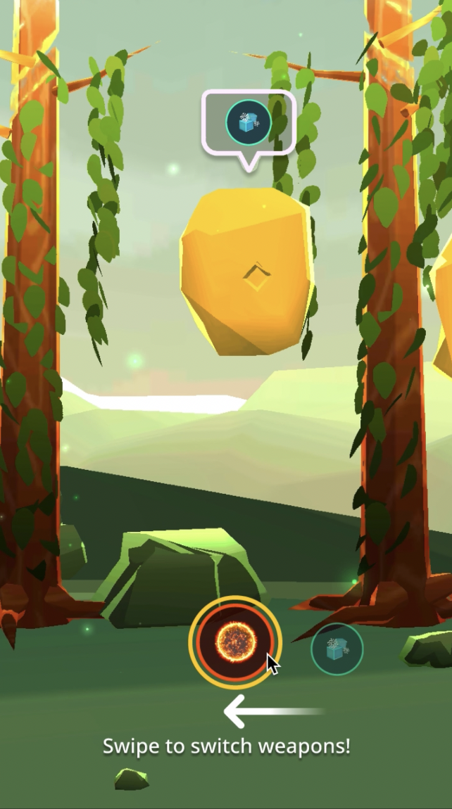
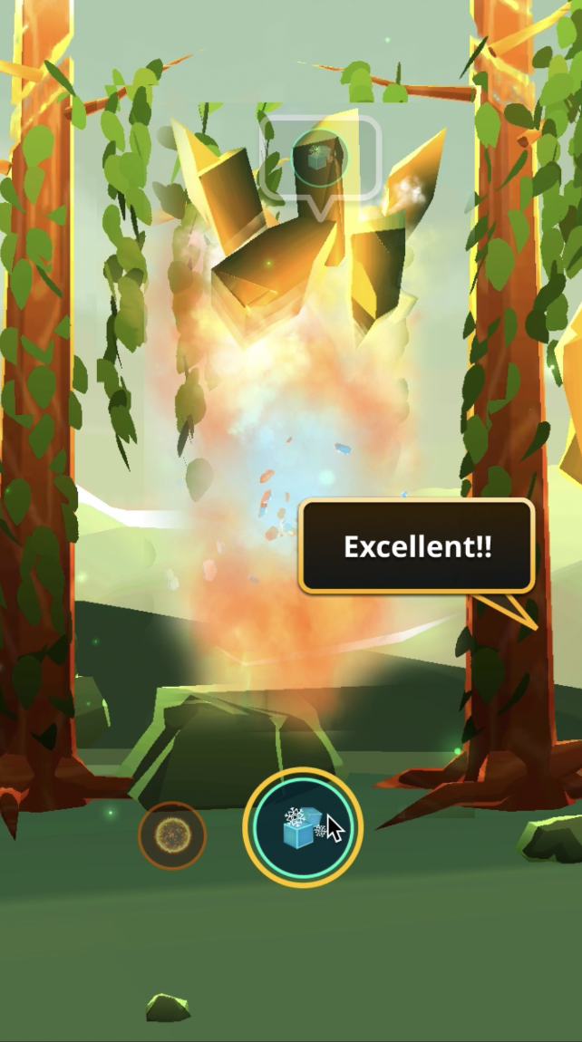
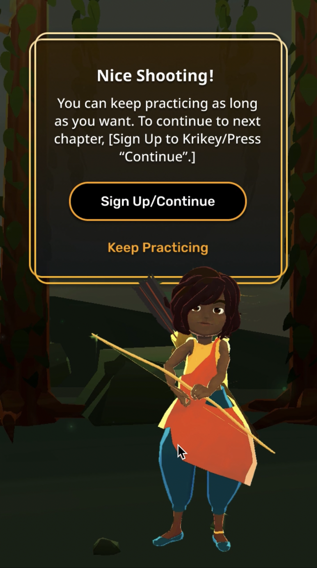
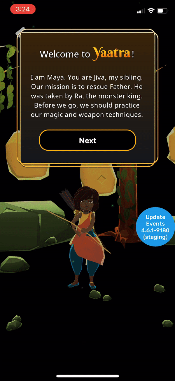
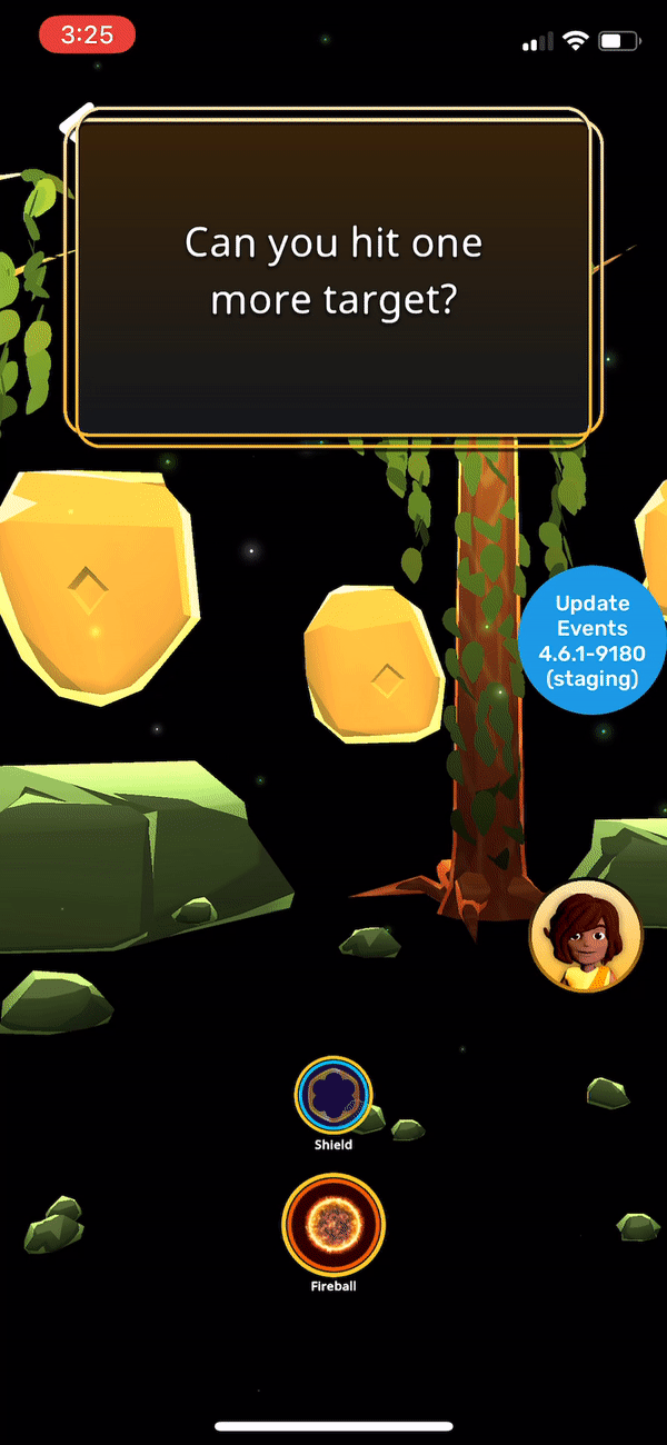
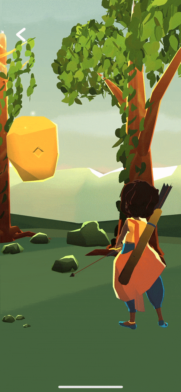
Before: Yaatra Training chapter
Yaatra is a FPS adventure game of two sisters on a mission to save their father. The training chapter had inconsistent UI elements, confusing UX, and no indication of where a player was at in their journey. It seemed to continue indefinitely.
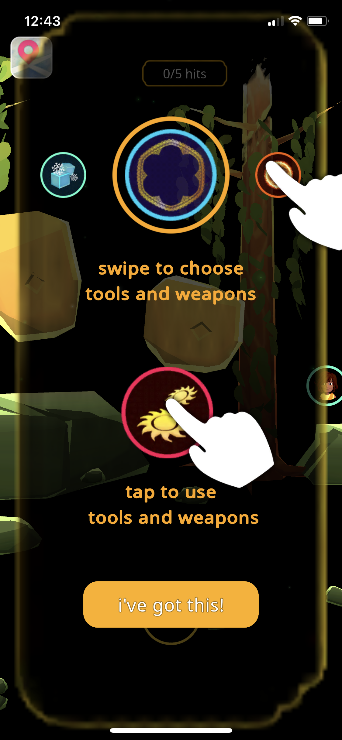
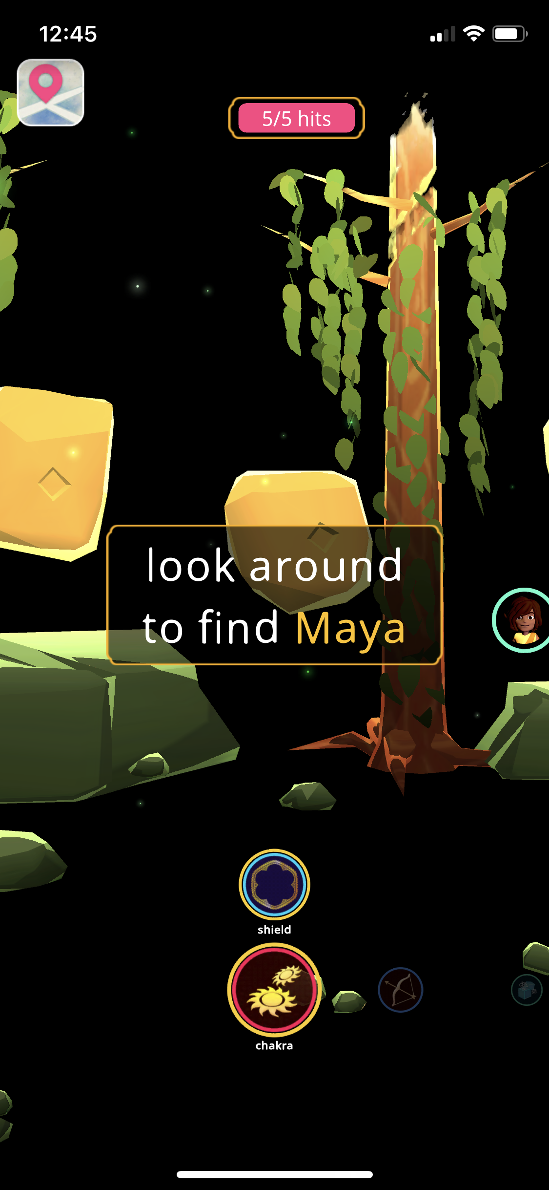
After: Yaatra Training chapter - (As designed)
The goal with the redesign was to provide contextual feedback and make sure the modals, speech bubble, and weapons UI was clean, consistent, and told players they had options to progress further in the game or stay and keep practicing after a short period of training.
After: Yaatra Training chapter - (Implementation)
We were able to iterate before implementation to create a better speech bubble design with an embedded name of whoever was speaking as well as an off-screen indicator to show where the character was in relation to the position of the phone/camera.
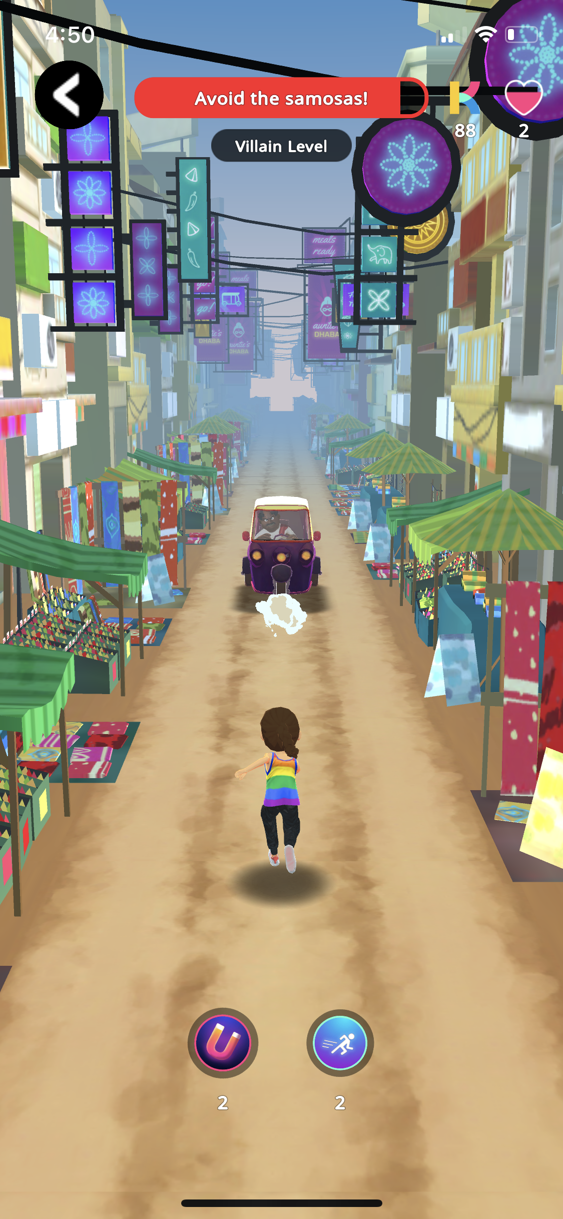
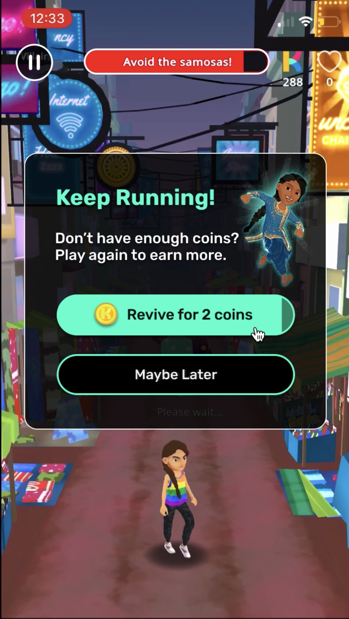
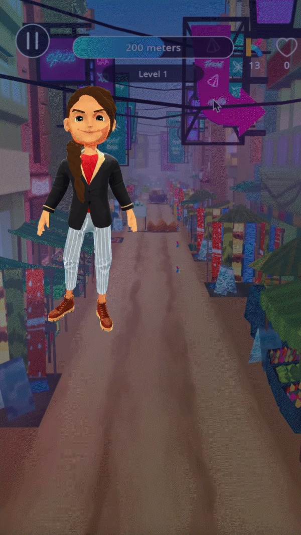
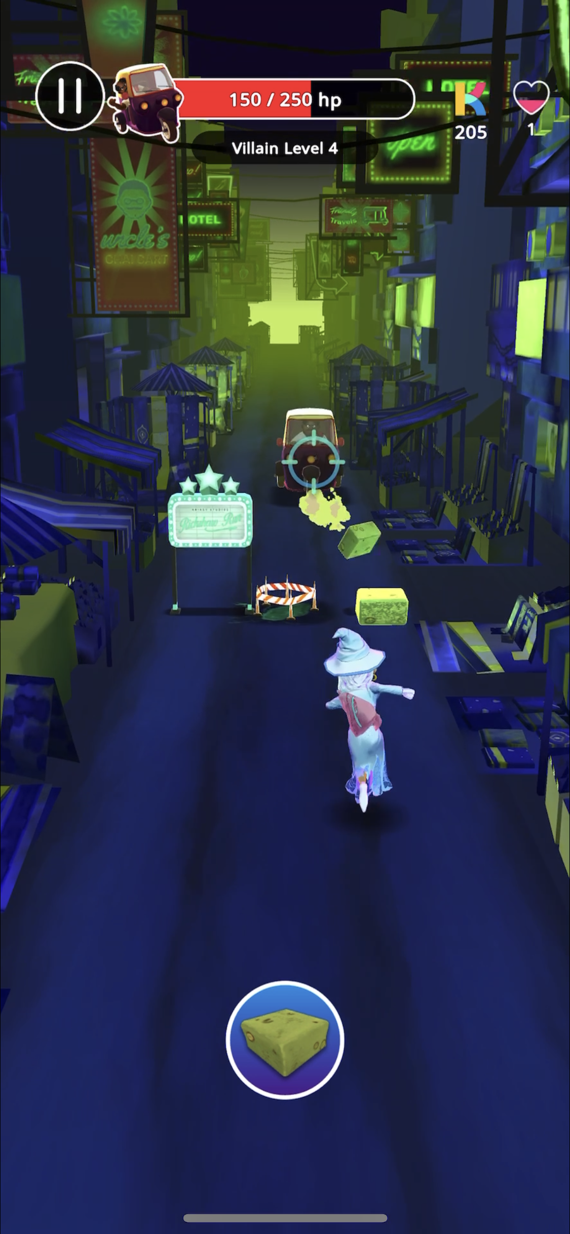
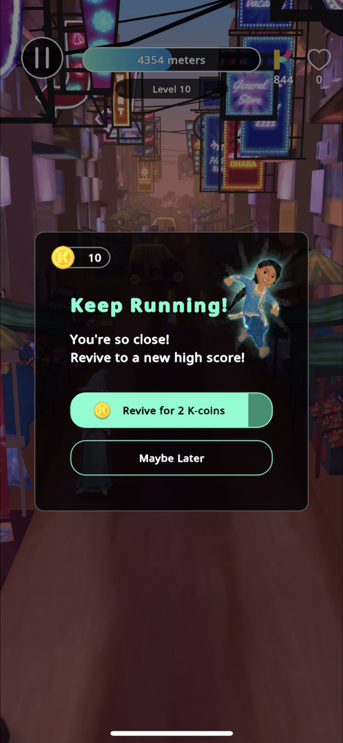
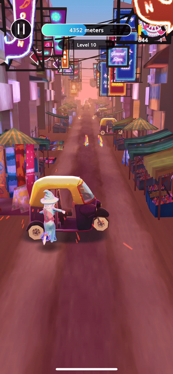
Before: Run Ji Run
The infinite runner game Run Ji Run has evolved tremendously since I started at Krikey. We pushed the former UX into more legible and exciting animations that carried us closer to the realm of competitors such as Sonic Dash and Subway Surfers. We developed gameplay to eventually become progressively more satisfying and challenging as a player advanced through the levels, and that's what you want - to find that sweet spot.
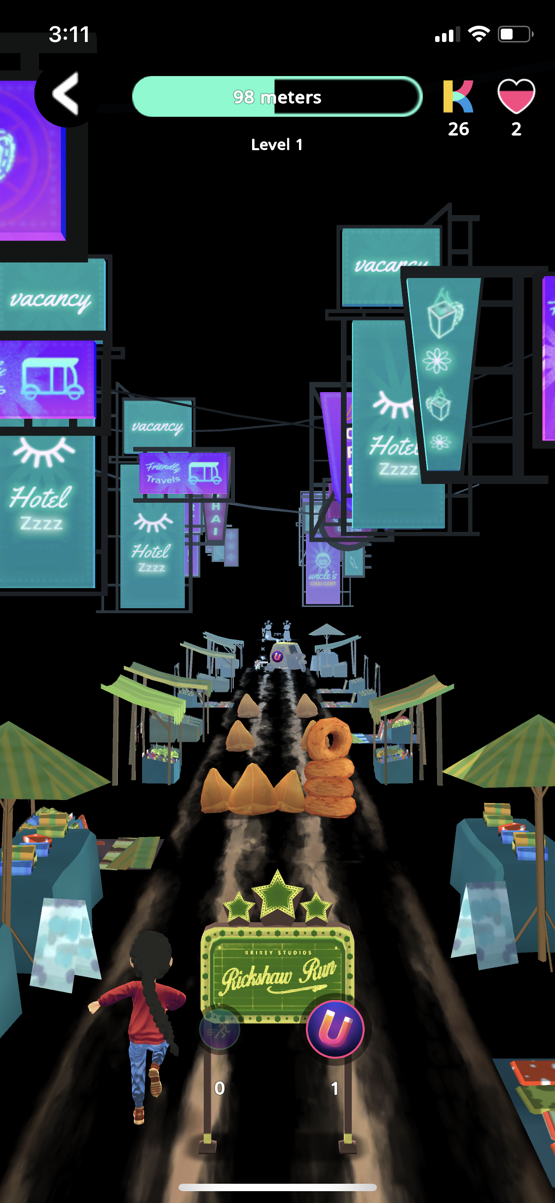
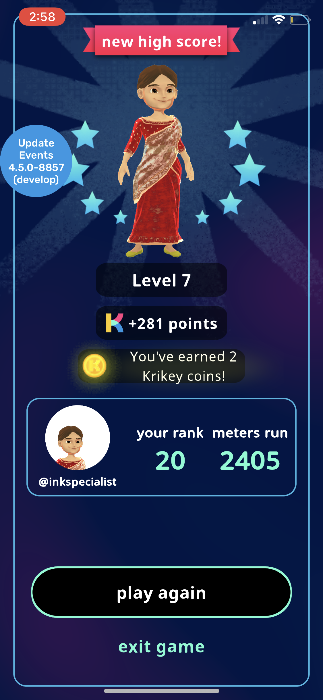
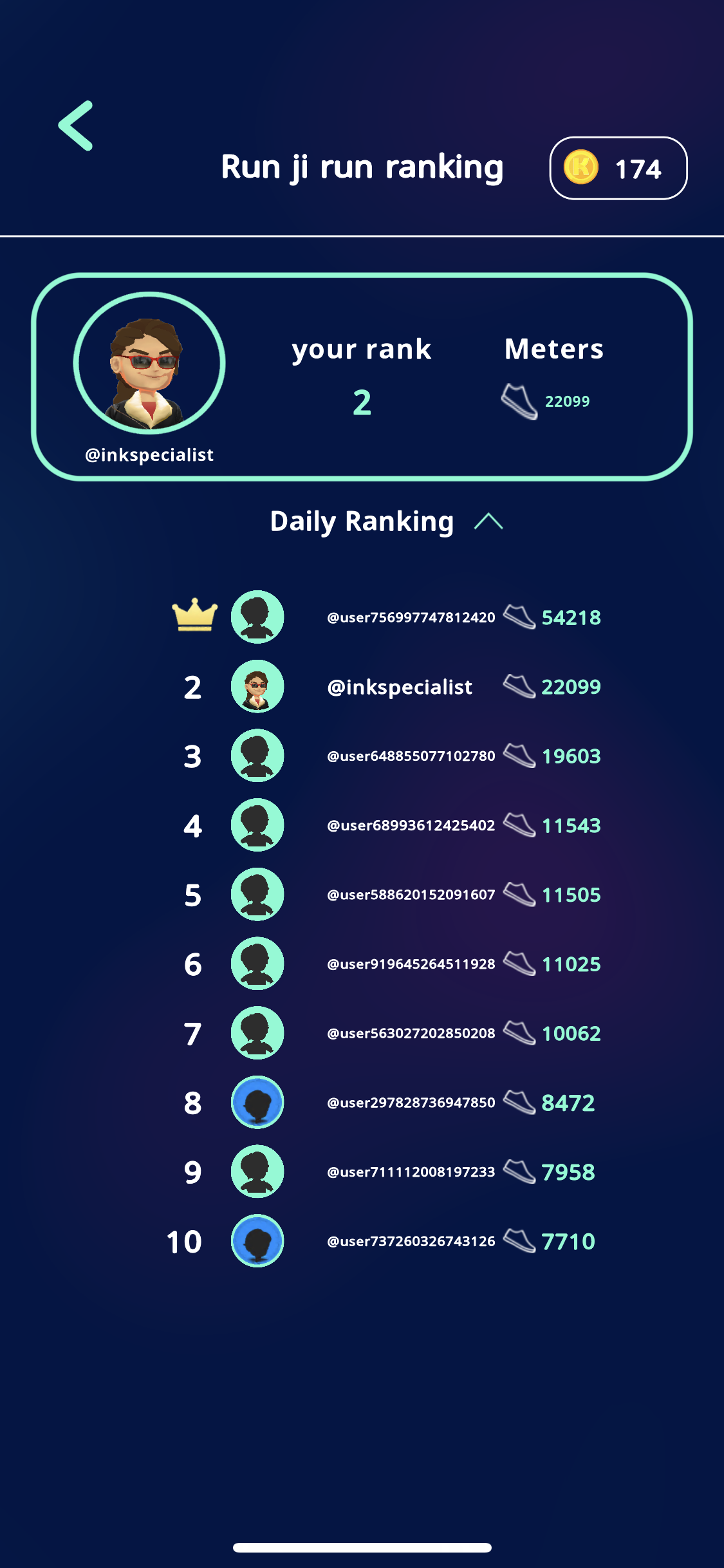
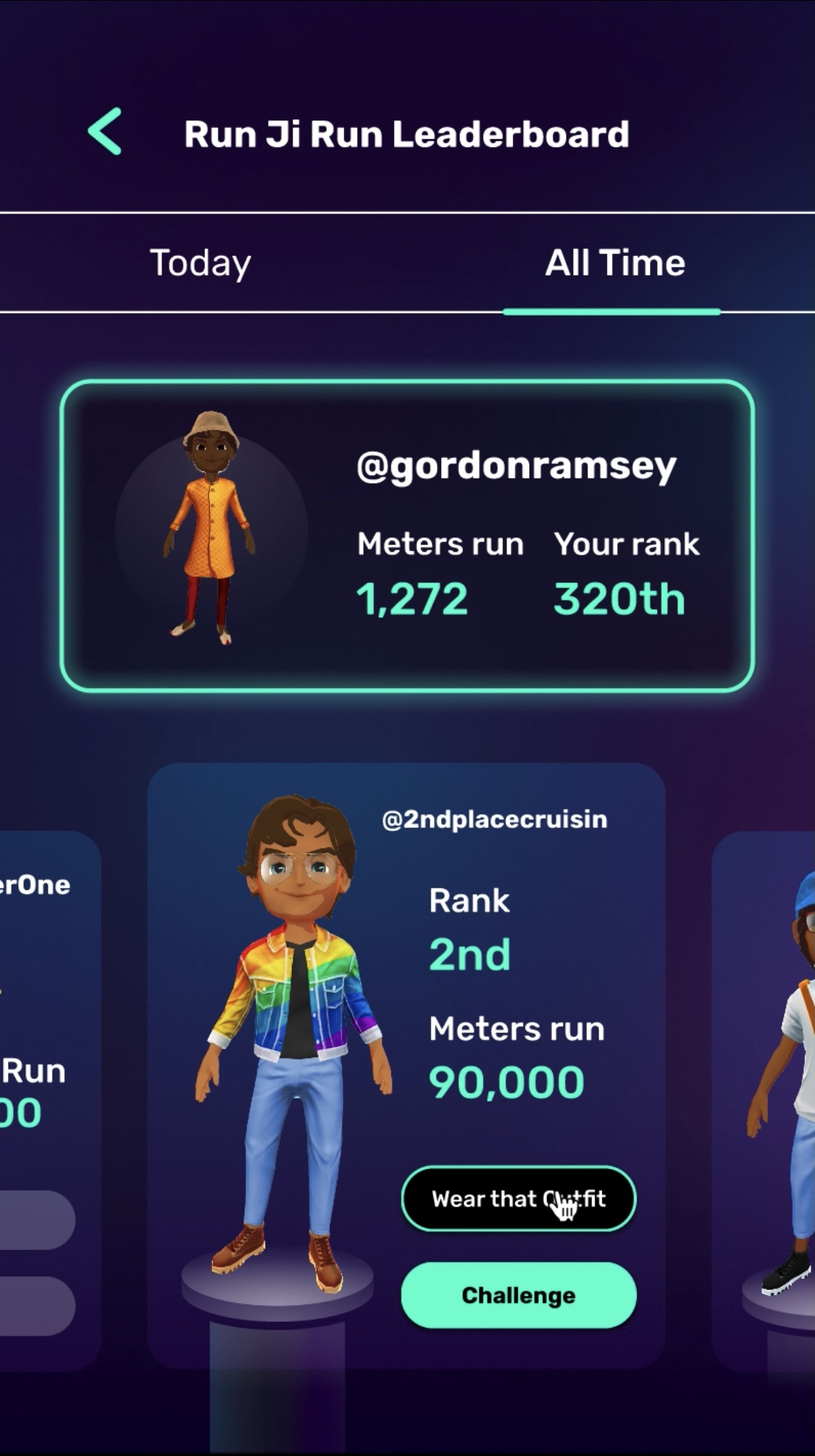
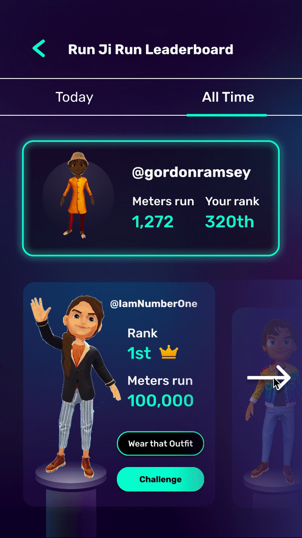
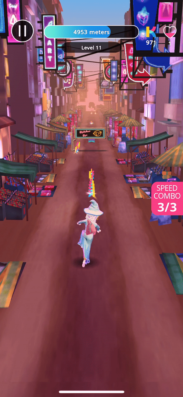
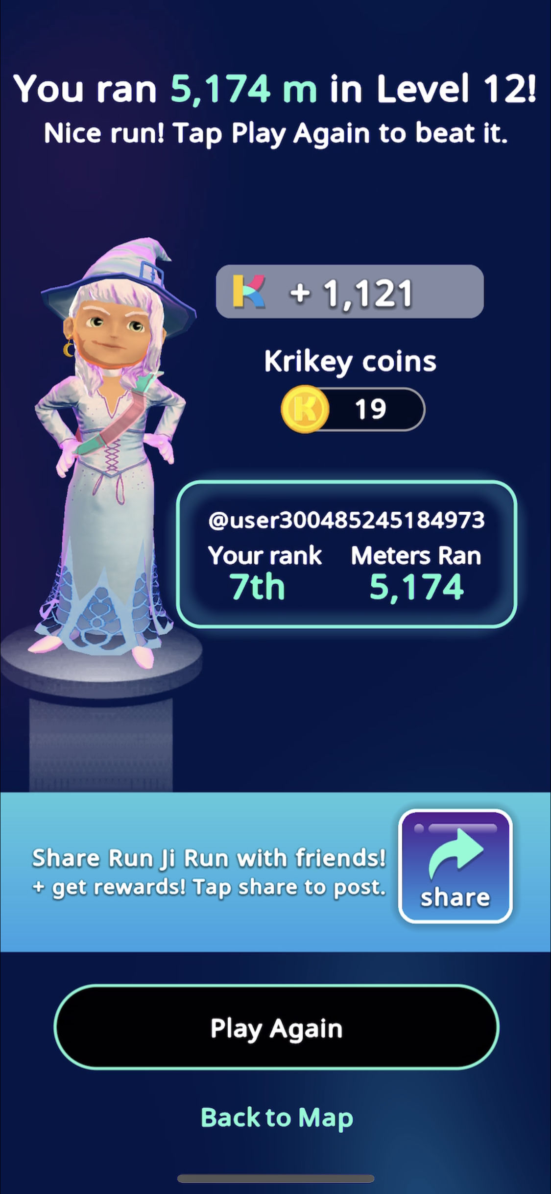
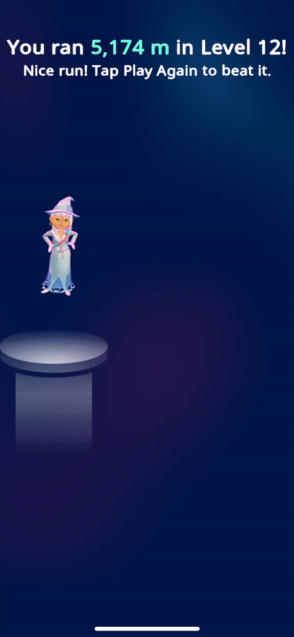
After: Run Ji Run (As designed)
Shown in order from left to right is a Run Ji Run revival feature, the Well Done screen prototype, the Leaderboard redesign and the Leaderboard prototype.
All done in Figma as prototypes.
After: Run Ji Run (Implentation)
In an attempt to get the implementations even closer to the designs, I wrote a new Designer-to-Developer handoff proposal that involved mirroring a Figma design system in Unity with dumb UI implementation by the Design team. This saves time (and many tedious Slack exchanges) for both designers and developers as well as creates a more cohesive UX across the entire app.
For the Well Done screen, I made sure to enlarge the size of the share button and create a full-width banner behind it to highlight the feature.
...