DIGITAL REALTY CASE STUDY
CASE STUDY
Setting the Benchmark for Data Center Map UX
Setting an Industry Standard for Data Center UX
Digital Realty's website serves over a million unique visitors annually — many are prospective customers evaluating where to colocate critical infrastructure.
The global and metro map experience is one of the highest-traffic paths on the site. Before this redesign, there was no clear path from region to metro to facility, nor was there a visual distinction between facilities within the same building. The site elements were limited in their interactivity, and the path felt dead.
Bottom line: The experience wasn't supporting the sales funnel the way it needed to. I led the redesign of the entire Global and Metro map flow, end-to-end from discovery to launch and beyond. The result? We created a design pattern good enough to be copied.
.
.
.
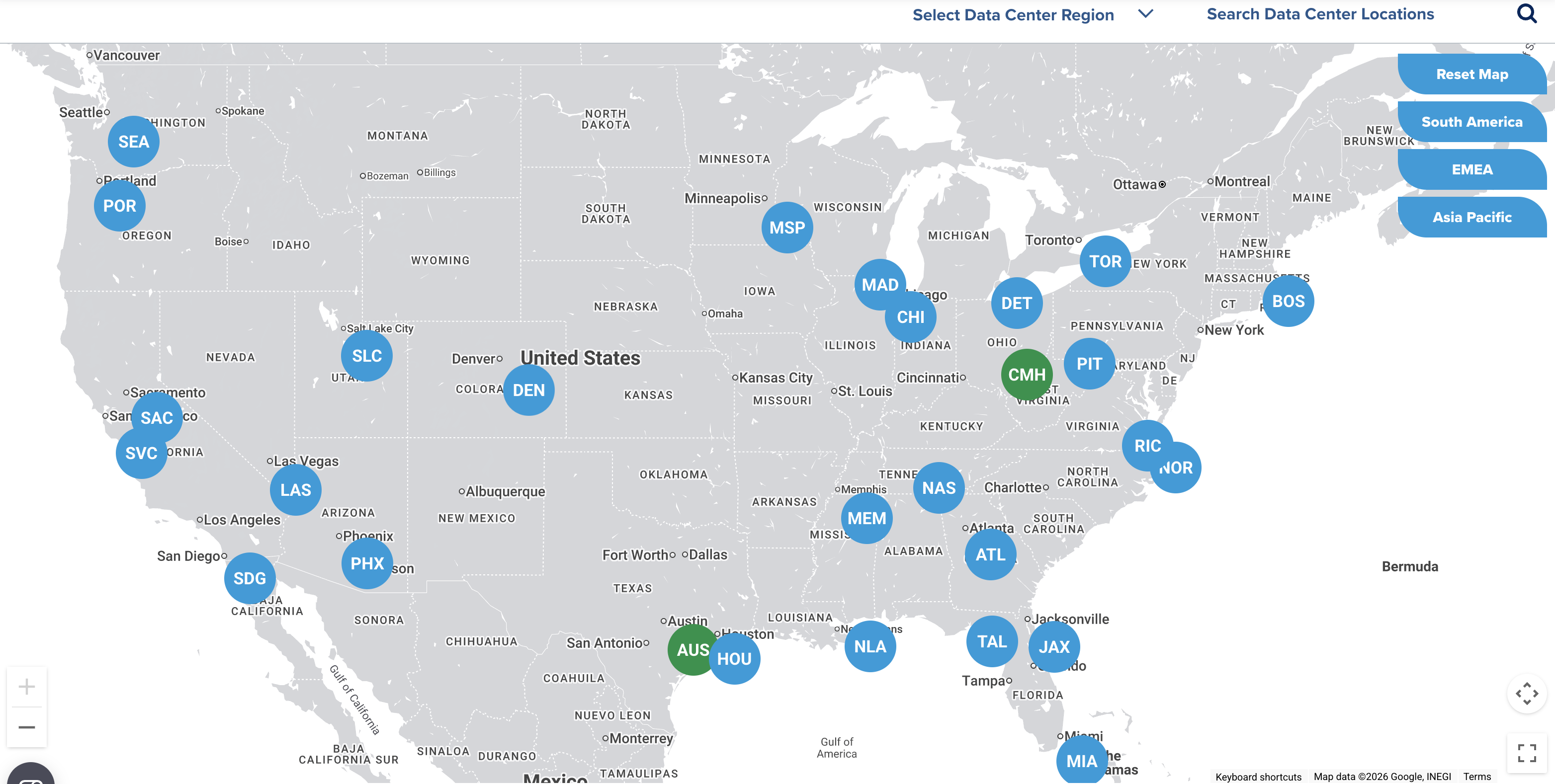
Above: The Global and Metro Map redesign shown on the live site circa February, 2026
Problem: The Broken Funnel
Digital Realty operates 300+ data center facilities across 50+ metros on six continents. The website's mapexperience is how many prospective customers first explore the portfolio — identifying a region, narrowing to ametro, and ultimately finding the right facility for their infrastructure needs. That journey should feel intuitive. It didn't.
The existing map had been built without a cohesive information architecture guiding the user forward. What should have been a smooth funnel — global overview to regional context to metro detail to individual facility — was fragmented and full of dead ends. Clicking into a group of numbered facility clusters on the global map would take users deeper, but the path terminated at a small dot that didn't connect to any metro or facility page. Users couldn't get from the global map into the metros at all. On mobile, the experience was even worse — scrolling within the map would trap users, making it difficult to navigate the rest of the page. There was no funnel, just a maze.
Below: "Before" images of the Global and Metro Map experiences - www.digitalrealty.com circa early 2023. The Global Map included clusters of numbers which symbolized metros and facilities within each metro, but there was no link between worlds to go from the Global to Metro to Facility level.
Understanding
users
Our target users are college students enrolled in Organic Chemistry I courses, putting them primarily between the ages of 17-21. Most are on track to develop careers in science, medicine, or education. Reviewing information from user interviews, we developed a list of user needs and their corresponding goals.
User need
– intuitive exercises that maximize learning potential and correspond to course material
– ability to use anywhere
Goal: design a mobile app for iOS and Android with a total of 5 exercises, focusing on molecular interaction (source: PubChem database), covering fundamental organic chemistry concepts that reinforce understanding and are tailored to different learning styles
User need
– interaction with molecules three-dimensionally and ability to switch between 3D/2D visualization
– requisite information to help solve problems (atom ID key, definitions, etc)
Goal: create simple, intuitive, and engaging UI that makes use of interaction design to convey meaning; should enable switching between different visualization modes and include all relevant information to solve problems within each exercise
User need
– ability to sync content with course dashboard
Goal: develop a dashboard that displays user progress for each exercise, with functionality to connect to social media or course software
User need
– content that retains user interest and encourages exploration; integrated tutorials
Goal: create intuitive tutorials that help you learn as you play; include sandbox component where users can search for molecules and explore their structures/ properties; create a list of achievements users can unlock as they advance

Discovery: Understanding where users got lost
Before designing anything, I needed to understand how users were actually behaving — not how we assumed they were behaving.
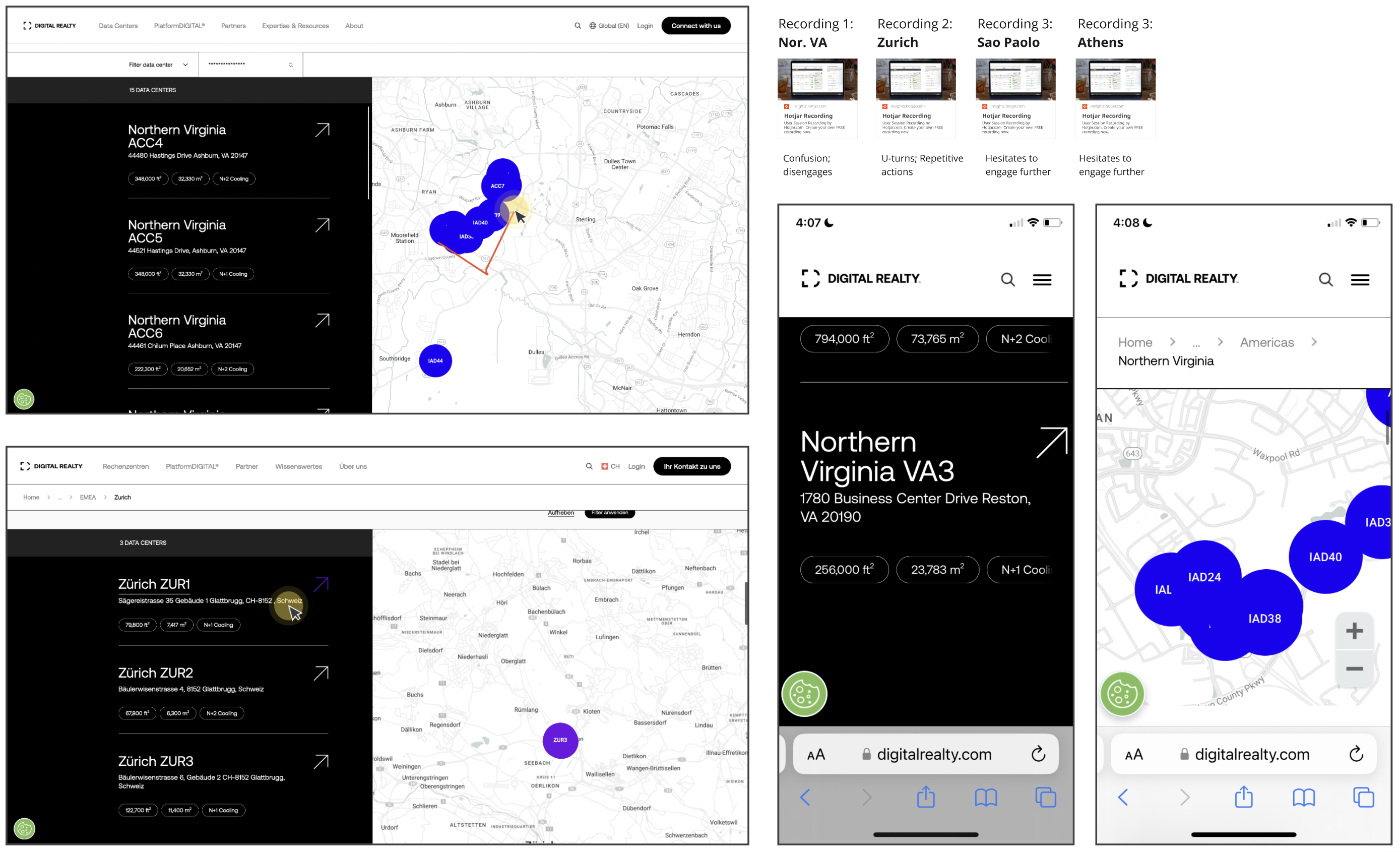
I used Hotjar session recordings to observe real users navigating the maps. What I saw confirmed and expandedon the problems I'd identified through my own expert evaluation: users were zooming in and out repeatedly,navigating back and forth between pages without finding what they needed, and in many cases abandoning themap entirely before ever reaching a metro or facility page.
One session in particular crystallized the problem. During a recorded Northern Virginia session on desktop, a user landed on the metro map and encountered facilities overlapping on the map. In order to discern between these facilities, read which number they were, and see where they were located exactly, the user needed to repeatedly zoom in and out. They then hovered over the facility list, but navigated away from it quickly —because the list had no interaction whatsoever. Nothing happened on hover. The list and the map were two separate, unlinked elements on the same page.
Not exactly an edge case, Northern Virginia is Digital Realty's densest metro with 15+ facilities in close proximity. If the experience broke down there, it was breaking down everywhere that had facility density. The dense metros are where the highest value customers are looking.
I also pulled device analytics to understand the audience. The data showed a roughly even split: 52.1% mobile, 44.6% desktop, and 3.3% tablet. This meant that any solution had to work equally well across input paradigms— hover-based interactions for desktop users and tap-based interactions for the mobile majority. A desktop-only solution would fail more than half the audience.
Below: Images from HotJar sessions showing users interacting with the Metro Map before redesign; Desktop (left) and Mobile (right), with links to source HotJar sessions
Understanding
users
Our target users are college students enrolled in Organic Chemistry I courses, putting them primarily between the ages of 17-21. Most are on track to develop careers in science, medicine, or education. Reviewing information from user interviews, we developed a list of user needs and their corresponding goals.
User need
– intuitive exercises that maximize learning potential and correspond to course material
– ability to use anywhere
Goal: design a mobile app for iOS and Android with a total of 5 exercises, focusing on molecular interaction (source: PubChem database), covering fundamental organic chemistry concepts that reinforce understanding and are tailored to different learning styles
User need
– interaction with molecules three-dimensionally and ability to switch between 3D/2D visualization
– requisite information to help solve problems (atom ID key, definitions, etc)
Goal: create simple, intuitive, and engaging UI that makes use of interaction design to convey meaning; should enable switching between different visualization modes and include all relevant information to solve problems within each exercise
User need
– ability to sync content with course dashboard
Goal: develop a dashboard that displays user progress for each exercise, with functionality to connect to social media or course software
User need
– content that retains user interest and encourages exploration; integrated tutorials
Goal: create intuitive tutorials that help you learn as you play; include sandbox component where users can search for molecules and explore their structures/ properties; create a list of achievements users can unlock as they advance
Hotjar allowed me to see how the experience was dropping for our users.
Defining Success, Phase 1: Global Map Redesign
Before moving into design, I articulated what the redesigned experience needed to achieve: Product outcomes tied to business goals.
A user should be able to trace a clear, unbroken path from identifying a region of interest on the global map to viewing a specific facility's details. The map experience should mirror the actual decision-making journey of a data center buyer: region → metro → facility. Every interaction should provide immediate visual feedback that confirms where the user is and where they can go next. On mobile, the experience should work within the constraints of a small screen without trapping users. I determined that the list and the map should function as a single linked system, not two adjacent but unrelated components.
The metric I cared most about wasn't page views — it was conversion. Were users who engaged with the map actually reaching facility pages and taking meaningful action, like filling out a contact form or downloading a spec sheet? If the redesign was successful, I expected to see conversion rates climb even if raw traffic didn't.
The global map was the top of the funnel, and it was leaking everywhere. Users who landed on it had no clearway to navigate into the metro-level experience where the real evaluation happens.
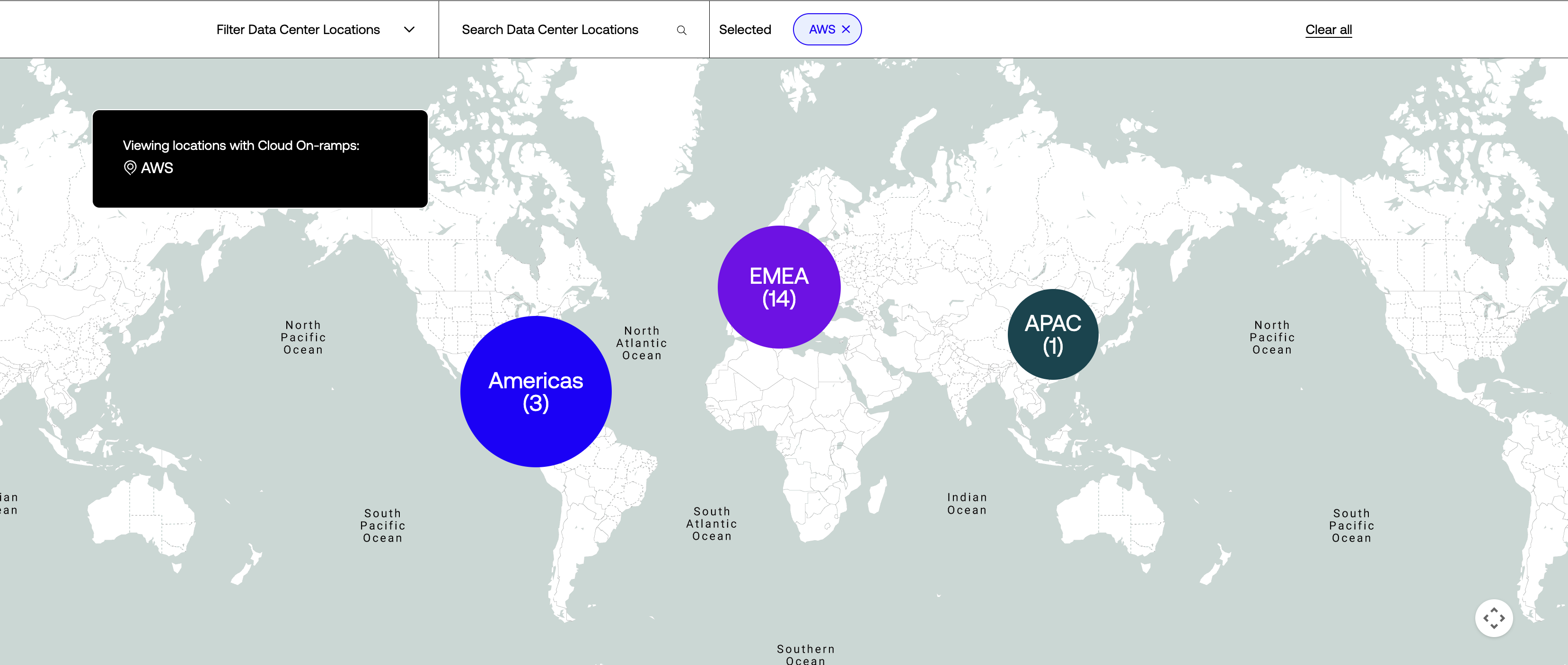
The Global Map Solution
I designed a layered zoom hierarchy with intentional navigation at each level. The experience now moves through a deliberate sequence:
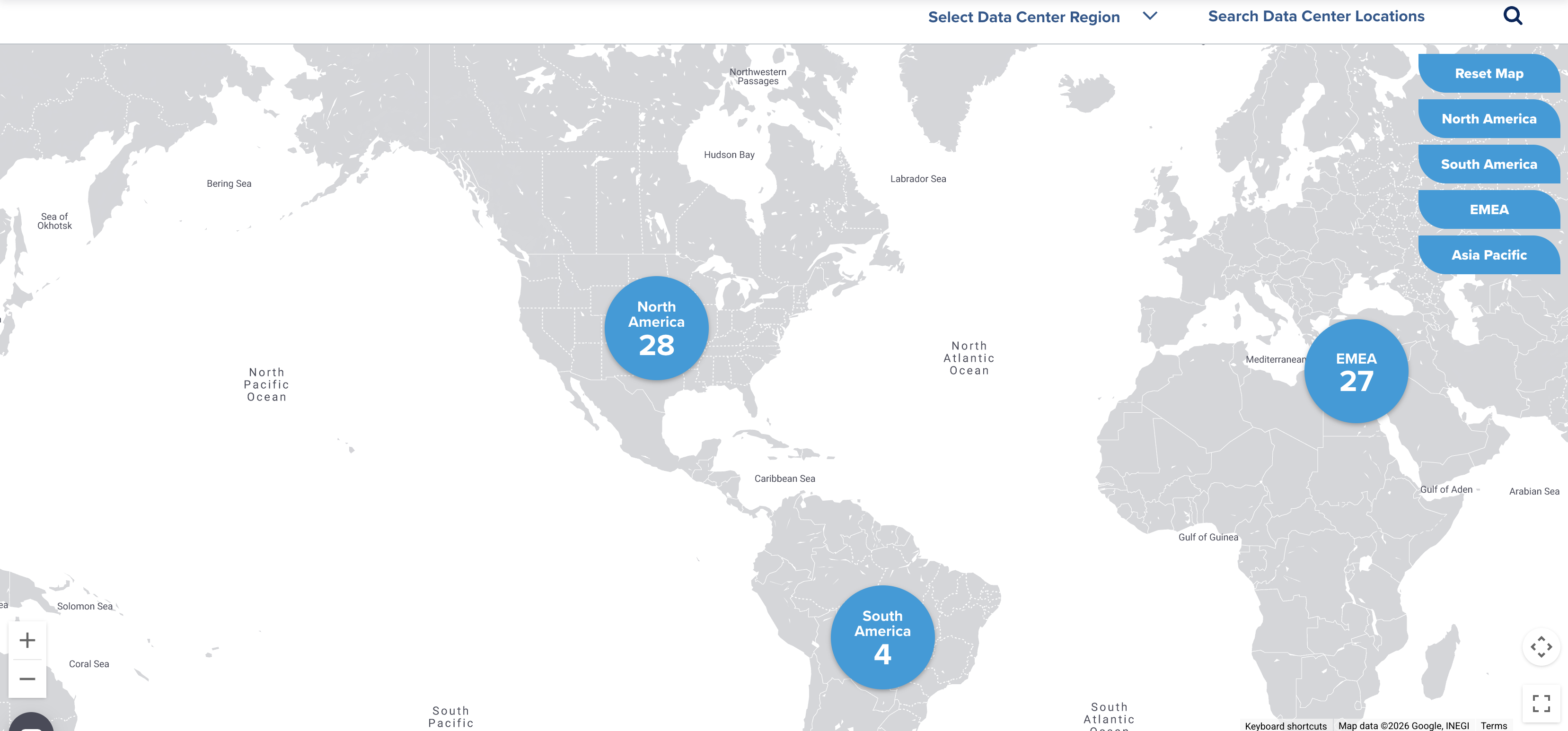
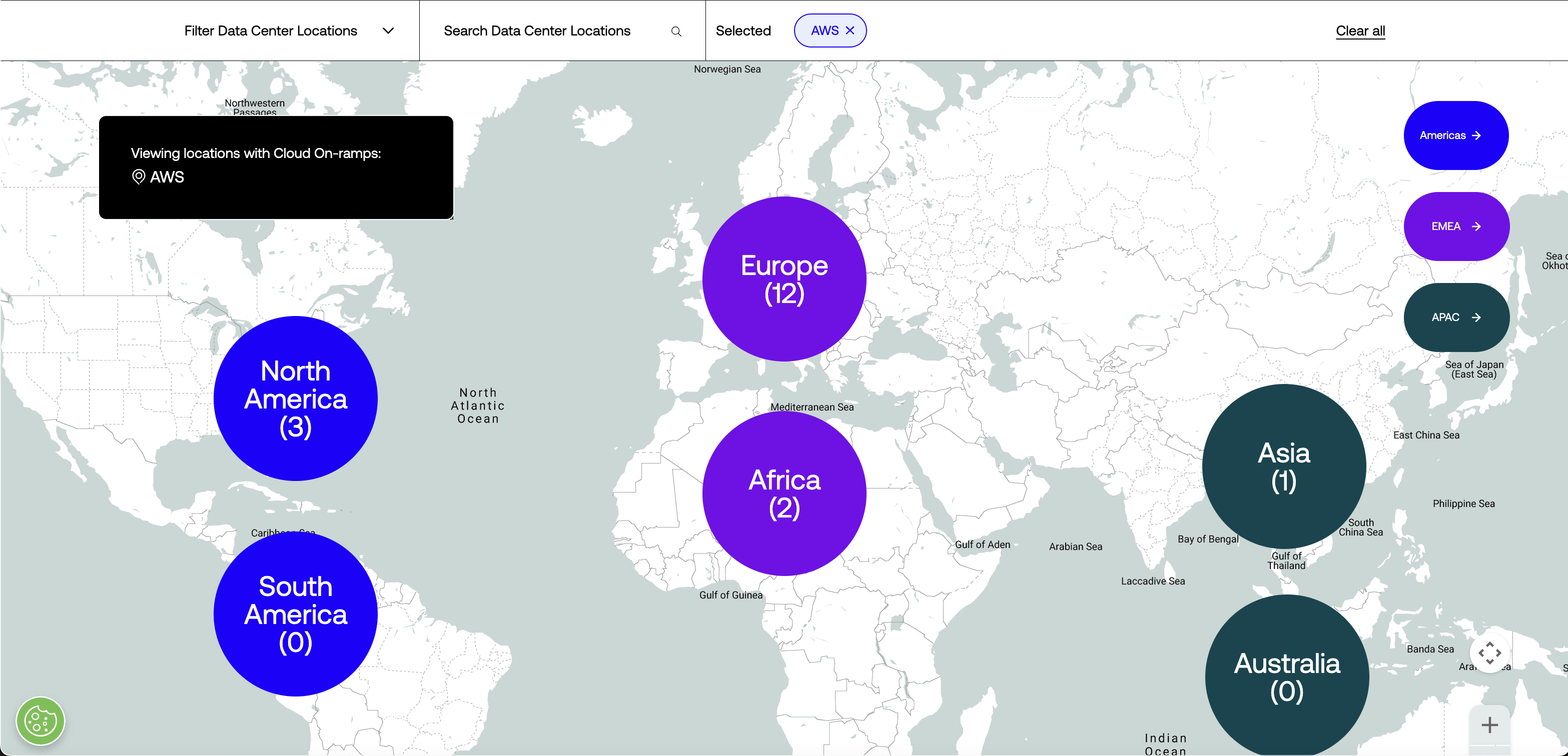
The global view shows all regions, with continent/region buttons in the upper right corner (Americas, EMEA, APAC) that trigger an animated pan and zoom to frame every metro within the selected region. From there, users can navigate further into specific continents or countries within each region— for example, clicking into Americas presents a choice between North America and South America, each with their own framed view.
Below: A prototype simulation of the Global Map design developed in Figma
Design & Development
NanoString has on-site laboratories where I was able to observe users of the nCounter systems.
I spoke with lab researchers and engineers to better understand their workflows and how they interacted with the instruments.
Key takeaways:
most users were between the ages of 26-44;
wanted to spend less time on the machinechanging reagents & opening the cartridge drawer
were most common taskslab researchers always wore gloves when interacting with the instrument
- need clear and easy way to download their data files
The animations were important. Easing in and out of each zoom level helps users maintain spatial orientation —they always know where they are in relation to the whole. Without those transitions, jumping between zoom levels would feel disorienting, especially for users who aren't already familiar with Digital Realty's global footprint.
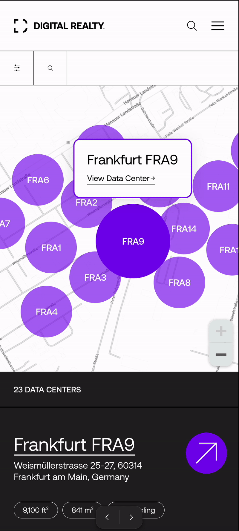
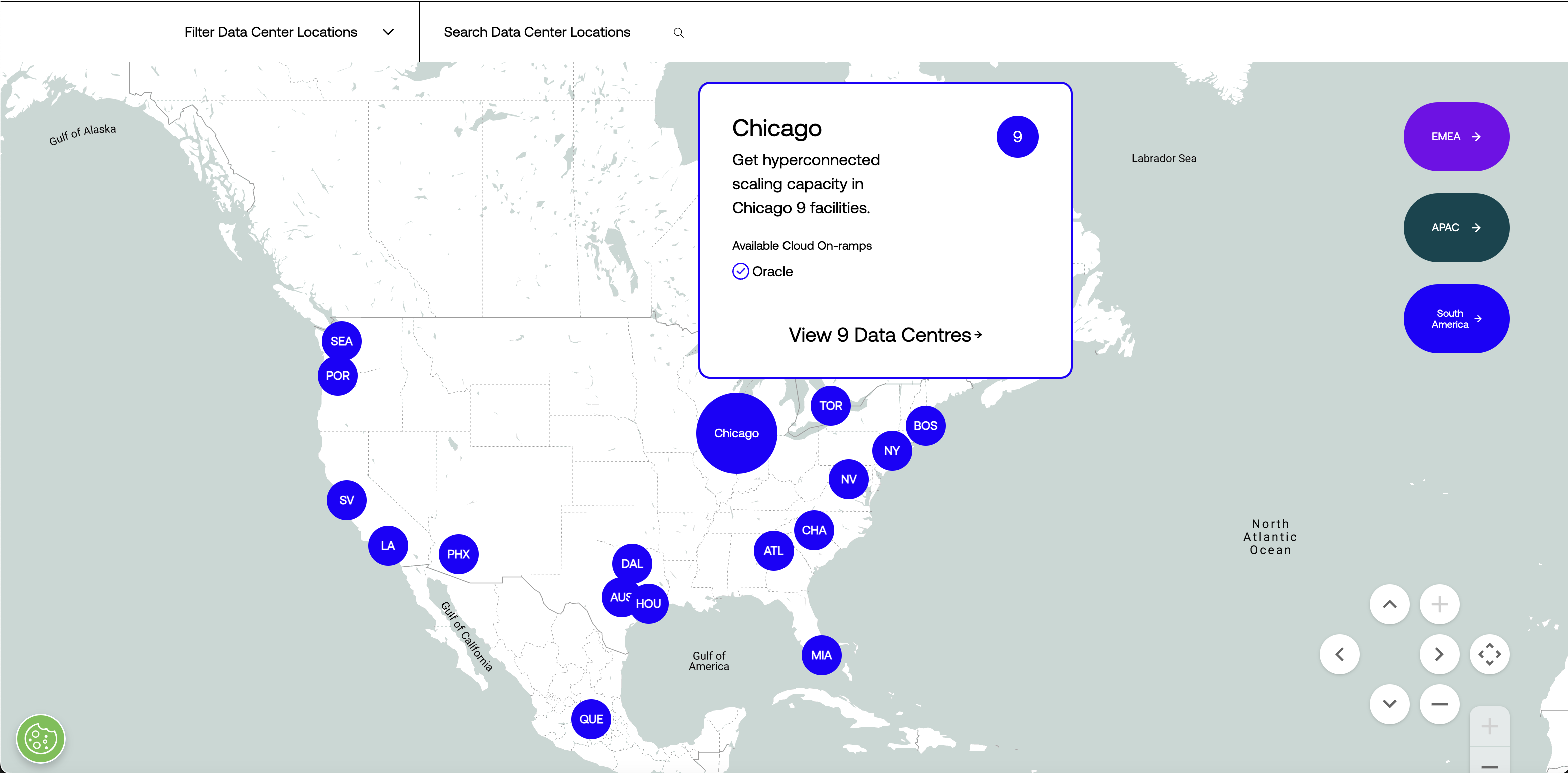
The most critical design component here was the metro popup. Hovering over a metro marker on desktop (or tapping once on mobile) now surfaces a card with the metro name, a brief description, the number of data centers in that metro, and a clear call to action: "View [X] Data Centres →". This was the missing link in the funnel. Before this redesign, there was no mechanism to get from the global map to a metro page. Now there's an explicit, prompted transition that guides users to exactly where they need to go.
Design details that mattered
Each metro marker now displays a two to three-letter code (CHI for Chicago, DAL for Dallas, NV for Northern Virginia) instead of raw facility counts. This made the map scannable at a glance — users could identify metros by name rather than trying to decode what a number on a dot meant.
The region buttons use distinct colors tied to Digital Realty's brand palette — blue (#1F00FF) for Americas, purple (#7700EC) for EMEA, and slate (#01454F) for APAC — creating a visual system that carries through the rest of the site. The zoom controls were positioned to avoid conflicts with mobile scroll behavior, solving the problem of users getting trapped inside the map.
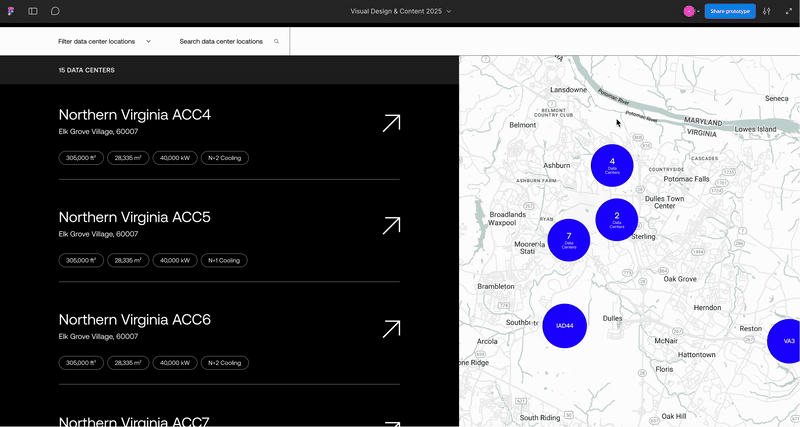
Phase II: Metro Map Redesign
With the global map funneling users into metro pages effectively, the metro map became the next bottleneck. The metro map is where evaluation actually happens — users comparing facilities, checking specs, deciding which locations to explore further. And it was where the experience was most broken.
Paint point hypothesis:
Confusing visual design and a lack of interactivity between the facility list and the metro map leads users to spend more time navigating back and forth between locations. The lack of an intermediate step that confirms the user is about to navigate to a new page upon click of a facility marker leads to unexpected navigation outcomes.
From hypothesis to spec: Writing the source of truth
After defining the problem and designing the solution, I wrote the complete interaction specification that would serve as the single source of truth for the development team. This wasn't a mood board or a loose set of design directions — it was a detailed spec with user stories, acceptance criteria, platform-specific behaviors, and edge cases, structured so that a developer could build from it without ambiguity.
The spec covered every interaction state across desktop and mobile: on-load defaults, list-to-map linking behavior, facility-to-list linking behavior, cluster expansion and collapse, zoom behavior at each level, and the handling of dense clusters with 10+ facilities (which required a nested cluster pattern — expanding to show 8 facilities around an inner cluster that could be tapped to reveal more).
I wrote it as a Confluence page with embedded Figma prototypes and screen recordings demonstrating each interaction. It became the reference document for the entire team — viewed by 12 team members, with several developers returning to it dozens of times during implementation. One developer viewed it 47 times.
The result: The feature was implemented almost exactly to spec, requiring only 1-2 minor adjustments during the entire development process. Near-zero rework. That precision saved engineering time, avoided costly iteration loops, and meant we shipped ahead of schedule.
Below: A prototype simulation of the Metro Map created in Figma in collaboration with RocketSource
Mobile Solution
With 52.1% of users on mobile, this wasn't a responsive afterthought — it was an equal design challenge. There's no hover state on touch devices, so we designed around the tap.
Tapping a facility in the list brings it to the top of the list view, highlights its marker on the map (changing from transparent to fully opaque), and pans the map to center on it. If the facility is within a cluster, the cluster expands on tap to reveal individual markers. Tapping a single facility marker surfaces a popup with the facility name and a "View Data Center →" link — the same intermediate confirmation step that was missing in the previous design.
This step was a deliberate product decision. In the old experience, tapping a facility marker immediately navigated users to a new page. There was no way to preview which facility they'd selected or confirm it was the right one. Users who tapped the wrong overlapping marker — easy to do in dense metros on a small screen — had to hit back and try again. The popup eliminates that friction entirely.
For clusters with 10 or more facilities, we designed a nested expansion pattern: the first tap expands to show 8 facilities arranged around an inner cluster indicator. Tapping the inner cluster zooms into the remaining facilities. Tapping outside of an expanded cluster collapses it. These behaviors were specified down to the interaction level in the acceptance criteria, which is why the mobile implementation shipped cleanly.
Below: Mobile version (Figma prototype) of the Metro Map experience
The most important outcome of this two-phase redesign isn't any single feature but the connected path that now exists from the very top of the funnel to the very bottom.
Before: Global map → dead end
Users had to find metro pages through site navigation or search.
After: Global map → region selection → continent/country view → metro popup → metro page with linkedfacility list and map → facility popup → individual facility page
Every step provides visual feedback.
Every transition is animated to maintain spatial context.
Every interaction has a clear next step, and the user is never stranded.
This connected experience exists because I owned both phases of the work and designed the metro map to extend the patterns established in the global map:
Consistent marker styling, consistent popup behavior, consistent animation language, consistent regional color coding. A different designer working on Phase 2 without the context of Phase 1 would likely have created something functional and less connected. The cohesion is part of the product's success.
Results
Here are the metrics compared year-over-year (2023 vs. 2024) for the same period (September 30 –October 31) before and after the global and metro map updates were complete and live on the site.
Metro Map Experience
Contact form fills increased from 66 to 108 — a 63.6% increase — despite total users dropping from 16.9K to10.2K (a 40% decrease).
Form conversion rate jumped from 0.12% to 0.38%, representing a 216.67% increase. PDF downloads conversion rate rose from 2.59% to 7.59%, a 192.86% increase.
Facilities Pages
Contact form fills increased from 39 to 54, a 38.46% increase. PDF downloads grew by 50% (from 1.0K to1.5K). Form conversion rate climbed from 0.13% to 0.37%, a 184.62% increase. PDF download conversionrate rose from 3.58% to 10.26%, a 186.59% increase.
What the numbers mean
The drop in total users with a simultaneous spike in conversions is the most telling signal. Fewer people were visiting, but the people who did visit were dramatically more likely to take meaningful action — filling out contact forms, downloading facility spec sheets, navigating deeper into the site. The redesigned experience wasn't just more polished, it was structurally sound and more effective at qualifying and converting the right audience.
The downstream impact on facilities pages is equally significant. The metro map update didn't just improve the metro experience — it improved everything below it in the funnel. By creating clear, linked navigation from the metro map to individual facility pages, users arriving at those pages were more intentional and more engaged. They weren't landing there by accident; They'd been guided there by a coherent experience.
Post-deployment Hotjar recordings confirmed the behavioral shift. Users were engaging with the metro map interactivity — hovering to highlight, expanding clusters, using the popups to navigate — and arriving at facility pages with clear intent. The back-and-forth navigation pattern I'd observed in the original recordings was largely gone.
Enterprise engagement also told a compelling story. Companies like CBRE Group, Lumen Technologies, and Jones Lang LaSalle showed markedly higher interaction rates in 2024, with JLL reaching a 70.37% action rate on the metro pages. When the experience works for sophisticated buyers who evaluate data centers professionally, that's a strong signal that the product decisions were right.
Shipping precision
Beyond the user-facing metrics, the process itself was a success story. The metro map spec I authored served as the definitive reference for development, with 12 team members relying on it throughout implementation. The feature shipped almost exactly to design spec, requiring only 1-2 minor changes — near-zero rework. That precision translated directly into saved engineering hours, no costly iteration loops, and an on-time launch.
Industry Validations
The strongest signal that a product decision is right is when the industry follows.
Within a year of the redesigned global map launching, a major competitor in the data center space adopted a strikingly similar map experience — including the global-to-regional navigation pattern, region labels matching Digital Realty's structure (Americas, EMEA, Asia-Pacific), metro-level drill-down with interactive markers, and popup cards prompting users to explore specific locations. The structural and interaction parallels extend well beyond coincidence.
Metrics alone didn't give us the validation of a near-verbatim industry competitor design copy :)
What I'd Do Next
If I were continuing to own this experience, here's where I'd focus:
Personalization. Session-aware defaults — remembering the last region viewed, surfacing recently explored metros — and being able to compare them directly against one another (not the competitor), would reduce friction for repeat visitors, who are often the highest-intent prospects. Sell the map? How about sell the map against itself?
Analytics instrumentation. While the year-over-year conversion data is compelling, more granular event tracking on specific interactions — which region buttons get the most clicks, which metro popups convert highest, where in the zoom hierarchy users drop off — would enable continuous optimization.
Accessibility audit. The current experience relies heavily on hover states and color changes. Ensuring the same information is available to keyboard-only and screen-reader users would broaden the audience and bring the experience into full WCAG compliance.
My Role
I led the UX design and technical artist functions across both phases of this project. That included user research and behavioral analysis through HotJar session recordings and Google Analytics, defining pain point and refinement hypotheses, writing the complete interaction specifications and acceptance criteria that served as the source of truth for development, creating Figma prototypes for desktop and mobile, collaborating with a distributed design agency and development team across multiple time zones, and guiding the work through to execution across all of Digital Realty's global sites. The spec I wrote was viewed nearly 200 times by the team, the feature shipped to spec, the metrics proved the approach, and competitors followed.
Find me on